Price behaviour is the most objective barometer of market balance. And gas prices in 2018 are signalling a tightening market. Two price moves this year have sent up a flare that risk is shifting to the upside.
Firstly, Asian LNG prices maintained a significant premium (1.0-2.5 $/mmbtu) above European hub prices across summer 2018. Asian prices temporarily diverged from TTF across the last three winters to meet seasonal demand (especially in the case of China). But the fact that the price premium to Europe has remained elevated through a period of traditionally weaker seasonal demand has flagged a tighter LNG market.
Secondly, there has been a summer surge in European hub prices, which have risen by more than 30% from Jul – Sep 2018. This price rise has been the result of higher carbon prices pushing up power sector switching levels and tighter competition for available LNG. The TTF spot price surge & steep forward curve backwardation is symptomatic of a scarcity of near-term gas supply.
In today’s article we take a step back and look at the global gas market balance and potential price evolution between now and 2025.
Downsize risk diminishing… but not gone
Wind back the clock to 2015 and there were broadly two paths the LNG market could take in absorbing more than 100 mtpa of committed new supply coming to market across 2015-20:
- High Asian growth: A high Asian LNG demand growth trajectory could just about keep pace with new supply. In this case, the impact of surplus LNG volumes ‘spilling’ into Europe was likely to be limited.
- Low Asian growth: A low Asian growth trajectory meant substantial volumes of surplus LNG would need to flow to Europe, potentially pushing TTF prices down towards Henry Hub levels.
Step forward to 2018 and Asian LNG demand has grown at a blistering pace across the last three years. Growth has been led by China, which has undertaken a strong policy driven transition from coal to gas to address urban pollution issues. At the same time some LNG projects in Australia and the US have suffered schedule slippage reducing supply projections.
Chart 1 shows Chinese LNG demand over the last 5 years. After standing still in 2015 (-4%), Chinese demand has grown at 31% and 47% across 2016 & 2017 respectively. In 2018 Chinese LNG imports are running almost 50% above 2017 levels to the end of August.
Chart 1: Chinese LNG demand 2014-18

Source: Timera Energy
The pace of Asian demand growth has been so rapid this year, that Asia has been pulling LNG away from Europe across summer 2018 as opposed to spilling surplus LNG. This has been reflected in the Asian price premium over TTF.
From where we stand now in 2018, two factors have reduced downside price risk compared to 2015:
- Capacity delivery: More than 50% of the current wave of new LNG liquefaction capacity is now online. The time window of potential oversupply has narrowed accordingly.
- Growth trajectory: The current growth trajectory for Asian demand is keeping pace with new supply. This reduces the risk of a ballooning surplus.
However, downside price risk is not dead and buried. The Chinese demand growth halt in 2015 is a reminder that Asian demand growth can surprise to the downside as well as the upside, particularly given the 2018 surge in prices. The most obvious threat to demand is a global recession (given we are ten years into an economic expansion).
There is still more than 50 mtpa of committed supply coming online across 2019-21. If this outstrips demand, then a spill scenario pushing European hub prices down is still a credible risk.
Upside risk in 2020s is rising
Beyond the 2019-21 horizon, the global gas balance has tightened given an expectation of a continuation of the strong Asian demand growth experienced across 2016-18. This means the risk of a gas market squeeze in 2022-25 has increased substantially.
Chart 2 illustrates the balance of the LNG market if Asia continues on its current high demand growth trajectory. The chart shows the supply and demand balance in the LNG market (top panel), and European gas market (middle panel). It also shows LNG market balance based on current committed supply (bottom panel).
Chart 2: LNG market supply & demand balance under a High Asian Growth scenario
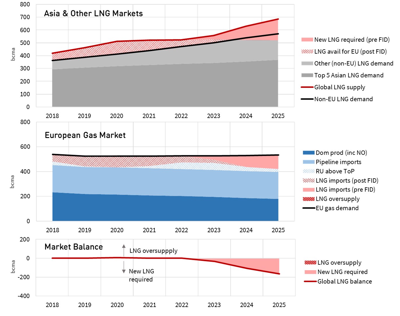
Source: Timera Energy
The bottom ‘market balance’ panel highlights two important implications of the current rate of Asian demand growth:
- There is little to no surplus LNG spilling into Europe over the 2019-21 horizon
- The LNG market needs new supply from 2022.
FIDs for new liquefaction projects have been thin on the ground since 2016. The only projects of scale that have committed to proceed are the Qatari expansion & the Shell led Canada LNG project announced last week.
These projects are not enough to meet the supply gap given the current pace of demand growth. Projects take 4 to 5 years to come online post FID. This means the timing and scale of new FIDs over the next 12 months will likely be critical to determining how tight the LNG market will be across the 2022-25 horizon. The risk of a sharp squeeze is increasing.
3 potential paths for price evolution
Chart 3 shows three illustrative price paths for European hub prices to 2025. We have not shown Asian spot LNG prices. But these are likely to remain structurally linked to TTF, given large volumes of flexible LNG supply that can arbitrage price differentials (albeit with a continuation of significant short term Asia vs TTF price spread volatility given supply chain response constraints).
Chart 3: 3 illustrative TTF price paths to 2025
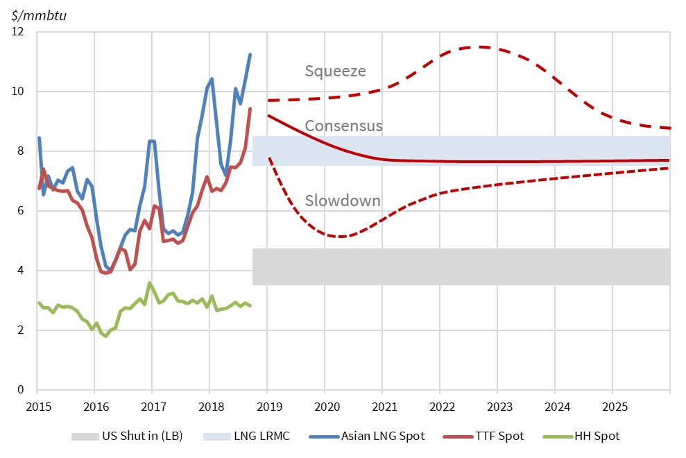
Source: Timera Energy
- Consensus
The central path follows forward prices for the first 3 years and then assumes prices remain flat in real terms at 7.5 $/mmbtu, at the lower end of consensus estimates of the Long Run Marginal Cost (LRMC) of the next wave of LNG supply.
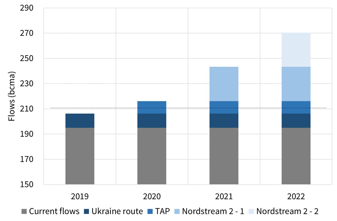
This is consistent with Russia increasing gas flows into Europe across 2019-21, in order to ease prices back to levels that make LNG project FIDs more challenging.
Gazprom has a strong incentive to prevent a competitive surge in the FID of new LNG projects across the next two years. New LNG projects are a clear threat to Russia because once committed, they represent price taking gas that can flow into Europe if a surplus arises.
- Squeeze
The higher price path is consistent with a continuation of strong Asian demand growth. This could be coupled with delays/issues with new LNG supply (as has been the case across 2015-18).
In this scenario, Asia continues to pull LNG supply away from Europe at the same time domestic production is declining. Price evolution is also consistent with Russia failing to dampen price rises, due to capacity constraints or political issues (e.g. Nordstream 2 delay, Ukraine route issues). Under these conditions, European hubs are pulled higher as they compete with Asia for LNG.
A perceived higher price path is likely to incentivise more LNG project FIDs during 2019 and 2020. This would likely set up a price decline in the mid-2020s as new capacity comes online, the extent of which depends on the pace of global demand growth.
- Slowdown
The lower price path is consistent with some form of interruption to the current rate of Asian (and/or European) demand growth. A global recession is the most obvious example, but this could also come from slowing Asian demand in response to recent price rises.
Within Europe, falling hub prices would also be consistent with an increase in Russian flows (2019-20) to pull prices back down below levels supporting new LNG FIDs.
The influence of any of these factors is only likely to be temporary across the 2019-21 window. Beyond that it is hard to build a scenario where prices do not move back towards levels consistent with investment in new supply.
These 3 price paths illustrate the range of uncertainty over the next 5 years confronting portfolios with gas price exposure. But behind this uncertainty, two key structural drivers remain: demand growth in Asia and declining domestic production in Europe. It is those drivers that are shifting gas market risk to the upside.