The European gas market is formed around a well interconnected network of traded hubs. Liquidity at most of these hubs is limited to a short-term horizon close to delivery. When it comes to forward market liquidity, there are only two hubs that count.
The Dutch TTF hub sits at the commercial centre of the European gas market. Price signals at other hubs are strongly linked to the variable transport cost differentials to TTF, although can at times be impacted by physical of commercial constraints.
But despite the primary status of TTF, just across the English Channel, the UK’s NBP has retained its status as a key secondary source of forward liquidity. There are two important reasons behind the resilience of NBP:
- Separation: The relative isolation of the UK market at the Western edge of the European gas network means that constraints flowing gas between the UK and the Continent can drive structural differences in pricing dynamics.
- Regas access: The UK has relatively large volumes of under-utilised regas capacity that allow LNG market players access to a liquid hub price signal in order to manage portfolio exposures.
Basis differentials between TTF and NBP have ben fairly stable, with basis risk accordingly low. But as the European gas supply flexibility balance slowly tightens across Europe, some interesting divergences are opening up between price behaviour at TTF vs NBP. In today’s article we set out a comparative analysis of the key flex market price signals across the two hubs.
Flex signal 1: Seasonal price spreads
The key benchmark for the value of flexibility to shift gas between seasons is the summer/winter price spread. Chart 1 shows the evolution of the front year forward contract spread at NBP compared to TTF.
Chart 1: NBP vs TTF front year forward market seasonal price spread
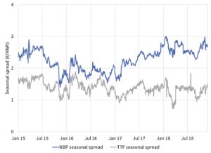
Source: Timera Energy
NBP seasonal spreads have historically maintained a small premium to TTF. This is consistent with NBP tending to trade above TTF in winter to attract imports to meet higher demand and at a discount across summer as UKCS flows (in excess of UK demand) are exported to the Continent.
However, the closure announcement of the Rough storage facility in 2016 opened up a more structural divergence of NBP and TTF spreads. Rough (at full strength) represented almost 4 bcm of working gas volume. Given the relatively slow cycling speed of Rough, this working volume was focused on providing seasonal flexibility.
The loss of Rough has meant that this flex needs to be backfilled, primarily via Norwegian supply flex but also by drawing on flows via the IUK & BBL interconnectors. The seasonal spread price signal to incentivise these alternative sources of flexibility is significantly higher than that required to cover the variable cycling costs of Rough. This has driven the more structural divergence of NBP spreads above TTF.
TTF seasonal price spreads remain stubbornly stuck in a 1-2 €/MWh range, close to a soft lower bound driven by the variable cycling costs of seasonal storage. A more structural recovery of spreads at TTF is likely to depend on:
- Storage closures: a number of European seasonal storage assets remain cashflow negative at current spread levels. Ongoing spread weakness and expiry of long term contracts (at more favourable terms) is pushing owners towards closure.
- LNG import seasonality: LNG import flows into Europe have typically been higher in summer than winter, given Asian LNG demand patterns. As LNG import volumes grow, seasonality may increase.
- Russian flows: Russian supply contracts have traditionally been a key source of seasonal flexibility. But seasonality of Russian flows has decreased as volumes have ramped up since 2015.
The evolution of storage closures and seasonal import flow patterns into next decade will be important in driving TTF seasonal price spread levels.
Flex signal 2: Spot volatility
The second key signal for gas supply flexibility is spot price volatility. This drives the value of daily (or short term) deliverability of gas. An analysis of day-ahead NBP vs TTF spot price volatility is shown in Chart 2.
Chart 2: Historical day-ahead spot price volatility at NBP vs TTF
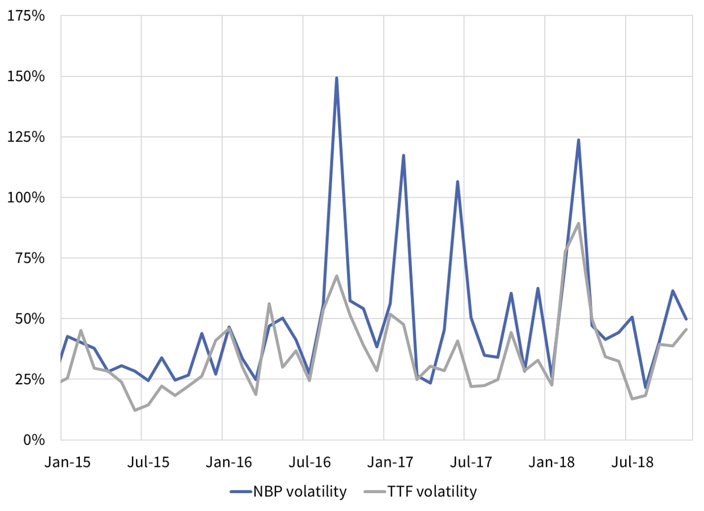
Source: Timera Energy
A divergence between NBP and TTF spot price volatility can also be seen after the 2016 Rough closure announcement. This is consistent with the fact that Rough represented about 25% of UK daily storage deliverability.
In the Chart 2 analysis we have excluded short term price jumps (measured as daily price returns greater than 3 standard deviations from the mean). If price jumps are added back in, then the divergence between NBP and TTF volatility is even greater.
The higher level of spot volatility at NBP (vs TTF) is driven to a large extent by larger and more frequent market stress events. It is interesting to note two types of volatility events in Chart 2:
- Competitive stress events: Some stress events are European market wide and see the UK and NW European markets competing for available gas. Examples here are the ‘beast from the east’ shock in Q1 2018 and the French nuclear outage related stress in Win 16/17.
- Isolated stress events: But since the closure of Rough, NBP has been more susceptible to volatility caused by UK specific constraints (e.g. see UK price jumps across 2017). These may act to transmit some volatility to TTF, but are primarily reflected in more volatile NBP prices.
Spot volatility across both NBP and TTF has risen since 2016 as the European supply flexibility balance starts to tighten. But this increase in volatility is focused on market stress events, with NBP more susceptible than TTF and TTF-NBP basis risk set to become more of an issue than for many years. The growing influence of stress events on flexibility value is likely to continue as the European gas market becomes more import dependent in the 2020s.