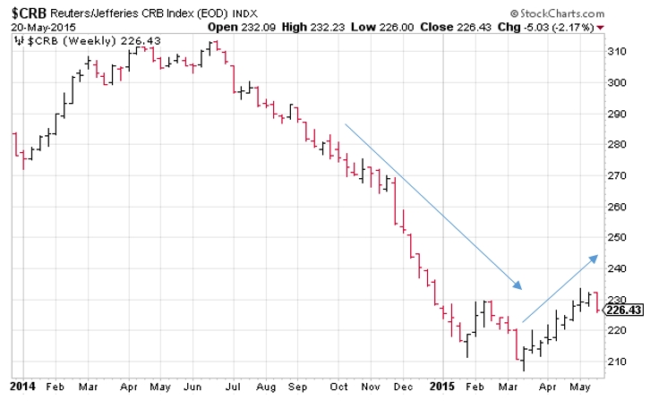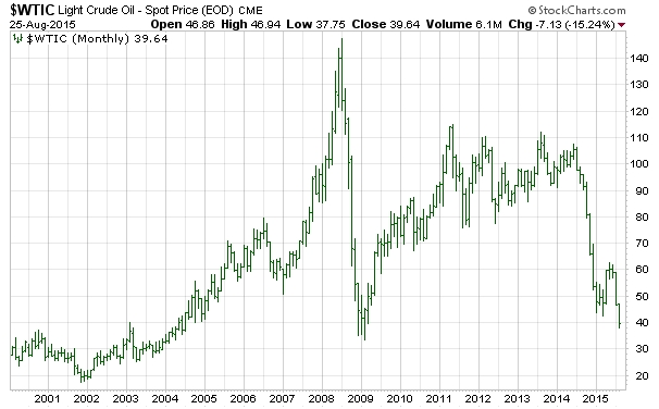
A sharp slump in spot gas prices last summer marked the start of a new phase of global gas pricing. This summer the gas market has been relatively quiet. Instead price action has been focused on the oil market. After recovering back towards 70 $/bbl in Q2, Brent plunged back under 50 $/bbl in August, pointing to a more prolonged period of oil price weakness.
An emerging oversupply of LNG and weak oil prices have seen the re-convergence of global gas prices. But so far European spot gas prices have remained broadly in line with oil-indexed contract prices. We have not yet seen a repeat of the global gas glut conditions of 2009-10, where a gap opened up between the cost of oil-indexed supply and hub prices. But this may change over the next to years.
The state of play
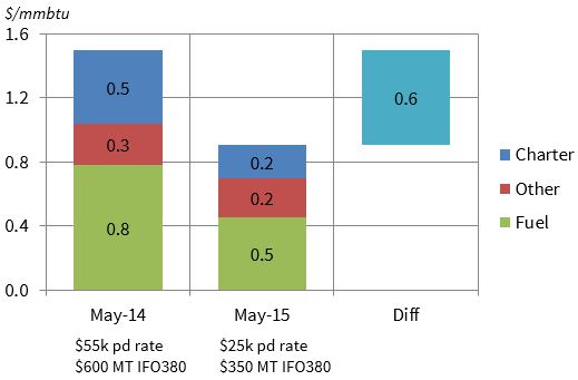
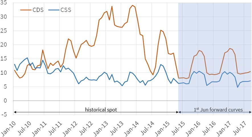
Chart 1 shows the rapid re-convergence of European & Asian gas prices over the last 12 months. The precipitous decline in Asian prices has been driven by the combined effect of (i) LNG oversupply and (ii) falling oil prices dragging down oil indexed contract prices.
In fact the last 12 months resembles 2011 in reverse. It so far remains to be seen if the gas glut dynamics of 2009-10 are to follow.
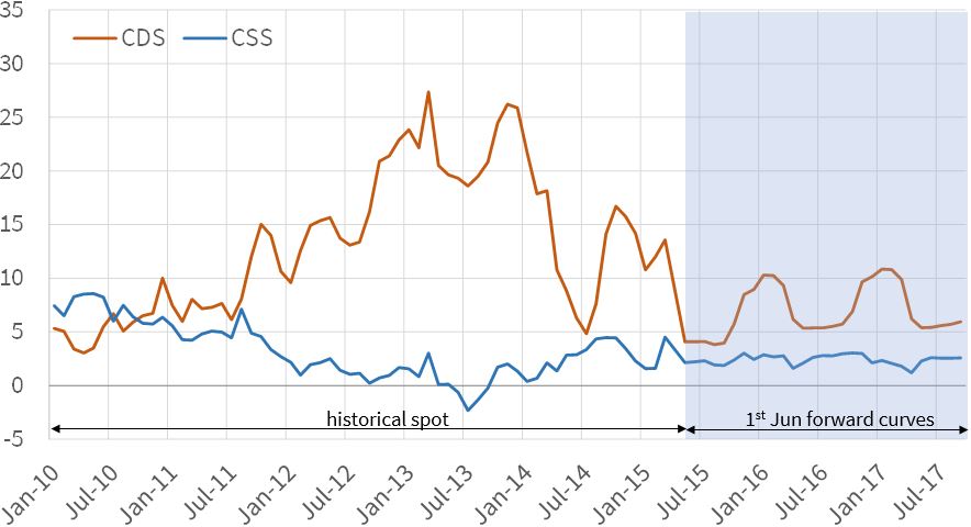
Chart 1: Global gas price evolution
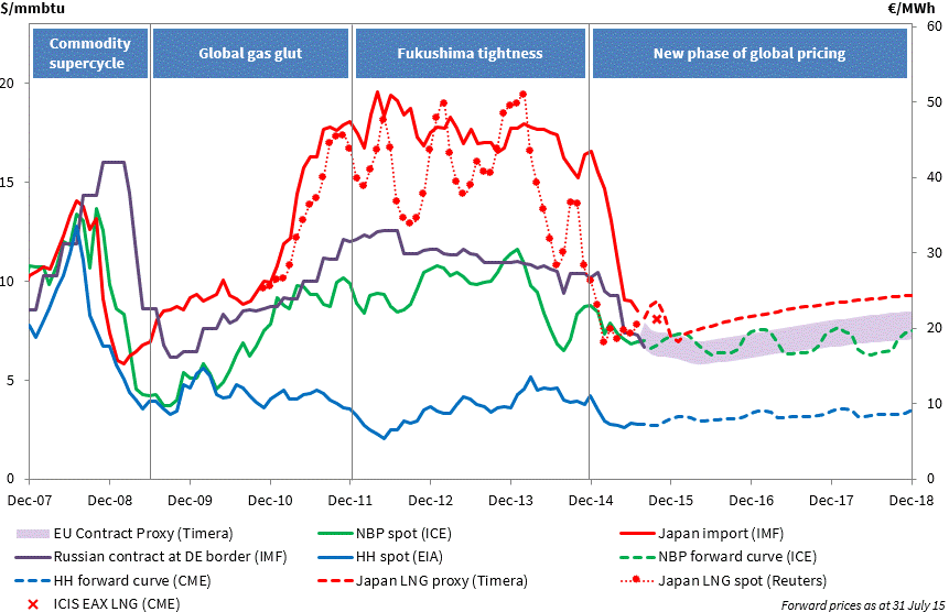
Source: Timera Energy
As summer winds to an end, European hub prices are hovering around the 6.00 $/mmbtu level. Asian spot LNG is changing hands at around 7.30 $/mmbtu (Japanese marker). So the acute pressure on European hubs from weak Asian LNG prices has temporarily subsided from earlier this year when the Asian vs European spot price spread briefly inverted.
But Europe’s status as the LNG market of last resort (or global gas sink) remains. European hubs are currently providing key support for global gas prices. Even if LNG is not flowing to Europe, it is being priced off a basis to European hubs.
There is no doubt as to the predominant exposure of large suppliers and portfolio players. The LNG market is long gas against a backdrop of relatively weak demand from Asian utility buyers. Rather than much anticipated demand from China driving price recovery, Chinese buyers are looking to unload portfolio length.
The main buying interest in the LNG market is currently focused on Middle Eastern buyers. But the competitive nature of the current Egyptian and Jordanian supply tenders and the likelihood of small premiums over NBP prices illustrates the LNG supply overhang.
After a brief recovery in Q2, oil prices are declining again, pointing to further downwards pressure on long term gas contract prices into 2016. The lagged impact of the oil price recovery on Asian contract prices can be seen via the red-dashed Asian LNG price proxy in Chart 1.
Higher slope coefficients on Asian LNG contracts mean contract prices fall faster in response to weakening oil than European pipeline contract prices. This also means that the Asian LNG market may transition to a role of dragging European hub prices lower, rather than pulling them higher.
Asian LNG contract prices are likely to end 2015 below 7.50 $/mmbtu (given the lagged impact of crude prices). Prices are set to fall further next year if oil price weakness continues. Lower Asian LNG prices are likely to drive the increasing diversion of flexible supply from Asia to Europe. This is the reverse effect of the post Fukushima period and means more LNG flowing into European hubs.
Looking forward into 2016
No crystal ball is required to predict the trend of supply in 2016. There is more than 50 bcma of new liquefaction capacity entering the LNG market across 2015-16. A number of large liquefaction projects will be commissioned from late 2015 into 2016 e.g. the two remaining Australian export projects on Curtis Island, the first US export trains at Sabine Pass and the expansion of the giant Gorgon field off Western Australia.
This new supply needs to find a home in a market that is already long LNG. To date there has been a notable absence of opportunistic buying in response to lower prices. China is the most important candidate, but weak manufacturing and export data and central authority devaluation of the yuan do not bode well for a significant pick up in Chinese import demand in the near term. That points to large volumes of new supply flowing into European hubs, either directly (e.g. from Sabine Pass) or indirectly (e.g. via Australian gas displacing other Asian imports).
We have written previously about the risk of breaching the ‘tipping point’ in the European gas market. This is the point where the contractual flexibility to ramp down oil-indexed pipeline swing contract volumes to make way for LNG imports is exhausted. Once past the tipping point, oil-indexed prices are pushed out of their current role as the dominant setter of marginal hub prices. In turn, spot prices may need to fall significantly to induce demand response from gas-fired power plants e.g. in a 4-6 $/mmbtu price range. Conditions in 2016 look like they could well test this theory.
Gearing up for battle
From a European supplier perspective, it is not the absolute level of gas prices that are the key driver of portfolio value. It is rather the differential between the cost base of long term oil-indexed contract supply and hub prices which drive sales revenue. The divergence between oil-indexed and hub prices in 2009-10 precipitated big supplier losses and a round of supply contract re-negotiations & concessions that continued until 2012-13.
Suppliers have so far been shielded from the pain of 2009-10 given hub prices have remained broadly in line with contract prices. But if hub prices diverge from oil-indexed prices again in 2016, similar pressure on portfolio margins can be expected. A particularly dangerous scenario for suppliers would be a recovery in oil prices at the same time global gas market oversupply intensifies.
After 5 years of pain from power generation portfolio write downs, the balance sheets of European utilities are ill prepared for another shock. This would likely precipitate an intense phase of supply contract renegotiations, portfolio restructuring and asset divestments. It could also be the catalyst for the significant restructuring of portfolio supply to more closely reflect hub prices, with LNG offering a competitive alternative to pipeline supply.
Current market conditions and asset margins point towards a growing likelihood that utilities will need to raise capital to sure up balance sheets. New capital with an appetite for energy assets is waiting in the wings in the form of infrastructure and private equity funds. But fund appetite for merchant risk is limited by conservative risk/return mandates. So transaction structures are likely to involve utilities retaining the lion’s share of asset market risk exposures.
Article written by David Stokes and Olly Spinks