The impact of LNG imports on hub price volatility

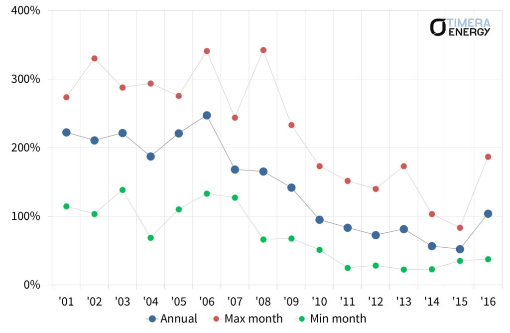
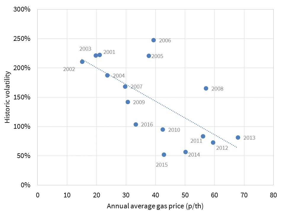
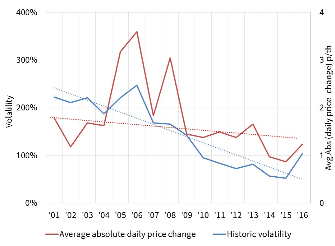
After 5 tough years, a glimmer of hope emerged for gas storage operators in 2016. Spot price volatility at European hubs started to show signs of a more enduring recovery. This has been supported by a resurgence in power sector gas demand. Reductions in existing gas supply flexibility have also helped, for example constraints around the UK’s Rough storage facility.

However gas storage facilities face a potential threat in the form of rising LNG imports. There is little doubt that LNG import volumes into Europe will increase significantly over the next decade, as the LNG supply glut intensifies and European import dependency increases. But there is less clarity as to exactly how rising LNG imports will impact hub price volatility.

The simple argument that is often presented is that LNG regas terminals and on-site tank storage compete with conventional gas storage facilities to dampen volatility. But this argument ignores some important practical constraints that limit LNG import flexibility. 

Deconstructing LNG import terminal flexibility

LNG import flexibility can be broadly split into two categories, the first associated with the LNG supply chain and the second with regas terminal storage tanks:

  1. ‘Type A’ flexibility – LNG cargo diversion: Cargoes not initially intended for European delivery are sent to Europe as a result of (i) cargo diversion or (ii) purchase of spot cargoes. Or alternatively cargoes that were intended for Europe are diverted away.
  2. ‘Type B’ flexibility – use of LNG terminal storage: On-site tank storage can be used to profile gas send out in response to hub price volatility (i.e. increased/decreased withdrawal as prices rise/fall). Tank storage can also facilitate “Type A flex” via enabling the reload and diversion of cargoes that are bound by destination specific contract clauses.

Let’s consider how each of these sources of flexibility impacts hub price volatility.

Type A flexibility constraints: diversion flexibility

The LNG supply chain can certainly provide seasonal flexibility to the European gas market, if there is an adequate hub price signal to incentivise a seasonal flow profile. However there are practical constraints around the ability of LNG imports to respond to spot price volatility.

Spot price volatility is by nature a short term phenomenon, often shorter than the time horizon required for LNG supply chain response (e.g. 1 to 3 weeks). Response time depends on the availability of divertible LNG cargoes which can be constrained by price, location and contractual factors.

Ability to divert a cargo in response to higher hub prices may depend on the availability of short term shipping and regas capacity. Diversion or reloading LNG in response to lower hub prices often relies on complex diversion economics and logistics and access to regas terminals.

Chart 1 shows a case study focused on the response of LNG imports to the UK NBP price spikes in Mar-Apr 2013.

Chart 1: UK LNG deliveries vs spot prices (Jan – Jul 2013)

2013 case study v2

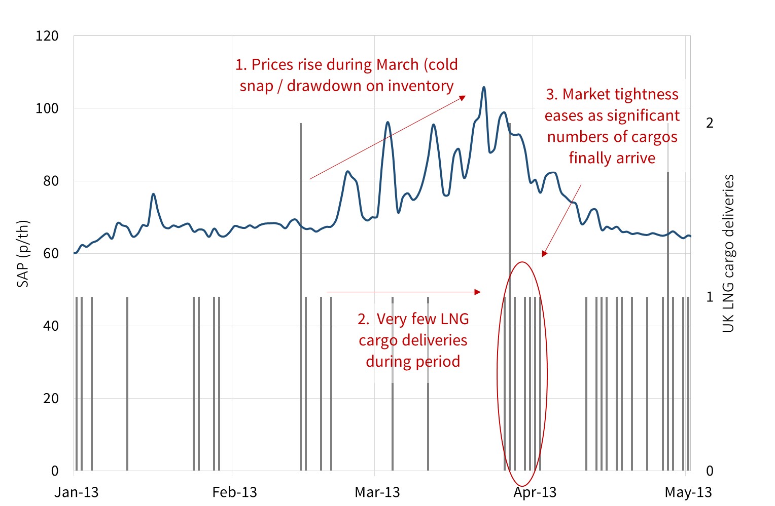
Source: Timera Energy (data from National Grid)

Hub price volatility across this period was caused by a combination of major infrastructure outages that curtailed Norwegian imports, cold weather and issues with the IUK interconnector. Spot prices began to signal system stress in late Feb and remained at elevated levels throughout Mar (spiking to above 100 p/th). But it was not until Apr that the LNG supply chain was able to deliver a significant increase in import volumes to help rebalance the system.

Type B flexibility constraints: regas tank flexibility

At first glance, LNG tank storage may appear to have similar characteristics to fast cycle gas storage facilities. But while tanks can be used to profile gas send out, there are fundamental differences that limit regas terminal flexibility. These include:

  • LNG storage can only inject into the network, not withdraw from it
  • During periods of high terminal utilisation, storage tank optimisation is restricted by a requirement to send out gas to facilitate the unloading of cargoes
  • Minimum inventory requirements to keep the tanks cool can constrain send-out during periods with few deliveries
  • The use of terminal storage can often be limited by contractual terms
  • In tank boil off rates contribute to the cost of holding inventory, although rates are relatively low (0.02-0.1% per day)

Under the right conditions, regas terminal send-out can be profiled into periods of higher prices to dampen volatility.   But the factors listed above combine to substantially reduce the flexibility associated with terminal tank storage.

Chart 2 shows a case study of UK terminal send out over a recent 12 month period to illustrate the fact that physical terminal constraints and cargo logistics are key drivers of terminal send-out, as opposed to optimisation against NBP spot prices.

Chart 2: UK regas terminal send-out (Jul 2015 – Jun 2016)

2016 UK terminal sendout v2

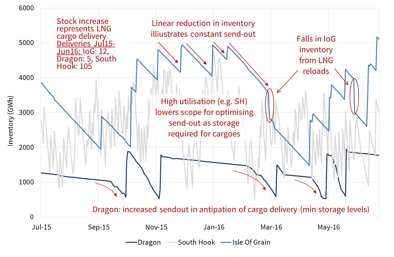
Source: Timera Energy (send-out data from National Grid)

The chart shows how tank inventory was typically sent out in a linear (steady) profile, as opposed to being optimised against spot price volatility. It also illustrates how terminals need to use high send out rates during periods of higher utilisation (e.g. for South Hook receiving regular cargoes). Terminals with lower utilisation such as Dragon need to  retain a minimum inventory to keep the tanks cool and then typically send out gas in anticipation of a new delivery.

LNG imports as a source of higher volatility?

There is inherent flexibility within the LNG supply chain to divert cargoes to higher priced markets. Regas terminal storage tanks also provide flexibility to profile send out of inventory. But the combination of these two factors alone does not necessarily mean that rising LNG imports will act to dampen European hub price volatility.

There are circumstances under which rising European dependence on LNG imports may act to increase spot price volatility. This is particularly the case because of the growing role of European hubs as the global LNG swing market (or ‘market of last resort’). Consider the following two cases:

    1. Surplus: During periods of surplus LNG cargoes, Europe can see a substantial ramp up in imports. Periods of high terminal utilisation can act to temporarily depress hub prices. This dynamic is exacerbated by the fact that LNG cargo volumes are bulky in nature relative to other supply sources delivering to hubs (e.g. fields, pipelines, storage).
    2. Shortage: Relatively large volumes of LNG supply can also be diverted away from Europe during periods of tightness in other regional markets (e.g. Asia or South America). This can drive up European hub prices, particularly if hubs need to ‘price up’ to compete for available cargoes.

Swings from surplus to shortage can occur over a relatively short time span, given the immaturity of the LNG spot market (e.g. compared to the crude market). So cycles of surplus and shortage can act to drive higher European spot price volatility.

The logic that rising LNG imports always acts to reduce spot price volatility oversimplifies the problem. The reality is more complex and depends on market conditions. If conditions are right, terminal send out can be profiled to dampen hub price volatility. But this effect is likely to be overshadowed by a structural increase in volatility as Europe evolves into the role of ‘shock absorber’ for the LNG market.

Article written by Olly Spinks and David Stokes


Progressing up the mountain of LNG

The LNG market is in the earlier stages of an unprecedented ramp up in supply. Global liquefaction capacity is set to rise by more than 50% by 2022. 205 bcma (149 mtpa) of new liquefaction capacity is past the Financial Investment Division (FID) and is under construction or has come onstream since 2015.

We published an article in early 2016 setting out the characteristics of this mountain of new LNG supply. As we enter 2017, we are only approximately 30% up the mountain. There remains over 145 bcma (101 mtpa) of capacity still to be commissioned across 2017-22. 130 bcma (96 mpta), almost 90% of the remaining volumes, will come online over the next three years alone.  In today’s article we return for a status check.

Mountain characteristics

New LNG supply is dominated by two sources:

  1. Australian LNG liquefaction capacity which reached FID between 2009-12 and is due to come online between 2015-17.
  2. US LNG export capacity which reached FID between 2012-15 and is due online 2017-20 (in addition to Sabine Pass trains 1 & 2 which were commissioned in 2016).

Chart 1 shows an updated view of the mountain of supply volume breakdown we showed last year.

Chart 1: 2015-22 Mountain of new LNG supply updated

LNG Supply Jan17

Source: Timera Energy

The 60 bcma (44 mtpa) of capacity delivered to date across 2015-16 has included:

  • The three Queensland projects backed by coal bed methane (Curtis Island, Gladstone)
  • Sabine Pass Trains 1 & 2
  • Indonesia’s Donggi-Senoro plant
  • Trains 1 & 2 of the giant West Australian Gorgon project

The capacity volumes shown in Chart 1 are based on target dates for first cargoes. However the full impact of new supply from the projects commissioned to date has been diluted by project ramp up times and delays.

The calm before the storm

As observed in the last LNG supply growth surge in the late 2000s, there is a lag between anticipation and reality. New LNG trains typically have a commissioning ramp up time of 6 to 9 months from first cargo to full capacity. On top of this there have been a number of delays and disruptions to the ramp up of new LNG trains.

Chevron’s Gorgon terminal has suffered perhaps the most prominent issues, with a series of unscheduled stoppages for maintenance disrupting supply from both Train 1 and 2. These issues, in addition to cold weather in China and nuclear maintenance in South Korea contributed to firming Asian spot LNG prices in Q4 2016. It should be noted however that despite these setbacks, Australian LNG exports for November 2016 were up 44% YoY.

The remainder of the climb

The impact of new supply is set to become more pronounced as 2017 progresses. Ramp up and teething issues for existing terminals are likely to recede. In addition the next wave of new projects are due to come online including the Wheatstone, Itchys and Prelude projects in Australia, the 1st train of the Russian Yamal terminal and Sabine Pass Train 3.

The issue confronting the LNG market from 2017 is that the pace of growth in supply in the next three years is likely to significantly outstrip demand growth. There are likely to be two important implications of this:

  1. Increasing European imports: LNG cargoes that are surplus to Asian (& emerging market) requirements are likely to end up in Europe, given liquid hubs, flexible contractual structures and an ability for the power sector to absorb gas.
  2. Further price convergence: Surplus LNG is likely to put downwards pressure on spot price differentials between Asia, Europe and the US. This could see the trans-Atlantic spread between NBP/TTF and Henry Hub compressing to non-sunk variable costs below 1 $/mmbtu.

Beyond 2017 all eyes shift to the US. There is a committed delivery pipeline of more than 80 bcma of US export capacity, most of which is due to come online in 2018-19. The US is also the most likely next source of new liquefaction FIDs to supply the LNG market in the 2020s. In addition to possible FID’s for Sabine Pass Train 6 and Corpus Christi Train 3, the Golden Pass project, awaiting non-FTA approval could add a further 20 bcma of export capacity if it proceeds.

Perhaps most importantly, the growing supply glut is set to see a substantial increase in the role of Henry Hub in driving the level of global gas prices as LNG trading arbitrage narrows spreads between key regional price benchmarks.

Article written by David Stokes, Olly Spinks & Howard Rogers.

UK capacity market surprises again

The UK capacity market continues to deliver surprises.  Large scale CCGT plants were expected to provide most of the new capacity in the third T-4 auction held in December.  But small scale peaking generators again dominated the auction, driving down the clearing price to 22.50 £/kW, well below consensus expectations.

The evolution of the UK capacity market is being closely followed across Europe.  France and Italy are in the process of implementing similar market wide capacity mechanisms.  Other markets such as Germany and Belgium are exploring strategic reserve mechanisms to ensure support for flexible capacity.

Regardless of the capacity support mechanism, the UK experience is providing important information on capacity costs and the competitiveness of new technology types versus existing plants.  The UK capacity market is also helping to crystallise the commercial and financing models of new flexible generation projects and driving down costs. So what are the lessons from the UK auction to carry into 2017?

3rd auction highlights

Given quite a bit of detailed analysis on the auction has already been published, we keep this article focused on a few important headline facts.

Clearing price:

There was a broad range of published views on clearing price levels going into the auction.  Most of these were in the 35-45 £/kW range, based on estimates of the cost to deliver new CCGT capacity.  Instead, substantial volumes of smaller scale distribution connected capacity pushed prices below 25 £/kW.  The auction supply stack is shown in Chart 1.

Chart 1: 2016 T-4 auction supply stack

2018-t-4-auction-stack

Source: EMR delivery body

Unsuccessful capacity:

The volume of existing capacity that was unsuccessful in the auction was dominated by older coal units (Cottam, Fiddlers Ferry and 1 unit of West Burton A) and Peterhead, the Scottish CCGT disadvantaged by locational TNUoS charges.  No big surprises here.

The other key category of exiting capacity was the 8.5 GW of unsuccessful new build CCGT projects.   The developers backing these projects included ESB, Carlton Power, Calon (Macquarie), Scottish Power, SSE and Intergen.

Existing coal assets and new CCGTs likely dominated the large volumes of capacity that exited the auction between 30-35 £/kW and between 22.50-25 £/kW.

New build:

Small scale peakers once again dominated successful derated new build capacity which was split across:

  • 0.33 GW Centrica’s Kings Lynn CCGT
  • 0.30 GW Intergen’s Spalding expansion OCGT
  • 1.5 GW of small scale peakers (mostly gas or diesel reciprocating engines)
  • 1.4 GW unproven DSR (the majority of which is likely to be small scale engines behind the meter)
  • 0.5 GW of battery storage (including some volumes also successful in Grid’s Enhanced Frequency Response tender in Aug 2016)

You could easily conclude from these results that small scale peakers will continue to dominate capacity delivery going forward.  But in our view the result of 2016 T-4 auction may with hindsight be viewed as a bit of an anomaly.

Peakers and embedded benefits

The economics of small scale distribution-connected peakers have been attractive to date.  Reciprocating engines have ‘all in’ capex costs as low as 150-200 £/kW (vs 500+ £/kW for new CCGTs).  Peakers have also had access to revenue uplift from a range of other embedded generation benefits that we have described previously.

These factors have helped to drive down capacity bids to around the 20 £/kW level or even below.  But peaker developers are facing dark clouds building on the horizon.  There is a concerted government effort underway to ‘level the playing field’ between CCGTs and small peakers.  Action already underway includes:

  1. Ofgem review of embedded generation benefits, with specific focus on the most lucrative triad benefit (from helping suppliers reduce transmission charge burdens)
  2. UK government (BEIS) consultation on removing the ‘double counting’ of Capacity Market Supplier Charge avoidance revenue
  3. DEFRA consultation on imposing emissions limits that require diesel engines to fit emissions abatement equipment

In advance of the Dec 2016 auction, there was a lack of clarity on what changes will ultimately be made, and when. But Ofgem published a letter that provided strong guidance that it is minded to substantially reduce the triad benefit going forward (citing a 1-6 £/kW range versus the current 45 £/kW).

The ‘11th hour’ nature of Ofgem’s letter (only 4 days before the auction started) likely diluted its impact on auction bidding.  Capacity market bids tend to be signed off at board & investment committee level well in advance of the auction.  And it appears optimism prevailed in the way peaker developers bid capacity into the December auction.

Bidding optimism may have been driven by a belief that the government will grandfather existing projects, despite Ofgem providing guidance that this may cause problems.  But in the absence of grandfathering, the economics of small peakers is under threat, at least at 20 £/kW capacity bids.

New build CCGTs

All the excitement surrounding the success of peakers masked another important development from the 2016 auction process.  The bids from CCGT new build projects were significantly more competitive than in previous auctions.  We identify three important factors behind this:

  1. Turnkey contract terms: There have been genuine reductions in turbine capex costs and improvements in unit efficiencies and flexibility.
  2. Financing terms: Investor willingness to take on merchant risk has reduced project dependence on tolling contracts with steep price haircuts.
  3. Spark spreads: The 2016 recovery in spark spreads and CCGT load factors (at the expense of coal units) is increasing energy margin expectations

So while peakers won round three of the battle for 15 year new build agreements, CCGTs closed the competitive gap.  This is likely to be important going forward as peaker economics are eroded by the reduction and removal of embedded benefit revenue streams.

Implications for the future

Rightly or wrongly the government remains supportive of larger scale grid connected generation capacity, particularly new CCGTs, as the primary way to resolve the UK’s current security of supply issues. So ironically, a good result for small peakers in 2016 may undermine their prospects going forward.

The results of the 2016 auction will likely only encourage the UK government to take more aggressive action to curb embedded benefits going forward.  A set of scheduled policy announcements in 2017 will mean a clearer rule book going into next year’s T-4 auction.  And it is our view that the ‘levelled playing field’ will likely favour CCGT developers as the primary source of new capacity going forward.

Article written by Olly Spinks & David Stokes

Revisiting our 5 surprises for 2016

‘We are fairly confident of one thing.  2016 will not be a dull year.’

This was our concluding statement from an article published on the February 1st this year, setting out 5 potential market surprises for 2016.

It was hardly a prophetic statement.  Crude oil prices had already fallen 20% by the beginning of February to around 30 $/bbl.  European coal prices had slumped to 44 $/t.  German Calendar 2017 power prices were trading near 22 €/MWh.  Even after only a month, it was clear that 2016 was going to be an unusually volatile year in energy markets.

This is our last article for this year.  As 2016 draws to a close, we revisit the 5 surprises for a year end status check.

What do we mean by surprises?

Before we examine the 5 surprises, here is a little context on their genesis (taken from our 1st Feb article):

Over the last two years, we have published a number of bearish articles on commodity prices… Being bearish was a lonely argument in early 2014.  But now in 2016 we are hard pressed to find anyone with a positive outlook.

Such a strong market consensus for further commodity price weakness suggests to us it is time to take a more creative approach to considering what could happen next.  Markets are after all a discounting mechanism.  The near term fundamental drivers of the power, gas, oil and coal markets all point towards ongoing oversupply.  But the strength of market consensus suggests this is starting to be well reflected in market prices.

Periods of such strong consensus have historically tended to mark price inflection points.  So it strikes us in 2016 that it is time to look beyond a ‘bearish everything’ view, for some more interesting structural changes in market dynamics.

In today’s article we consider 5 potential surprises for 2016.  These are not forecasts or predictions; we have no better chance than anyone else of divining the future.  But they strike us as being plausible scenarios, not currently reflected in market pricing, but worthy of consideration when planning for 2016 and beyond.

With that context on board, let’s assess each of the surprises.

1. Oil prices form a multi-decade bottom:  Status: Surprise is now likely a reality.

Brent has roughly doubled in price since hitting 27 $/bbl in late Jan, its lowest level of the year.  This can be seen via the animation in Chart 1. Current market pricing for ‘out of the money’ put options suggests the crude market is placing a very low probability of Brent prices returning to those levels.  In other words it is likely that the Q1 low in oil prices was the bottom of this cycle.

That said, crude may run into some headwinds in 2017. The OPEC ‘freeze’ looks shaky at best. And continuing price rises will start to support renewed hedging and investment from US shale producers.  The evolution of global oil demand should also play a key role in determining how oil prices behave next year.

Chart 1: Animation of Brent crude spot price and forward curve

brent-animationdec16

2. European gas market converges with Henry Hub  Status: No surprise in 2016, but risk remains for 2017.

We published an updated analysis of trans-Atlantic spreads two weeks ago.  The price differential between Henry Hub and NBP/TTF has remained in a fairly tight range this year (around the 2 $/mmbtu level), relative to the scale of the absolute price swings at these hubs.

In our view the trans-Atlantic spread can fall significantly further, for example to a 0.5-1.0 $/mmbtu range reflecting the non-sunk variable costs of moving gas from the US to Europe.  The rise in European LNG imports has been relatively modest in 2017.  But pressure is set to build on the trans-Atlantic price spreads as new liquefaction capacity continues to come online in 2017.

3. Major commodity market credit event Status: No surprise in 2016; looks less likely into 2017.

This surprise focused on a commodity price slump-induced credit event.  Back in Q1 this certainly looked plausible.  The market was pricing in substantial premiums to hedge the credit exposure to major commodity traders such as Glencore and Noble.

But as commodity prices have recovered, default risk has diminished.  As long as there is not a renewed plunge in commodity prices in 2017, the probability of a more systemic credit event appears to have receded.  What 2016 has shown though is that the balance sheets of large commodity traders are materially exposed to underlying commodity prices, despite the ‘structural hedge’ logic promoted by their PR departments.

4. Jump in European gas plant competitiveness Status: Surprise is now a reality.

Falling hub prices had already started to support UK gas plant load factors in January.  But a more structural shift in the competitiveness of CCGTs vs coal plants has taken place as the year has developed.  This has been driven by a sharp recovery in coal prices, while gas prices remain weighed down by strong supply.

The gas dominated UK and Italian power markets have led the recovery in load factors.  UK power sector gas burn has increased approximately 50% relative to 2015 levels.  But the recovery has extended across France, Spain, Belgium and the Netherlands.  Even Germany had positive baseload CCGT generation margins over the summer.  As long as coal prices remain elevated, this structural shift looks set to continue into 2017.

5. Continental power prices form a bottom Status: Surprise is now a reality.

The 2016 coal price rally has also played a key role in driving a recovery in Continental power markets. Baseload calendar 2017 German power prices fell to 21 €/MWh in Q1.  At these price levels it was doubtful whether any thermal plants in the German market were profitable.  But as coal prices recovered, German power prices surged 50% by October (although they have since given up some ground as coal prices have softened).

German power prices have a key influence across Continental European power markets, given high levels of interconnection.  Price rises in 2016 in France have been exacerbated by ongoing nuclear outage issues.  The price recovery may pause in 2017 if coal prices continue to retreat and French nuclear plants come back online.  But it is unlikely we see 21 €/MWh again.

What’s in store for 2017?

We leave you with two observations at the end of 2016:

  1. Cyclical bottom: It looks like energy prices have bottomed in 2016, marking the start of a cyclical recovery.
  2. Volatility: The events of 2016 suggest that after several years of more subdued conditions, energy market volatility is back.

Given the popularity of this year’s ‘5 surprises’, we have decided to make it a regular feature of the blog.  So what surprises lie ahead for 2017?  That was a topic of debate over an ale or two at the Timera Christmas party last week.  We’ll be back in early 2017 with further details.  In the meantime, all the best for the festive season.

Article written by David Stokes & Olly Spinks

Volatility has a gas price anchor

European spot gas price volatility has been in structural decline since the middle of last decade.   Volatility levels above 200% in the UK gas market were common across the first half of the 2000s. But by 2014 volatility levels had sunk to under 50%.  Only in 2016 have the first signs of a more sustained recovery in volatility started to emerge.

Chart 1 shows the evolution of historical UK spot gas price volatility since 2000.  Falling gas price volatility has been caused by the commissioning of new flexible infrastructure, improved interconnection and declining European gas demand, particularly swing demand from the power sector.

Chart 1: NBP Spot Volatility

nbp-vol-chart

Source: Timera Energy

Note: Spot volatility calculation is based on System Average Price (SAP) and excludes extreme price jumps (>3 standard deviations)

But is a 200% volatility level at a 15 p/th NBP price in 2000 directly comparable to 50% volatility at a 60 p/th price in 2014? The answer is not really.  The absolute level of gas prices matters as well as the percentage level of volatility.

In today’s article we explore this rather under-appreciated phenomenon.  We do this using an NBP case study because it provides the longest historical dataset (back to 2000).

Price times volatility

Volatility is a measure of relative price movements.  But it is absolute price movements that actually drive asset returns.  For example with a storage asset it is the absolute difference between injection and withdrawal price that drive cycling margins. Chart 2 shows different combinations of annual average NBP prices and historical volatility levels. The chart illustrates how periods of higher NBP volatility have historically been associated with periods of lower gas prices.

NBP gas prices were relatively low from 2000-05, with relatively high levels of spot volatility.  Conversely, NBP prices have been relatively high across the 2010-15 period, coinciding with lower volatility levels. This is logical given an absolute move in price represents a larger percentage change of a lower gas price than of a higher price.  This means that focusing on a decline in percentage volatility alone, tends to overstate the impact on decline in the value of assets such as gas storage.

Chart 2: NBP gas spot price vs volatility

price-change-vs-vol-scatter

Source: Timera Energy

Normalising for price

‘Average absolute daily gas price change’, a mouthful of a name, is a metric that can be used to normalise the impact of absolute gas prices.  This is useful because it is reflects the movements in price that actually drive flexible asset value.  Chart 3 shows the relationship between 1. the absolute daily price change metric and 2. the more commonly used percentage volatility metric.  The chart shows that while 1. has declined steadily between 2005-15, the reduction has been less extreme than 2.

Chart 3: NBP price volatility vs absolute price changes

price-change-vs-vol-v2

Source: Timera Energy

So whilst the margins accruing to flexible asset owners has been in decline over the last 12 months.  Looking at it through a pure volatility lens somewhat overstates the decline.

2016 volatility recovery

Both measures of volatility show a clear recovery in 2016.  There is still room for a further rise if December proves to be a cold month.  However the December risks have fallen somewhat this week with Centrica Storage announcing that the UK’s large Rough storage facility would be back on line for withdrawals of existing inventory by Dec 9th at the latest.

As we move into 2017, several key issues remain looming over the North-West European market for gas supply flexibility:

  • What happens to Rough after it limps through the current winter?
  • To what extent will the CCGT load factor recovery remain/continue (supporting gas swing demand)?
  • How will loss of Groningen supply flexibility impact hub prices?
  • How many more existing storage facilities may be mothballed or closed given an inability to cover fixed costs?

These issues are set to play a big role in determining whether the 2016 recovery in volatility is temporary or structural.

Article written by Olly Spinks and David Stokes

Global gas price convergence: state of play

A cold start to the northern winter is breathing some life back into global gas prices. There has been some excitement this month as Asian spot LNG prices have rallied back to around 7.10 $/mmbtu. While this is a steep discount to winter prices over the 2011-14 period, it still represents a sharp rise from prices around 4 $/mmbtu in Q2 this year. But what has this rally meant for the spreads between regional gas prices?

Convergence is alive and well

Some of the Q2 vs Q4 price rise is seasonal in nature (summer vs winter). But the Asian gas price recovery also mirrors a broader underlying recovery in both European and US gas prices. The UK NBP has rallied from below 4 $/mmbtu in Q2 to around 6 $/mmbtu currently. US spot gas prices have doubled from around 1.50 $/mmbtu to 3 $/mmbtu.

Throughout these significant move higher in regional prices, strong global price convergence forces remain. The spread of Asian over European spot prices remains constrained by variable transport cost differentials (at ~1.00-1.50 $/mmbtu level). This is illustrated by the Q4 recovery in Asian spot prices having been capped by the diversion of flexible LNG supply away from Europe.

The spread between the US and European prices is less strongly influenced by the forces of physical cargo arbitrage. Sabine Pass is so far the only active US exporter of LNG, with the majority of first wave export capacity due online in 2018-19. Yet the price spread between the US Henry Hub and UK NBP remains similar to levels of Q2 (albeit at significantly higher absolute price levels). Let’s take a more careful look at this relationship.

Trans-Atlantic price spreads

In Chart 1 we show an updated view of the relationship between European and US gas prices that we published back in April.

Chart 1: Trans-Atlantic price spread benchmarks

atlantic-basin-arbitrage

Source: Timera Energy

The Trans-Atlantic front month spread currently sits over 3 $/mmbtu. This can be contrasted with an average forward spread closer to 2.50 $/mmbtu  along the Henry Hub vs NBP forward curves.

The wider current spot price differential partly relates to more pronounced seasonal price spreads in Europe compared to the US. Seasonal spreads are close to historically low levels in Europe, but the spreads in the US are even lower given an oversupply of seasonal flexibility.

European hub prices have also been supported this year by the sharp rally in coal prices.  This increases the gas price levels at which gas for coal plant switching takes place in the power sector, creating additional gas demand.

Further along the curve, forward hedging of US export contract volumes is helping keep any European vs US price divergence in check. But in our view European hubs are not yet converged with Henry Hub on a variable cost basis as we set out in April. In other words current forward curves still reflect positive arbitrage value above the true non-sunk variable costs of moving LNG between the Gulf Coast and North West Europe.

Lessons learned from 2016 price dynamics

We finish this week with three factors that have been illustrated by the events of 2016:

  1. Price vs spread level: The global price rally since Q2 2016 demonstrates how the current LNG glut is driving lower regional price spreads (i.e. global price convergence), rather than lower absolute price levels. Underneath the rally this year has been a fundamentally driven recovery in Atlantic Basin hub prices that has helped support a move higher in global prices.
  2. European anchor: The influence of Europe as a market of last resort is not dependent on a surge in LNG import flows. LNG import growth this year has been somewhat below expectations, given robust pipeline flows from Russia, North Africa and Norway. But European hubs remain the key price setting influence for Asia (& other importing countries), given the diversion flexibility of European LNG supply.
  3. Henry Hub influence: Growth in the influence of Henry Hub on global prices does not depend on high volumes of physical arbitrage. Relatively few Sabine Pass cargoes have landed in Europe. But despite this European hub prices remain the key spot price benchmark for US export flows. And the hedging of forward US export capacity is strengthening the Henry Hub vs NBP forward curve relationship.

Approximately 30% of the committed volume of new LNG liquefaction capacity to be delivered between 2015-20 will have been commissioned by the end of 2016. The influence of the three factors above should continue to strengthen as the LNG market absorbs the remainder of this new supply.

Article written by Olly Spinks and David Stokes

Keep an eye on the US dollar, yields and inflation

The US dollar has surged since the election. The dollar index hit its highest level in over a decade last week suggesting that the next leg of the dollar rally that started in 2014 may be under way.

A renewed dollar rally is important for energy markets because of an historically negative correlation between the dollar and commodity prices. But the factors driving the current dollar rally may have broader implications for commodity markets. A recent rise in US bond yields and a recovery in cost and wage benchmarks suggest the first uptick in inflation since the financial crisis.

USD and commodity prices

Chart 1 shows how the USD rally in 2014-15 broke a 30 year downtrend extending back to the mid 1980s.

Chart 1: US dollar index (1980-2016)

macrochart1

Source: Stockcharts.com

The USD has been consolidating in a range for the last 18 months (since early 2015). But last week the US dollar index (against a basket of major currencies) broke out of this range, rising to levels not seen since 2003. If this breakout holds, it may foreshadow the next leg of a USD rally into 2017.

We have written before on the important negative correlation between the USD and global commodity prices (e.g. oil and coal). The dollar rally in 2014-15 coincided with a sharp decline in commodity prices, shown in Chart 2.

Chart 2: CRB commodity index (1980-2016)

macrochart2

Source: Stockcharts.com

After forming what looks to be a major bottom in Q1 2016, commodity prices have surged this year, defying consensus expectations of a prolonged slump. This commodity price rally has happened against a backdrop of a range bound dollar.

If the dollar resumes its uptrend in 2017, history suggest this may create some headwinds for the current rally in commodity prices. There was already evidence of this last week, as the US dollar breakout coincided with sharp corrections in a number of commodity markets including coal.

Look to yields and inflation to explain USD rally

The 30 year down trend in the USD has coincided with a similar downtrend in US bond yields (the implied interest rates on longer term fixed income assets). This is no coincidence given yields strongly influence the cross-border capital flows that drive exchange rates.

Chart 3 shows the evolution of the US 10 year bond yield (which acts as a benchmark for global yields).

Chart 3: US 10 year bond yields (1980-2016)

macrochart3

Source: Stockcharts.com

In July 2016, US yields retested the all-time historical low level set in 2012 at around 1.35%. But yields have recovered rapidly since. Since the US election week, US 10 year yields have seen their sharpest two week rally in 15 years. As a result US yields have broken out of their major post financial crisis downtrend (as shown in Chart 3).

There are two key factors driving this move higher in longer term interest rates:

    1. Monetary policy: Global central banks appear to be stepping back from more extreme easing monetary easing policies. Support for a push towards negative yields is waning given the damage it is doing to the balance sheets of financial institutions (Deutsche Bank being a prominent example).
    2. Inflation flag: Early signs of a recovery in inflation are appearing on the horizon, after a post financial crisis period of strong disinflationary forces. The commodity price rise in 2016 looks to be an important contributing factor.

Chart 4 shows a set of US inflation benchmarks moving towards their highest levels since the financial crisis. The recovery in some forward inflation indicators, such as the Economic Cycle Research Institute Forward Inflation Gauge, is even more pronounced.

Chart 4: US inflation benchmarks

macrochart4

Source: DoubleLine Capital

What could this mean for commodity prices?

The USD may cause some headwinds for commodity prices in the near term. It is possible that a strong 2017 USD rally could even cause a sharp correction in commodity markets. But there are other factors that suggest that any weakness is likely to be temporary.

China has allowed its currency to weaken significantly against the rising USD since 2014, particularly across the second half of 2016. That should represent a shot in the arm for Chinese export industries which are a key driver of global commodity demand.

Periods of inflationary pressure have historically coincided with rising commodity prices. This is supported by the logic that commodities are priced in currency terms (predominantly in USD). And inflation erodes the value of the currency denominator.

Finally commodity market fundamentals are cyclical in nature. There is a well spoken saying that the cure for low commodity prices is low prices. Commodity prices have been trending down since 2008 and have slumped since 2014. This is resulting in a hiatus of investment in new supply and the curtailment of existing supply.

Cycles occur at different paces in different markets. For example, oil and coal markets look to be more advanced in the current cycle than the gas market. But cycles also tend to be correlated across commodities given the broader macro drivers described above.

Despite near term dollar strength, evidence appears to be building that points to a major recovery in commodity prices over the next decade.

Article written by David Stokes and Olly Spinks

Asian demand response to lower LNG prices

The Economics 101 textbook tells us that ‘if prices fall, demand should rise… all other things being equal’. It is an unfortunate reality of the real world that all other things are rarely equal. This leaves us with the practical challenge of trying to understand how LNG demand may respond to lower prices.

Price-induced LNG demand growth is one of several market clearing mechanisms that can help absorb the imminent global LNG supply glut. LNG demand response in Asia is particularly important given high levels of LNG import growth and relatively low levels of existing contract cover.

So does evidence to date support the economic theory? And how could Asian demand response evolve across the remainder of this decade? We take a look in today’s article.

2014 vs 2015 case study

We start with the empirical evidence to hand. Asian LNG spot prices fell by almost 50% from 2014 to 2015. Table 1 shows volumes of LNG consumed (and % change) across the two years.

Table 1: 2014 vs 2015 LNG demand

asian-demand-table

Source: Timera Energy

Total Asian demand fell in 2015 (year-on-year) rather than rose, confounding economic theory (in the LNG market context). This was driven by declining demand from the three biggest Asian buyers, Japan, Korea and China. China, Asia’s biggest growth market, recorded its first ever decline in LNG demand in 2015. As always, it is important to consider a wider set of drivers in play.

Falling LNG demand in these larger markets was a function of substitution to cheaper coal fired generation (coal prices also fell sharply), combined with warmer winter weather and weaker economic activity. In other words all other things were ‘not equal’.

Looking beyond the three largest importers the evidence was somewhat different. The ‘top 5’ Asian buyers are rounded off by India and Taiwan, both showing single digit percentage increases in demand. It is challenging to define how much of this volume rise relates to ‘business as usual’ demand growth versus demand response induced by lower prices.

Some of the smaller Asian markets saw significantly higher percentage rise in imports (e.g. Thailand, Singapore and Malaysia), although for several countries these rises come off a very low base e.g. Indonesia only began importing LNG in mid-2014.

But in absolute volume terms, the increases from these smaller importers is relatively limited. Asian LNG demand is predominantly driven by the top 5 buyers. Chart 1 shows the recent evolution of LNG demand across these top 5 markets.

Chart 1: LNG demand evolution of larger Asian buyers


asian-lng-demand-by-country

Source: Timera Energy

Is the picture changing in 2016?

It is dangerous to read too much into one year of empirical evidence. Demand data for 2016 is still coming in and does not yet capture the important Q4 winter consumption period. But so far LNG imports for the two big Asian buyers, Japan and Korea, are weaker over the first three quarters of 2016 (vs 2015 levels).

China on the other hand looks to have returned to import growth mode. Imports over the first three quarters of 2016 are up by more than 19% (vs 2015). But this in part reflects increases in LNG purchases as a result of an over-contracted LNG position. China has not been a particularly active buyer of spot LNG cargoes so far in 2016.

The release early next year of full year LNG demand data for 2016 will provide an interesting point of comparison. But in the meantime, let’s consider some of the factors likely to drive the evolution of Asian demand response.

Dynamics of Asian demand response looking forward

In the absence of an economic shock, it is reasonable to expect ‘business as usual’ demand growth to continue across emerging Asian LNG markets into next decade. This is supported by powerful tailwinds from expansion in energy consumption with economic growth and an increasing policy focus on emissions favouring gas over coal as a fuel.

But we suspect that several factors will limit specific increases in demand from Asian buyers in response to lower prices:

  1. Limited market mechanisms: Clear and liquid price signals are an important catalyst for price induced demand response. In Europe, liquid gas and power markets support power sector switching of gas for coal as relative prices fall. But Asian energy markets are heavily regulated and lack clean market mechanisms to induce fuel substitution. Substitution may take place anyway (e.g. there is evidence of this in 2015), but it is likely to be in lower volumes at a slower pace.
  2. Policy vs market drivers: Because gas markets are more highly regulated, procurement policy plays an important role in driving changes in demand behaviour. Changes in the procurement policy of state buyers (e.g. China) or large utilities with long term contract cover (e.g. Japan, Korea) is typically slower and more cumbersome than direct market response to price signals.
  3. Infrastructure constraints: A number of secondary buyers (e.g. Taiwan, Pakistan, Singapore) do not currently have the regas capacity headroom to ramp up demand significantly above current levels. There are also energy infrastructure constraints within a number of markets that limit the substitution of gas for other fuels e.g. limited gas-fired capacity in the power sector.

As is often the case with commodity demand, China looks to be key. In Nov 2014 CNPC laid out 115 bcma of gas to coal switching potential across the remainder of this decade (covering the power, industrial and heating sectors). But it is unclear to what extent this will (i) be met by LNG versus other sources of supply and (ii) be volume responsive to lower LNG prices.

Before the plunge in prices, China viewed LNG mainly as a source of flexible top up supply (e.g. for gas storage and peak shaving). But that was based on the premise that LNG was uncompetitive versus alternative pipeline and domestic supply. Global LNG oversupply is reshaping that competitive balance, at least for the moment. The extent of China’s policy reaction to lower LNG prices will likely be the key factor determining the potential for incremental Asian demand response.

Article written  by David Stokes, Howard Rogers and Olly Spinks

Client briefing pack

Timera Energy has published a client briefing pack ‘Global Gas Market – the path to market recovery‘. This includes an overview of current global pricing dynamics, how the LNG glut will be absorbed and the market evolution into next decade. You can download the briefing pack by clicking on the title link above or going to Latest Insights.


Global LNG and European gas market workshop

Timera Energy offers tailored in-house workshops exploring the evolution of the global LNG and European gas market fundamentals, pricing dynamics and the implications for asset values and commercial strategies. These involve Timera Senior Advisor Howard Rogers (also Chairman of the Gas Programme at the Oxford Institute for Energy Studies), who is acknowledged as a leading industry expert in the global gas market.

For more information please contact Olly Spinks.


Coal price dump and jump in animation

Spot coal prices continue to surge around the world. As winter approaches, Pacific Basin steaming coal prices have broken above 100 $/tonne. Coking coal prices are above 250 $/t.

The price action in the coal market is being driven by Chinese demand. Power plant coal inventories in China are relatively low heading into winter. Chinese steel production is also recovering at an unexpected pace.

Asian tightness is feeding through into European coal pricing, with the ARA coal price benchmark topping 85 $/t last week. Rising coal prices are reshaping the fuel cost balance in European power and gas markets.

The competitive advantage that coal fired generators have enjoyed over CCGTs for most of this decade is rapidly being eroded. Higher coal prices have supported a surge in CCGT load factors in 2016 (supported by extended nuclear outages in France). European power sector gas burn has been particularly robust since the summer, running at levels more than 50% above last year.

The sustainability of the current coal price rally looks to be one of the defining factors for European energy markets heading into 2017. So today we look at an animated view of the evolution of coal prices this decade for clues on what lies ahead.

Back to the movies: coal in animation

We have previously published animations of the spot and forward price evolution of Brent, NBP gas and UK sparkspreads. Chart 1 applies to same technique to the evolution of ARA coal prices since 2010.

Chart 1: Animated evolution of European (ARA) spot and forward coal prices (2010-2016)

coal-animation-nov16

Source: Timera Energy (based on ICE data)

Some interesting characteristics from the animation:

  • Parallel shifts: There is a very strong correlation between movements in spot prices and forward prices. In other words spot tends to drive the curve. This is a characteristic that we have shown previously with crude, gas and power prices, and a great illustration of why forward prices are not a good forecast for future spot prices.
  • Curve slope: The shape of the coal curve has undergone a transformation as the decade has progressed. From 2010-14 the coal curve was predominantly in contango (upward slope), reflecting a positive convenience yield. But as the market tipped into a more pronounced state of oversupply from 2015, the curve flattened and then shifted into backwardation (downward slope). This is consistent with market expectations of continuing oversupply.
  • Occasional prompt stress: There are occasional periods of deviations of prices in the front 3 months of the curve from the rest of the curve. These are typically short lived, with either the curve ‘catching up’ or spot ‘falling back in line’, and indicate some temporary shock to the supply/demand balance.
  • Current shape: The current shape of the curve shows quite extreme states of both backwardation and prompt stress. Spot prices sit at about a 30% premium to 2018 forward prices. The majority of that premium is located across the current winter period. History suggests to us that there is likely to be an imminent transformation in curve shape.

A self-defeating rally?

Coal supply, as for many other commodities, tends to be inelastic over the short term (i.e. it is relatively unresponsive to price). The accelerating pace of the price surge over the last three months has all the hallmarks of a market being driven up an inelastic short term supply curve. This is consistent with price insensitive Chinese buying given low inventories and a cold start to winter.

Supply may not be able to respond immediately, but it is unlikely to take too long. A key factor supporting the 2016 recovery in prices has been Chinese policy to reduce a glut of domestic production. The Q4 price rally has already seen China materially soften its policy stance on mine closures.

There is also strong recent evidence of market supply reaction from big coal producers. For example at least 8 mines are in the process of being re-opened in Australia. Most of these are anticipated to be producing by the end of this quarter or early in Q1.

The blistering rally in commodity prices since February 2016 has steamrolled bearish market sentiment. Coal has seen the sharpest rally of all. But current extreme backwardation in the coal curve suggests to us that the recent rally may be close to a near term peak.

Article written by David Stokes & Olly Spinks

The UK’s battle for new capacity: peakers vs CCGTs

An aggressive government capacity target in the Dec 2016 UK capacity auction is fuelling an intense battle to deliver new power plants.  As much as 5GW of new capacity may be required to meet the target.  Developers are competing to acquire lucrative 15 year capacity agreements, with indexed annual fixed payments that may exceed 30 £/kW.

There are only two heavy weight contenders in the battle to provide new capacity:

  1. Large scale grid connected CCGTs
  2. Small scale distribution connected peakers

Rounds one and two of the fight went to the small scale peakers.  A multitude of small peaker projects, most of them diesel fired, were successful in the 1st and 2nd UK capacity auctions.  These delivered a combined 1.5GW of de-rated capacity, despite capacity clearing prices below 20 £/kW.

In contrast, only one new build CCGT project was successful across the first two auctions (Trafford).  Construction has not yet started on this project and doubt remains as to whether it can be delivered to meet its capacity obligation at such a low capacity price.

CCGTs vs peakers: competitive balance

The rules of engagement are under review ahead of the 3rd auction in December.  Potential changes on three policy fronts may result in a revenue handicap for peakers relative to previous auctions:

  1. Ofgem announced in July that it intends to address what it sees as an unfair advantage to small scale peakers in the form of ‘embedded generation benefits’ that flow to distribution connected assets.
  2. The new UK Department of Business, Energy and Industrial Strategy (BEIS) launched a consultation last Friday on a set of adjustments to the Capacity Market rules also aimed at removing unfair advantages to small scale embedded generators (e.g. ‘double payment’ for the Capacity Market Supplier Charge on top of the capacity price).
  3. BEIS may also specifically penalise diesel peakers with new emissions limit rules, likely to be announced in advance of the December auction.

The outcome of these policy changes may substantially shift the competitive balance in favour of CCGTs.

CCGTs have higher capital costs, but also benefit from higher efficiency.  This means that they can generate significant additional revenue from the wholesale energy market, on top of capacity payments.  However, developers need to find investors or tolling offtakers willing to bear associated market risk.

Gas-fired small scale peakers (e.g. reciprocating engines) have a significant capex cost advantage over CCGTs. This helps supports high project leverage and a lower cost of capital.  But lower unit efficiency means peakers earn little in the way of energy market revenues.  Instead peaker economics are strongly influenced by revenues from embedded generation benefits.

What are embedded generation benefits?

Distribution connected peakers can service local demand, reducing the system cost burden on electricity suppliers.  Suppliers typically pass around 90% of these saved cost benefits back to the generators via Power Purchase Agreement (PPA) contracts.  The associated embedded generation benefit revenue streams that generators receive are a key factor underpinning the investment economics of small scale peaking plants.

There are several categories of embedded generation benefit revenues that peakers can access.  These include avoided transmission (TNUoS) charges, avoided system balancing charges (BSUoS) and avoided capacity market supplier charges (CMSC).  If you are interested in the details of these the categories of embedded benefits, they are summarised in Table 1.

Table 1: Summary of key categories of Embedded Generation (EG) benefits

EG benefit Overview
Avoided TNUoS charges (‘Triad benefit’) TNUoS charges are levied on suppliers based on the load measured in the 3 highest demand periods (or Triad periods). If EG is running in the Triad periods it reduces supplier net demand and TNUoS costs. Suppliers typically passes on ~90% of benefit of avoided TNUOS cost to EG. Typically most lucrative EG benefit (e.g. up to 50% of total). Significant increase in benefit by 2020.
Avoided BSUoS charges EG output reduces net demand and hence BSUoS cost burden for supplier. ~90% of this passed through to EG.
Avoided CMSC charges Capacity Market costs are recovered via CMSC charges levied on suppliers. As for TNUoS, suppliers can avoid these charges if EG is run to reduce demand. Suppliers pass on this benefit accordingly, although this revenue stream is now under review by BEIS.
Other avoided losses & charges EG can help suppliers avoid other losses and charges e.g. distribution network charges (GDUoS) and losses. These typically make up a relatively small portion of EG benefits and are likely to be more stable.

Source: Timera Energy

The BEIS consultation released last week may result in removal or reduction in revenue associated with CMSC charges.  But most important for peaker economics is Ofgem’s key concern relating to the embedded benefit revenues from avoided transmission charges, which National Grid is forecasting will rise substantially by 2020.

Potential changes to embedded benefits

Revenue gained from transmission charge avoidance is commonly referred to as the ‘triad benefit’.  Based on Grid’s forecasts of transmission cost charge increases, the triad benefit may increase by more than 50% by 2020.  This is driven by Grid’s forecast of a rapid rise in the TNUoS residual charge (the main non-locational element of TNUoS), from 45 £/kW today to 72 £/kW in 2020 as shown in Chart 1. Triad benefit increases represent a key source of projected revenue growth for distribution connected peakers, helping developers to bid projects at competitive levels into the capacity market.

Chart 1: Grid forecast increase in TNUoS residual charge

grid-residual-charge

Source: National Grid

There are two main factors driving an increase in the triad benefit:

  1. Significant transmission investment cost increases associated with the connection of new renewables capacity, specifically offshore wind in the North of the UK
  2. An increasing portion of transmission cost burden being pushed onto suppliers, in order to comply with a 2.5 €/MWh EU cap on generator burden.

Ofgem published an open letter in July 2016 setting out a specific set of concerns relating to the increasing triad benefit.  These included:

  • Prevention of a level playing field between grid connected and distribution connected power plants, which may result in an inefficient gen mix (i.e. favouring peakers over CCGTs)
  • Distortion in wholesale price signals (via peakers running out of merit during triad periods to ensure suppliers avoid transmission charges)
  • Distorting capacity market price signals (via peakers bidding in at lower prices given access to embedded generation benefits)

The open letter suggests Ofgem intends to act in some form to constrain (or reduce) the triad benefit available to peakers, prior to this year’s T-4 capacity auction in December.

Looking forward to round 3 of the battle

The December capacity auction pitches more than 8GW of new grid connected CCGT projects (and 1 GW of OCGT) against around 6GW of smaller scale distribution connected generators.  There is also a ‘wild card’ third category of capacity in the form of 2.4GW of battery storage projects. We suspect that current battery units costs are unlikely to be competitive with thermal capacity yet, but this is something to watch as a future source of capacity.

Embedded generation benefits may seem to be an obscure component of the UK power market investment landscape.  But the outcome of Ofgem’s review may swing gigawatts of new generation capacity investment in favour of CCGTs.  If Ofgem takes a light touch approach to reform of embedded benefits, then peakers may retain their advantage over CCGTs.  But larger cuts may spell the end for peakers as a competitive source of new capacity.

This is where politics may play an important role.  The government has indicated a clear preference for the delivery of large scale grid connected capacity.  This is consistent with a strong lobby from the big six utilities and UK IPPs, the dominant developers of new grid connected generation.  In contrast, the voice supporting embedded generation benefits is spread across a number of smaller developers and aggregators.

Ofgem is expected announce its decision on embedded benefits over the next few weeks.  The outcome of this policy announcement, along with the BEIS consultation on capacity market amendments, should provide a clearer view on the rules of play for the Dec auction.  Then the results of the auction itself are set to provide an important indication as to whether it will be CCGTs or peakers that dominate the delivery of new capacity next decade.

Article written by David Stokes and Olly Spinks