‘Battery storage flexibility is a key building block of a decarbonised power sector.’
This statement is not a myth. In fact it is almost a truism.
Intermittent renewables will dominate electricity supply in a decarbonised world. Wind and solar output require a low carbon source of flexible backup. Rapidly declining battery costs will facilitate broad deployment. Sound familiar?
While there is a broad consensus around the vision for batteries, the practical details of the business model and investment case for individual battery projects is less clear. In today’s article we challenge three ‘myths’ currently circulating in relation to battery investment.
‘Myth’ 1: Batteries shift load to smooth renewable output
While in theory batteries can be paired with renewables to smooth intermittent output, this does not represent a viable business model to support battery investment. There are three main reasons for this:
- Duration: Investment is currently focused on 0.5-2.0 hour lithium-ion batteries, which are seeing the steepest & fastest cell cost declines. The short duration of these batteries significantly limits the volumes of energy that can be moved between time periods.
- Degradation: A focus on shifting load requires deep cycling. This shortens the life of lithium-ion batteries and accelerates the costs of cell replacement, undermining project economics.
- Returns: Cycling batteries to shift load is not commercially optimal. The returns from load shifting (e.g. full cycle to capture cheapest offpeak hour vs highest price peak hour) are well below those required to support investment.
Maximising battery returns involves the complex optimisation of battery optionality against multiple markets including wholesale (e.g. day-ahead and within-day prices), balancing markets and network services.
The logic above does not preclude successful co-location of batteries with solar or wind projects. But the benefits of doing this are focused on cost reductions (e.g. shared infrastructure & connection) and portfolio risk diversification, not on load shifting.
Battery flexibility will also play a key role in dampening price fluctuations which are driven by intermittent renewable output. But with shorter duration batteries this is via multiple shallow cycles to respond to short term price volatility rather than deep cycling in order to shift load.
A viable investment case for longer duration, deeper cycling storage solutions (e.g. flow batteries) looks to be at least five years away.
‘Myth’ 2: Battery investment is being underpinned by network services
The UK and Germany are leading European investment in batteries. Early projects in both markets have been supported by network services contracts (e.g. the UK EFR contracts tendered in 2016 for very rapid frequency response services). But battery investment cases being developed today have turned to focus on merchant returns.
Revenue opportunities from network services remain. This includes both grid services for transmission connected projects (e.g. frequency response, reactive power) as well as local/site revenues for embedded batteries. But the value of these services has been declining and contract horizons shortening as competition to provide flexibility increases. For example, prices for frequency response services in both the UK and Germany have fallen significantly over the last three years.
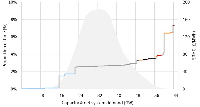
As a result, battery investment cases are being built on a ‘margin stacking’ model. This includes a base of more stable returns e.g. capacity payments, ancillary services & local site revenue. But merchant returns from wholesale and balancing markets are key to bridge the gap required to sign off a bankable project. An example of a margin stacking model in a UK battery project is shown in Chart 1.
Chart 1: Illustrative stacked margins required to support a transmission connected UK battery
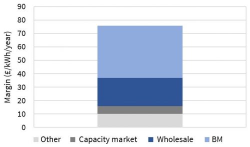
Source: Timera Energy
The chart shows projected annual average required returns by margin category to support investment in a transmission connected battery (measured in £/kW of capacity installed for a generic 1hr duration battery). The ‘Other’ category varies by project/site location but covers revenues from e.g. network services & positive transmission charges.
The highest returns on battery flexibility are achieved via ‘real time’ balancing markets e.g. in the UK the Balancing Mechanism and in Germany the primary reserve market. This is for the simple reason that price volatility is highest in these markets. Wholesale market and balancing returns typically make up more than 70% of required grid connected battery margin.
This focus on merchant returns leaves battery developers and investors with the key challenge of how to monetise battery flexibility value.
‘Myth 3’: Battery projects are bankable already
If you take current battery returns (e.g. in the UK or Germany) and map them onto current capital costs, it is very difficult to build a viable investment case. But investors are looking forward not down and there is a frenzy of activity in the battery space in 2019 in anticipation of an approaching tipping point.
This is supported by three strong tailwinds for battery economics:
- Declining capex costs: Battery cell costs are falling ~20% year on year and are projected to half again over the next 5 years. Cells typically represent about 50% of total project capex.
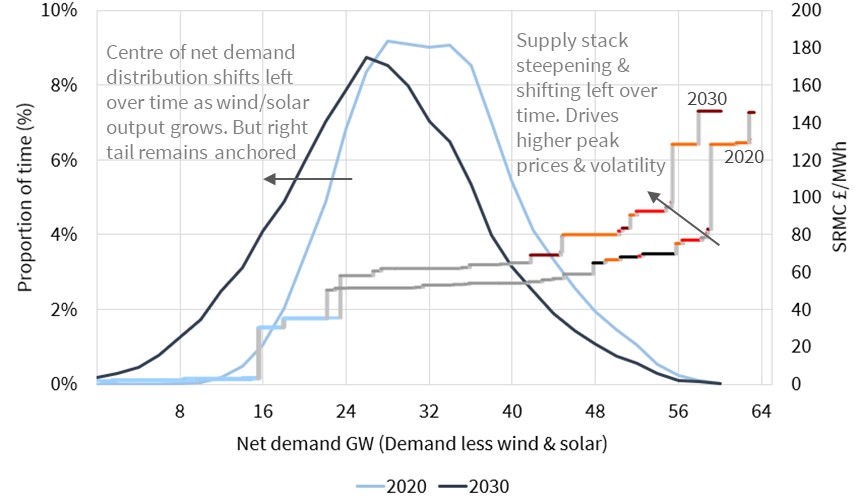
- Rising merchant returns: The last two years have seen weaker returns on flexibility (e.g. given capacity overhangs & warmer weather). But increasing intermittency and steepening supply stacks are key structural drivers supporting higher price shape & volatility into the 2020s, supporting rising battery margins.
- Policy changes: Policy makers, regulators and system operators are aware of the system benefits of batteries and are taking supportive action (e.g. via targeting removal of double charging for embedded batteries and sharpening balancing price signals).
There is no doubt that these tail winds will support the roll out of batteries at a substantial scale into the 2020s. The transformative nature of battery flexibility is no myth.
The challenge today is anticipating how the three factors above will combine to underpin the battery investment case and developing a viable business model to support this.