LNG induced gas price squeeze in South West Europe

It has again been a lively winter in the global LNG spot market.  Spot prices are following a pronounced seasonal shape as winter buying has driven Asian prices above the 20 $/mmbtu level.  What has been interesting this year is the level of competition from European buyers, particularly from Spain and Turkey, to secure flexible cargoes.  The knock on effect of Spanish LNG demand, has been a period of structural separation between gas prices in South West and North West Europe.

Spanish gas price linkage to spot LNG

The Iberian peninsula is relatively isolated from the rest of the European gas market.  Although interconnector upgrades are under development, there is a tight constraint on cross border capacity from Southern France into Spain.  In turn there is another key transmission constraint separating the PEG Sud and PEG Nord hubs within France (as we describe in more detail here).  So tightness in the Spanish gas market can drive quite pronounced price separation across the Spanish AOC, PEG Sud and Northern European (NBP/TTF/NCG) hub boundaries.

LNG supply rarely drives marginal hub pricing in Northern Europe (although one notable exception is the Mar/Apr 2013 price spike at NBP).  But the situation is different in Spain given the prominence of LNG as a supply source.  Spanish gas market prices (represented to some extent by the relatively illiquid AOC hub) tend to exist in one of three states:

  1. Oil on the margin: Whenever possible, the incumbent gas suppliers in Spain like to ‘manage’ portfolio supply (i.e. pipeline & LNG contracts) at the Spanish borders such that oil-indexed contracts drive marginal gas prices within Spain.  This is primarily because suppliers are selling gas to customers on an oil-indexed basis.
  2. NW European convergence: With increasing volumes of interconnection capacity to France and weakening Spanish gas demand over the last 5 years, NW European hub prices are increasingly influencing Spanish gas pricing.  This influence will only continue to expand as interconnection increases.
  3. Spot LNG on the margin: In periods when there is a more pronounced shortage of physical supply into Spain, pipeline contract imports & interconnector capacity can become constrained.   Spanish gas prices tend to rise to attract LNG supply as a result.  This is not necessarily to attract spot cargoes, but to choke off the diversion and reloading of Spanish LNG supply to other higher priced markets (e.g. in Asia and South America).

The impact of this third state (i.e. LNG spot influence) has been felt to some extent across the last three winters.  It has been particularly prominent this year given issues within the Spanish market.

The current Spanish price squeeze

A good way to visualise the impact of LNG prices on the Spanish gas market is to look at the evolution of a Spanish spot LNG benchmark.  Chart 1 shows a LNG spot price snapshot from the Reuters power and gas team, displaying the evolution of different Waterborne spot price benchmarks.

Chart 1: The evolution of Spanish vs key global spot LNG price benchmarks

Jan 14 LNG blowup

Source: Reuters

The Spanish spot price benchmark is shown in red.  Over the last three years, Spanish spot LNG prices have fluctuated between:

  • A lower bound of European hub price levels, broadly reflected by the blue (UK) and pink (Belgium) markers.
  • An upper bound of west Asian spot prices, e.g. the Indian marker in light blue.

During times of ample Spanish supply, e.g. Summer 2013, there is a broad convergence of Spanish prices with NW European hubs.  However during the last three winters, Spanish prices have risen to attract an adequate level of LNG flow into Spain, given competition from Asian and South American buyers.

There are a combination of factors this winter that have led to rising Spanish prices.  Lower renewable (wind & hydro) and nuclear output has provided an unexpected boost to gas-fired generation volumes.  In addition there have been significant Algerian production issues that have curtailed contract supply into Spain.

Despite the current winter tightness, spot LNG prices are unlikely to remain the dominant influence in the Spanish market for long.  As the current seasonal spate of competition for cargoes between Spanish, Turkish and Asian buyers dissipates, the pull of European hub prices will likely re-assert.  Over the last 5 years, Spain has suffered a pronounced erosion of gas demand from economic weakness and a fall in gas plant load factors.  Until these effects are reversed, periods of gas market tightness are likely to be temporary rather than structural.   And an expansion of cross border capacity with France will only strengthen the pull of European hub price convergence.

Transition from JCC Pricing in Asian LNG Markets

This week’s article is written by Howard Rogers, a Senior Advisor with Timera Energy and Director of Natural Gas Research at the Oxford Institute for Energy Studies.

The European transition to hub-based pricing is now well underway.  This raises the question as to whether Asian LNG markets will inevitably evolve away from their historic linkage to oil prices in long-term LNG contracts.  There is a level of discontent among Asian buyers that is supportive of a transition to an alternative pricing mechanism.  But it will likely take a bigger catalyst to pave the way towards Asian hub-based pricing.

Hub evolution in Europe

First let’s look at the three factors which conspired to change the European gas pricing landscape:

  1. Pro-competition policy and legislation  enabled third-party access to infrastructure, end-consumer supplier choice and the erosion of incumbent territorial domination. This created the framework in which traded hubs could develop.
  2. From 2009 a combination of plentiful new supply (LNG which the US did not require) at a time of reduced demand (because of the financial crisis and recession) created a significant spread between hub prices and oil indexed pipeline gas prices.
  3. The subsequent unsustainable financial exposure of the midstream utilities which required them to seek arbitration and negotiated price reductions in their long-term gas contracts. Now in NW Europe, long term contract prices are either explicitly hub indexed or are ‘adjusted’ to be equal to or very close to hub prices.

In the Asian LNG market there is the potential for the second and third of these factors to transpire, but a large question mark against the first. 

An Asian solution?

High Asian LNG prices (as a consequence of $100/bbl plus crude) have resulted in a chorus of complaints from Asian LNG buyers.  But there is no consensus as to whether the problem is one of ‘price level’ or ‘price formation’.  Continually adjusting price levels (by changing price formula variables) is one solution, but becomes somewhat futile if the underlying price formation mechanism no longer has any market logic.

If the problem is one of ‘price formation’ there are a number of alternative options.  The first is to re-assess the fuel mix in which gas competes, and derive a suitable multi-fuel price index.  The main problem here is the need to re-calibrate the index frequently as markets evolve and the fuel mix changes.  This approach also presumes the continuation of a structure in which oligopoly sellers interact with midstream incumbents.  The second approach is to use an existing spot LNG index such as the JKM.  At present this is quite volatile, possibly reflecting relatively low coverage of total Asian spot LNG trades.  Pricing based on Henry Hub currently has its attractions at current US – Asian price spreads, but may become more questionable if the oil price falls and US shale production, in time, disappoints expectations.

The last option in the list is an Asian trading hub price.  While this is probably the preferred option, achieving it (as is often the case) will require several challenges to be overcome. More on this later.  As was the case in continental Europe, market fundamentals play an important role in such pricing transitions.  So rather than discuss these possible changes in a ‘theoretical vacuum’ let’s look ahead over the next ten years.  Although subject to many uncertainties, there is a good possibility that the period 2018 to 2023 could be one of plentiful LNG supply, with consequences for major players but also offering favourable conditions for an Asian LNG hub to develop.

Could new LNG supply be the catalyst?

We have the co-incidence of significant US LNG export volumes coming at a time when Australia and other suppliers will also be bringing new projects on stream.  In part this will be aided by aggregator/portfolio players who are contracting US volumes with no fixed corresponding end-user contract. The big uncertainties are:

a)     Continuation of the robust US shale gas production performance; and

b)     Chinese future demand for gas and LNG.

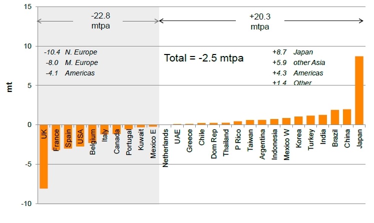
A key dynamic will be how Russia (supplying 25% of Europe’s gas) will respond to a potential overspill of LNG into Europe.  This could be in the form of a price war which would lower hub prices in Europe, the US and Asian spot prices, further increasing the incentive to move to an Asian LNG hub index.

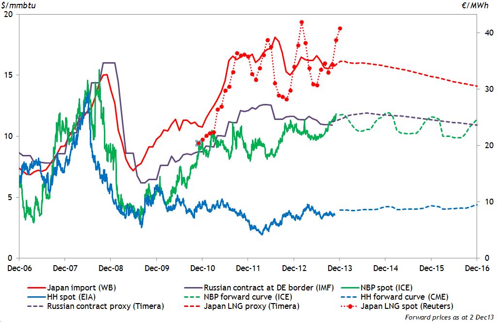
The major change over the last 12 months or so has been the scale of potential US LNG export projects moving through the approval process.  At a more sustainable Henry Hub price of $6/mmbtu it is feasible that these ‘re-gas re-configuration’ projects could remunerate incremental investment costs at European hub prices of around $10.50/mmbtu and Asian prices of around $12/mmbtu.  Some 85 bcma of LNG has received non-FTA approval from trains in six projects which have offtake agreements (or HOA’s) for 112 bcma.

Chart 1: US LNG Export Projects: Timing and Off-taker Type

US Export Projects

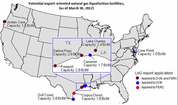
Sources: Company & Media Reports, Author’s Assumptions

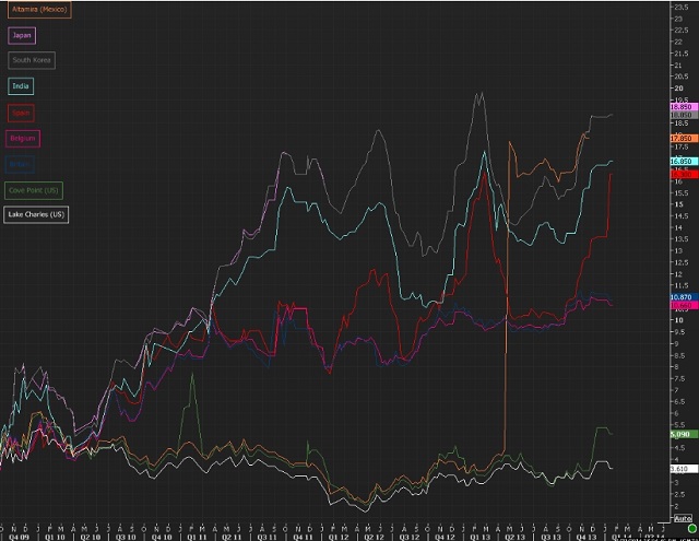
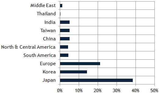
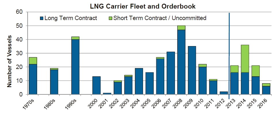
A breakdown of Asian LNG demand vs supply

The graph above shows that while Japan, South Korea and India have been active, the majority of these volumes have been secured by aggregators & portfolio players.  While Sabine Pass is likely to start up at end 2015/early 2016, capacity from these projects starts in earnest post 2018.

Chart 2: Asian LNG Importers – LNG Contract & Spot Demographics 2010 – 2025

Asian LNG by Country
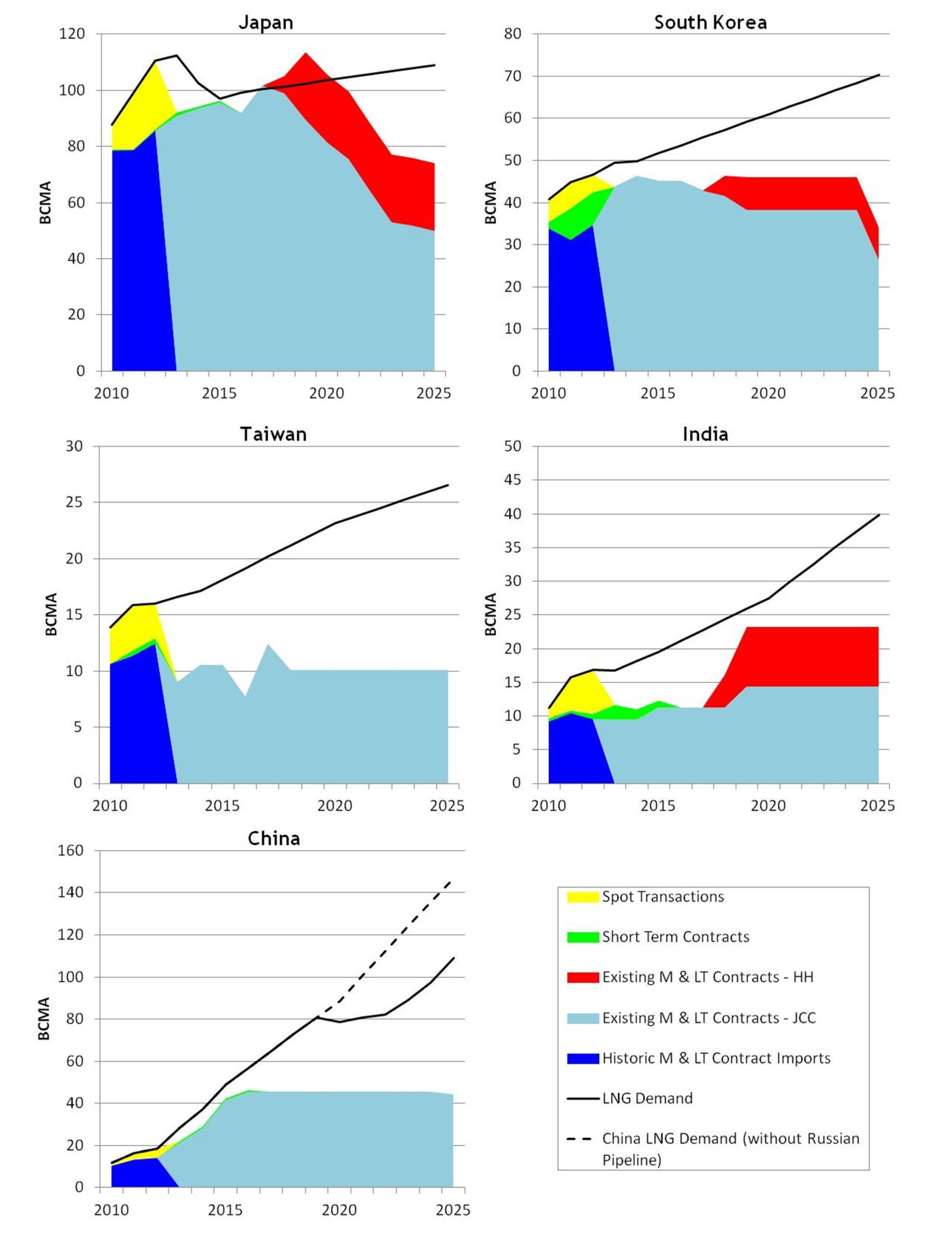
Source: GIIGNL, Author’s assumptions, D Ledesma OIES.

The above figure shows the illustrative LNG requirements of the 5 main Asian LNG importers.  LNG demand is the black line.  Long Term contract supplies are in blue (dark blue historic, light blue future supply from existing contracts).  Green represents supplies from existing short term (less than 4 year) contracts and yellow historic spot LNG supply.  The red represents volumes of US LNG from offtake agreements or Heads of Agreement signed by Asian buyers.  Note that these graphs exclude: future Spot LNG volumes from existing and new projects, US volumes secured by aggregators/portfolio players and long term contracts from projects which have net yet achieved FID.

In the case of Japan, once nuclear power plants have re-started, the existing portfolio of JCC contracts fulfils demand until 2018/2019.  The US volumes continue to satisfy demand until 2020/2021.  Unless Japan is able to materially renegotiate the terms of its existing LNG contract portfolio away from a JCC basis, it will not be able to change the price formation basis of its LNG imports until the end of this decade.  South Korea is in a similar position but has more room to introduce spot volumes and towards the end of the decade has flexibility to insist on a move away from JCC in order to change its portfolio price formation balance.

India’s future LNG requirements are uncertain for many reasons but GAIL has been active in securing US volumes.  Taiwan being a small market will probably continue to rely on spot LNG in the main.  China appears to have a requirement for supplies in addition to its current contracted portfolio from 2016 onwards.  It has not signed any agreements for US volumes but is active in both Canadian and East African ventures.  These however are unlikely to be onstream until 2020.

In the next figure we look at the aggregate position and add in the US volumes signed up by the ‘Aggregators/ portfolio players’ in grey.

Chart 3: Asian Future LNG – Contract, Spot and Price Formation

LNG Asian Combined

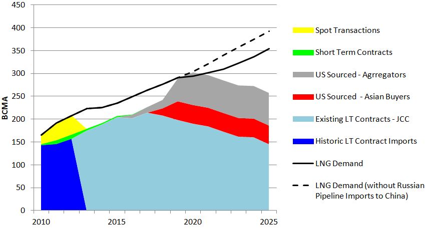
Source: GIIGNL, Author’s Assumptions

This suggests that, on the basis of the assumptions behind these projections, if all US volumes are directed to the Asian LNG market, in the 2018 – 2023 period there is little room available for spot LNG volumes from existing and new projects/suppliers and long term contracts from projects which have net yet achieved FID.  This is indicative of a potential period of oversupply during which Europe could receive an ‘overspill’ of excess LNG supply as it did during 2010 and 2011.  If these conditions transpire, they could be a key catalyst for a shift to Asian hub-based pricing. 

The path to an Asian LNG hub

We now return to the challenges of creating a hub in Asia.  Unlike North America and Europe, Asia lacks a major liberalised national pipeline gas market.  Even if one or more existed, geography would prevent an integrated regional market being created through pipeline interconnections.  As such, there is little prospect of a major regional traded gas hub, initially developed on the basis of pipeline gas supply, providing the platform on which LNG can be traded.  For Asia therefore, it makes more sense to anticipate a hub developing purely on the basis of LNG trading.

Singapore has made a start during 2013.  However even if all Asia’s spot LNG (40 bcma in 2012) flowed through a hub, that would only represent about 1.5 cargoes a day.  Given the distance between Singapore and the major Asian LNG markets it is probably that part-cargo trading is difficult on cost grounds.  Liquidity could improve if for example a substantial portion of the future grey aggregator volumes in the previous figure were to be sold on the Singapore hub.  What is more likely to succeed longer term is the establishment of hubs at say Tokyo and Shanghai, where part-cargoes could be traded.  This assumes however that buyers other than the midstream utilities (such as large industrials) are able to purchase part cargoes through enforced third party access at regas terminals.  Whether the willingness exists at a national policy level to instigate such changes is as yet unclear.

At present, based on research and thoughts to date, the following three scenarios for the Asian LNG Market are offered:

Scenario 1 – Contractual Impasse.  This is where we have been for the past year or so and are likely to remain for a year or so more.  Buyers continue to complain about JCC pricing but no changes can be agreed with sellers on existing contracts.  Buyers refuse to sign new long term contracts at prices linked to crude oil, producers refuse to sign on any other basis and so no new contracts are signed (apart for those where the supply is from the US).  US export growth increases spot trade but the Asian LNG sector overall stagnates.

Scenario 2 – Smooth Contractual Transition Scenario in which new long term contracts begin to be signed on an alternative basis to JCC with price review clauses anticipating a future Asian LNG hub.  There are challenges to existing contracts but re-negotiations result in adjustments which are tolerable to buyers and sellers.  Despite ongoing financial pain, Japanese buyers manage to ‘hang on’ until existing contract portfolios decline.  Spot trading increases and by the 2020s larger and more liquid hubs emerge in Tokyo and Shanghai and new long term contracts are signed on the basis of these prices.  This scenario has most chance of transpiring at oil prices below $100.

Scenario 3 – the Contractual Train Wreck Scenario.  Here Asian buyers’ losses (particularly those in Japan) become so serious that they demand re-negotiations on existing contracts.  These are resisted by suppliers who continue to demand JCC linked pricing.  Litigation is started with unpredictable results and large financial sums at stake.  No new long term contracts are signed during this period (apart from those based on US supply) but spot trading continues to increase and eventually liquid hubs emerge in Tokyo and Shanghai and new contracts are signed on the basis of hub price indices. This scenario is more likely at oil prices above $100/bbl.

Given the changes in importing market structure since the 1970’s, it is extremely difficult to make the case that JCC is still a rational basis for pricing Asian LNG.  It has created huge financial problems for Japanese buyers and threatens longer term competitiveness. While US exports contracted on a Henry Hub plus costs basis appear more attractive at present, this may not be the best reflection of global LNG supply and Asian market fundamentals in the longer term.  Over time, one or more Asian LNG trading hubs would establish more appropriate prices.  But there are significant challenges to achieving the necessary liquidity, requiring difficult choices and resolve on the part of buyers and policymakers.  Transitioning to this more enduring price formation basis while addressing the challenges of existing Long Term JCC contract portfolios could be a long and bumpy ride!

A more in depth look at the issues discussed in this article can be found in the OIES paper entitled Challenges to JCC Pricing in Asian LNG Markets penned by Howard Rogers and Jonathan Stern. 

Pricing dynamics in the new UK capacity market

Changes to the UK power market have been coming thick and fast this decade.  The implementation of a Capacity Market in November 2014 is just one of a growing list of market reforms.  But the Capacity Market is set to have a unique & structural impact on UK power market dynamics and asset values.  Replacing an energy only market with separate energy and capacity markets is quite a dish to swallow.

Two factors make the Capacity Market a big deal:

  1. It introduces a new revenue stream for UK power plant, in addition to the current wholesale market revenue stream
  2. It gives the government the ability to tightly control the level of capacity in the market

These factors will have a key impact on wholesale power prices and the return on generation assets.  From 2014 onwards, commercial and investment decisions will involve taking a view (either explicitly or implicitly) on the level and dynamics of pricing in the new Capacity Market.  In this article, the second in our series on the Capacity Market, we look at the drivers behind capacity pricing.

How will capacity prices be determined?

Up until late last year, a lack of detail on Capacity Market design from DECC (the Department of Energy and Climate Change), made it difficult to draw meaningful conclusions on capacity pricing.  That is starting to change.  There are still many design factors to be resolved before the first auction in November.  But there is now enough detail to start drawing some sensible conclusions on capacity pricing dynamics.

We start with a basic overview of the market mechanism that will set capacity prices.  If you are familiar with the capacity market design, you may want to skip ahead to the next section.

Capacity Market overview

Chart 1 shows a representation of supply and demand in the Capacity Market.

Chart 1: Capacity Market supply and demand curve

Capacity S&D curve

Source: Timera Energy

Demand

The capacity demand curve (illustrated by the blue line in Chart 1) will be derived by DECC and announced in advance of each auction (the first one is due to be published in June 2014).  It sets a price cap above which DECC considers it is not worth acquiring additional capacity.  The cap level is yet to be confirmed but is likely to be related to the estimated cost of building a new gas plant.

DECC’s demand curve will be downward sloping at prices below the cap to reflect an increasing appetite for capacity at lower prices.  However there will only be a 1.5 GW range above & below the target level.

Supply

The supply curve (illustrated by the dark red line in Chart 1) consists of bids from industry participants to provide incremental volumes of capacity at specified prices.  Unlike the demand curve, the composition of the supply curve is not visible in advance of the auction.  Instead it is partly revealed as the descending price auction uncovers which participants have successfully bid to acquire capacity rights.

Any capacity receiving another form of government support (e.g. RO, FiT/CfD, RHI) is excluded from the market, along with any capacity that chooses to opt out (e.g. retiring plant).  The remainder of capacity falls into two tranches:

  • Price setters: new or substantially refurbished capacity looking to recover major capex costs in 3 to 10 year capacity agreements, which can bid accordingly to set the capacity price.
  • Price takers: existing capacity that is not looking to recover major new capex costs and can bid for 1 year capacity agreements, but is restricted to bidding below a government determined threshold level (yet to be announced).

Clearing price

The rest is Economics 101, with the marginal bid setting the capacity price which is paid to all market participants.  The characteristics of the demand curve are relatively predictable.  It is known in advance of the auction and will likely retain a similar construction from one auction to the next (anchored by the 3 hours target LOLE and price cap). So the key uncertainty and complexity driving capacity pricing, comes from the cost structure and bidding behaviour of the market participants that make up the capacity supply curve.


Structure of the capacity supply curve

In order to understand capacity price levels it is important to have a grasp of the cost of providing incremental flexible capacity.  To the extent that the Capacity Market is competitive, pricing should broadly reflect the cost of providing incremental capacity (caveat the reality that there may be significant opportunities to exercise market power in setting market price).

There are a number of potential sources of incremental capacity, but the key ones likely to drive capacity pricing can be grouped as follows:

  1. Preventing existing gas & coal plant from closing
  2. Refurbishing existing gas & coal plant to enhance/extend lives
  3. Developing new OCGT or CCGT plant

Deriving the cost structure of the incremental sources of capacity is not simple.  The relevant benchmark for each source is the cost of capacity net of energy market returns (i.e. net of margin earned in wholesale power market).  But as plant owners bid into the auction this year, they will need to make an assumption on the impact of the Capacity Market on power prices and implied energy market returns in 2018/19.  Views on this may vary significantly.

In Chart 2 we show some estimated ranges of incremental capacity cost by source.  The ranges around each category reflect two factors.  Firstly, different cost estimates depending on asset/technology.  But secondly and more importantly, uncertainty around how plant owners will net off anticipated energy market returns when bidding into the Capacity Market.

Chart 2: Estimated net cost ranges for key capacity sources

Capacity cost benchmarks

Source: Timera Energy

Plant across all of these categories will compete to provide capacity, but the key question is which category will represent the marginal (price setting) source.  These plants will have the greatest influence in determining capacity price, as well as the greatest ability to exercise market power.

What type of plant will set the capacity price?

In order to understand which category of plant will set capacity prices it is important to understand how much incremental capacity will be required to meet the DECC target.  Of foremost importance is a snapshot of the projected capacity requirement, 4 years in advance of delivery.  This is because the main 4 year-ahead capacity auctions (e.g. in 2014) will be driven by the government’s forward estimates of capacity requirement (e.g. in 2018/19).  The capacity price will then be set in the auction based on the available capacity options to meet the target.

So considering the dynamics across the 3 main capacity categories:

Retaining existing plant

Paying existing CCGT and coal assets to remain in service requires at a minimum that plant fixed costs are covered.  So in a situation of capacity oversupply, plant fixed costs will be an important benchmark because the capacity price is likely to fall below these levels until older plants retire to redress the capacity balance.

Given the current conditions of capacity tightness in the UK, oversupply is unlikely to be an issue this decade.  But paying existing plant to remain open may have a key influence on the first capacity auction in November.  This is because DECC may allow loss making plant (e.g. many of the 90s built CCGT assets) to include in their capacity market bids, the losses suffered over the 4 year period prior to capacity delivery (i.e. 2014-18).  This may significantly inflate the cost structure around existing plant in the first auction (although this will be a one-off effect).

Plant refurbishment

As well as just delaying retirement, owners of existing CCGT assets can also make a more substantial investment in upgrading the plant.  DECC has indicated such refurbishment must involve investment over and above normal major maintenance capex (e.g. gas turbine refurbishment, CCGT to OCGT conversion or coal supercritical conversion).

The advantages of refurbishment for the owner are not just the enhanced asset, but the ability to lock in a capacity price over a longer duration contract (at least 3 years, maybe 5).  It also allows the asset owner ‘price setter’ rights in the auction.  Refurbishment may prove to be a fruitful source of incremental capacity.  This may act as an important buffer to prevent capacity prices from rising to support new build OCGT/CCGT capacity.

New build plant

DECC has, somewhat controversially, proposed to base the price cap on the cost of a large modern OCGT plant rather than the traditional market benchmark of a new CCGT plant.  DECC has published a gross cost estimate for an OCGT of 47 £/kW/yr, implying a net cost of 29 £/kW/yr (based on their courageous assumption of 18 £/kW/yr of OCGT energy margin).

This comes in substantially below DECC’s net cost estimates for a new CCGT which range up to 60 £/kW/yr.  While in theory, if it is only capacity that DECC wants to deliver, it may be logical to structure capacity pricing around OCGT assets.  But in practice OCGT investment has been ‘off the table’ for most UK market participants given the more favourable all in economics of CCGT assets.

The key interaction determining the cost of OCGT versus CCGT plant comes down to assumed energy market returns.  Because a new CCGT is significantly more efficient than an OCGT, it will earn higher energy market returns to offset its higher capital costs.  In fact it is difficult for an OCGT plant to earn any significant energy market returns in the UK given they must compete against a large volume of existing CCGT and coal assets, most of which are likely to have a variable cost advantage.

The first auction will reveal to what extent new OCGT actually play a role in setting capacity prices. But OCGT aside, there are a raft of potential new CCGT projects that will act to constrain upwards movement in capacity prices.

Marginal capacity pricing dynamics

The level of UK capacity prices will largely be determined  by which of the three categories of plant sets the price.  Given current capacity tightness, the market is likely to clear significantly above the fixed costs of CCGT (10-20 £/kW/yr).  In other words existing CCGT plant are set to earn substantial margins in the CM.

But in our view it is unlikely that capacity prices in the first auction will rise to levels that support OCGT/CCGT new entry (e.g. 60+ £/kW/yr).  That is unless the government sets a very aggressive capacity target and/or disadvantages existing coal plant (causing it to retire early).  Instead there looks to be a fairly comprehensive range of plant life extension/enhancement options that can bring forward the incremental capacity required.  The capacity supply curve is however likely to be lumpy which may mean sub-groupings of plant have considerable opportunities to exercise market power in setting price (e.g. by bidding up towards a level that supports OCGT/CCGT new entry).

Whichever category of plant sets marginal capacity pricing in November, capacity is likely to price at a level that places downward pressure on wholesale power prices in 2018/19.  In other words UK power market returns are going to undergo a rapid and structural change.  We consider the implications of this for portfolio managers and asset investors in our next and final article in this series.

We offer bespoke workshops on the commercial implications of the Capacity Market. These can be tailored to address issues such as business impact, asset strategy and market pricing dynamics. If you are interested please contact us.

GasTerra storage auctions & flexibility value implications

Twice a year GasTerra auctions Dutch storage capacity.  The price the market is willing to pay for this capacity provides a useful insight into the value of flexibility in the NW European gas market.   And the evolution of capacity value since the first auction in 2011 tells an important story of the shift in the focus of storage value from seasonal flexibility to shorter term deliverability.

How has the value of storage capacity evolved?

The two key market price signals that drive gas storage capacity value are seasonal price spreads and prompt volatility.   So it is no surprise that the price outcomes of the GasTerra auctions have mirrored the steady decline in seasonal spreads and spot volatility over the last three years.  Chart 1 shows the history of auction results, including 3 auctions where market bids failed to clear above the capacity reserve price.

Chart 1: Historic GasTerra virtual storage auction prices

chart 1

The GasTerra capacity product or Standard Bundled Unit (SBU) is seasonal in configuration, taking approximately 180 days to fill.  That means its value has been falling in close relationship to the decline in seasonal spreads.  But with the TTF winter/summer spread hovering around an anaemic level of 1 €/MWh, the value dynamics of the GasTerra SBU are changing.  In order to better understand this we look at the November 2013 auction result in some more detail.

The evolving value of storage capacity

In order to interpret the Nov 13 auction result we need to model an expected value for the GasTerra SBU at the time of the auction.  We can model this using the Timera Energy gas storage modelling suite along with the prevailing forward market seasonal price spread (1.2 €/MWh) and an estimate of spot gas price volatility (40%).  For this exercise we apply a stochastic dynamic programming approach to value the SBU (consistent with that commonly used by trading functions in energy companies).  Chart 2 shows the results.

Chart 2: Comparison of Nov 13 auction result against expected value

chart 2

Although the GasTerra SBU is configured towards extracting value from seasonal spreads, it is interesting to note the relatively high proportion of extrinsic value.  As spreads have collapsed the focus of monetising capacity shifts to capturing value from the flexibility to respond to market volatility.  Under these conditions, the value from shorter term price spikes becomes an increasingly important source of value for seasonal storage.

The impact of falling seasonal spreads has a knock-on effect, increasing the level of competition for short term deliverability, which in turn suppresses spot volatility.  In other words optimised seasonal storage capacity is competing more directly against fast cycle capacity to capture the returns from spot volatility.

Chart 2 also illustrates the relationship between the modelled expected value of capacity and the value the market is prepared to pay.  There is typically a discount of market value to expected value, reflecting the costs and risks associated with monetising capacity (e.g. hedging transactions costs, risk capital costs).  See here for a more detailed explanation of this.  The analysis in Chart 2 suggests that the market is willing to pay for about 70% of extrinsic value (assuming spot volatility at 40%).

Looking to storage deltas for further insights

To understand more about the evolving dynamics of storage it is useful to look at the monthly capacity deltas.  Deltas represent the sensitivity of storage capacity value to a price change in a given period.   Another useful analogy (which is not entirely mathematically correct) is that delta reflects the probability that the storage option will be exercised (via injecting or withdrawing) in a given period.

Chart 3 illustrates the GasTerra SBU deltas as modelled at the time of the Nov 13 auction, with the monthly ICE TTF futures curve overlaid.

Chart 3: Estimated GasTerra SBU delta weighted position on Nov 13 auction date

chart 3


Calculating storage option deltas (skip ahead if you are allergic to technical detail…)

Storage option deltas are complex to calculate and interpret due to the time dependent nature of the optionality.  The complexity of storage valuation models means that it is not possible to calculate deltas analytically (i.e. as a direct outcome of the model).

Instead a typical approach is to use the expected or average injection and withdrawal utilisation profile as a proxy for the delta weighted position.  This is generally a reasonable approximation but a more theoretically correct method is to calculate the deltas numerically.  This is done by shifting the price for a given period up and down by a small amount and recalculating the storage value for each case and measuring the change in option value as a function of price.  The advantage of this technique is that it can be applied to all valuation models but the key disadvantage is that it requires multiple complex calculations which may lead to performance issues.

Traders and risk managers place a high value on accurate option deltas as they provide valuable information as to the exposures arising from the capacity.  They can be combined with delta positions arising from other exposures (e.g. hedges) to give an aggregated view of portfolio exposures.  Traders use deltas to identify exposures and inform hedging decisions (e.g. delta hedging) and risk managers use them as exposure inputs into risk models.


The deltas from the Nov 13 auction are relatively flat across the injection and withdrawal periods.  This is a direct result of low seasonal spreads and provides another view on the shift away from intrinsic to extrinsic value.  If the seasonal spread was higher, there would be a stronger incentive to move gas from the lowest to highest price periods.   In this case the deltas in the optimal injection and withdrawal periods would be much closer to their maximum levels (shown by the grey outlines in the chart), with an equivalent reduction in the deltas of other periods.  In other words, the deltas give a direct signal of the likelihood of injecting or withdrawing in a given period.

Implications for storage asset owners                                                 

The last three years have been tough for storage owners as seasonal spreads and volatility have sunk.  But there are steps that can be taken to combat adverse market conditions.  Asset value can be defended without giving away upside from a market recovery.   But this means being flexible and adaptive in defining a capacity sales strategy.  As a simple example, GasTerra has started offering a 5 year product indexed to the Summer vs Q1 price spread, i.e. they retain the underlying spread exposure on capacity sold.

Product re-configuration is another key measure.  As the market evolves, so does the value of different combinations of injection, withdrawal and space.  By understanding the marginal value of each of these components, owners can construct new products or tariff structures that maximise the value of capacity sales.  This is being recognised in the increasing number of non-standard product types that are being marketed as complementary offerings to the traditional SBUs.

Early warning signs of an emerging markets problem?

In our last article of 2013 we posed a question around the vulnerability of energy markets to an economic shock.  We specifically considered the case of fallout from the current unprecedented global experiment in monetary expansion.  By the end of January 2014 it looks like there could be a potential candidate to test our hypothesis in the form of a shock to emerging market economies.  There is certainly not yet any conclusive evidence of a crisis.  But some warning signals have been flashing amber as January has progressed.  We illustrate these in this article with the use of several charts.

Emerging economy linkage to energy markets

We have been keeping a close eye on China as a key theme of this blog.  This is primarily because the state of Chinese economic growth is a useful barometer for the strength of commodity markets, given the key role China plays in driving global commodity demand growth.  While we are fully bought into the long run story around the emergence of China, it seems to us there is a growing risk of a shorter term hiccup.  There are currently a lot of somewhat unimaginative projections of Chinese growth that extrapolate recent history for ever.

But China is not the only developing economy that has an important influence on commodity markets.  India is the world’s second largest importer of coal and could potentially surpass China in the next 5 years.  India has also just overtaken Japan as the world’s 3rd largest importer of crude oil.

Closer to Europe, Turkey’s growing demand for energy has an important influence on coal and LNG markets.  Turkish demand for spot LNG over the current winter has been a factor behind soaring global spot prices.  In fact energy costs are the principle driver behind the eye-opening $60bn Turkish current account deficit that has been making headlines as the Turkish Lira has fallen over the last month.

Some warning signals flashing amber

In order to examine the impact of events in emerging economies it is useful to look at several charts.  Chart 1 shows the evolution of the USD against several key emerging market currencies (i.e. a rising line on the chart means a falling currency against the USD).

Chart 1: Emerging economy currencies in downtrend

EM currencies

While it has been the Turkish lira that has dominated recent headlines, there has been a pronounced downward trend in a range of emerging market currencies over the last 6 to 12 months.  The US Federal Reserve announcement of its plans to ‘taper’ monetary expansion (or Quantitative Easing) in mid 2013 has been a key driver.  As QE is unwound, foreign capital that has been chasing higher returns in emerging economies is returning to the relative safety of the developed world.

Chart 2 shows China’s manufacturing sector, measured by the Purchasing Managers Index (PMI), returning to contraction in January.  This appears to be signalling an end to the brief recovery in the second half of 2013 and may indicate weakening Chinese commodity demand in 2014.

Chart 2: Chinese manufacturing contracting again

China PMI

(source HSBC, Zero Hedge)

The Baltic Dry Shipping Index is a also useful indicator of global economic activity and trade flows.  Its sharp decline in January, shown in Chart 3 below, is another warning signal to watch.

Chart 3: Baltic Dry shipping index

BDI chart

 (source Stockcharts.com)

One of the key implications of a shock to emerging economies is its potential impact on the level of coal prices.  Chart 4, courtesy of the Reuters power and gas team, shows the API2 (European benchmark) year-ahead futures contract languishing around the key 80 $/t support level.  Continued weakness in coal prices is an important factor supporting the competitiveness of coal vs gas plant in European power market supply stacks.  It is also offsetting the effects of the recent uptick in EUA carbon prices.

Chart 4: European coal futures in decline

coal API2

 (source Reuters)

Beyond the nearer term horizon, weakness in emerging economies could also have an important impact on the LNG market.  Projected LNG demand growth is heavily skewed towards emerging economies (e.g. China, India, Argentina, Turkey) and a shock to growth would flow through to energy demand.  A more prolonged set back for emerging markets could leave a material dent in global gas demand projections over the remainder of the decade.

The charts set out above, illustrate some useful indicators to keep an eye on.  The current warning signals may of course recede again.  The global economy has managed to navigate past a number of icebergs over the past 5 years, assisted by further bursts of monetary expansion.   But if the current warning signals were to evolve into a more serious set back for emerging markets (e.g. similar to the crisis of the late 90s), then this would likely have an important impact on energy pricing and demand.

UK Capacity Market to become a reality in 2014

2014 will mark the end of the energy only power market that has served the UK over the past two decades.  By the end of this year the energy market will co-exist with a Capacity Market.  The UK government has announced that it will stick to its aggressive implementation timetable.  So barring any embarrassing delay, the first capacity auction will take place in November.

This auction will target the delivery of capacity in the winter of 2018/19.  But the impact of the Capacity Market will be felt long before the end of the decade.  The outcome of the 2014 auction will be a key driver of decisions to build, mothball or close gas & coal fired capacity over the interim period.  This will have important implications for the system capacity margin and pricing in the wholesale energy market.

Implementation of the Capacity Market will fundamentally transform UK pricing dynamics and generation returns.  It is also likely to be the blueprint for similar capacity markets across Europe.   This is the first article in a series where we will address the structure, pricing dynamics and value/risk impact of the new Capacity Market.


UK Capacity Market 101

If you had recently returned to the UK power market after having been lucky enough to take a 5 year holiday, you would probably be in need of a stiff drink.  Unfortunately whisky would do little to help you understand the government’s Electricity Market Reform (EMR) package.  In fact anyone claiming to be able to enlighten you as to the workings and implications of EMR is likely to be dangerously removed from reality.

Even for those of us who have endured 5 years of Electricity Market Reform, the Capacity Market is a special challenge.  It is essentially a correctional policy mechanism, attempting to compensate for the market distortions introduced by the other EMR policies.  As a result the design is complex and it is still evolving.  But we start by setting out a brief outline of the key elements announced to date, illustrated in diagram 1.

Diagram 1: Capacity Market elements & timeline into first delivery

Cap Market Timeline

Amount of capacity

A reliability standard will be used to determine the target system capacity level.  This standard will be based on what the government deems to be an acceptable loss of load expectation (or LOLE).   The government has said it intends to set this at 3 hours per year (i.e. a system security level of 99.966%).

Guided by the reliability standard, National Grid as the System Operator will then undertake analysis to determine the volume (GW) of capacity required to meet this standard in each year.  This volume will then set the target level for capacity auctions.

Participation

Capacity covered under other policy support mechanisms (e.g. FiT/CfD, RO, RHI) will not be eligible to participate in the Capacity Market.  In practice this means the exclusion of most low carbon generation capacity, although Grid will of course still include this capacity in calculating the target system capacity level.  Interconnection capacity will also initially be excluded, although with a view to later inclusion.

So Capacity Market participation will primarily be focused on new & existing gas plant, and existing coal plant.  While in principle it is a voluntary market, generators will be strongly incentivised to participate.  But existing assets have the option to retire rather than participate (e.g. at asset end of life).  Demand side response and power storage assets will also be able to participate.

Auctions

The primary capacity auction will be held 4 years ahead of each delivery year.  This is intended to allow the necessary lead time to develop new plant if successful in the auction.  The government has said it also intends to hold a secondary auction at the year ahead stage with a view to ‘refining’ the capacity balance if required.  The auction process will follow a descending clock format.  Auctions will be ‘pay as clear’, i.e. all participants will receive the clearing price of the marginal bidder.

The government has said the Capacity Market will consist of 3 key forms of capacity agreement:

  1. 10 year contracts to support new generation assets
  2. Up to 3 year contracts to support major refurbishment of existing assets
  3. 1 year contracts for existing generators

Importantly, only capacity providers that incur costs above a certain threshold (primarily 1 and 2 above) will have ‘price maker’ status, i.e. be allowed to bid freely to set the capacity price.  Bidding will however be constrained based on a government measure of the cost of new entry, with a view to protecting the consumer.  Existing plant will participate as ‘price takers’ unless they can demonstrate costs incurred above a predetermined threshold (e.g. there may be a case for CCGT which are currently making a loss to recover costs that would otherwise have caused the plant to close by 2018).

We will consider capacity pricing drivers and benchmarks in more detail in our next article.

Trading

In principle the government intends to facilitate the secondary trading of capacity rights between auction and delivery.  However this is likely to be restricted until the year-ahead of delivery.  This element of the market design looks to be dosed with a healthy measure of academic fantasy.  From the current CM design, it looks unlikely that capacity rights will be ‘commoditised’ to the point required to support significant volumes of secondary trading.

Delivery & payment

In the delivery year, Grid will manage periods of system stress via Capacity Market warnings.  These will be issued 4 hours in advance of the requirement to deliver electricity.  Holders of capacity agreements will be obliged to be available and ready to deliver a specified quantity of electricity when called upon in order to avoid financial penalties.  The penalty structure is still under development but will likely be quite punitive, although with a mechanism to cap generator exposures.  Grid will also have the ability to carry out spot checks on capacity delivery capability outside periods of system stress.

And the cost burden of this complex exercise?  That of course sits with the end consumer and is likely to be smeared across suppliers based on contribution to peak demand.


Some key considerations for market participants

It is easy to get bogged down in the complexity of the market design.  But with a basic understanding of the concepts it is possible to start to draw some conclusions on the commercial impact of the Capacity Market.  We address a few of the more obvious considerations at a summary level below, before returning to explore these in more detail in our subsequent articles.

What will determine the capacity price?

The key factors driving capacity price in any delivery year will be (i) the projected requirement for incremental capacity and (ii) the cost of providing that incremental capacity.  During periods where a capacity shortage is anticipated against the system target, participants will compete to provide incremental capacity.  So the costs of CCGT refurbishment and of CCGT/OCGT new build will be key pricing benchmarks.  During periods of adequate capacity margin, the capacity price is likely to be driven more by fixed cost recovery on existing assets.

While cost benchmarks will be important, the limited number of participants and complexity of market design will ensure that market power will also play a key role.  We come back to capacity pricing as the key focus of our next article.

What are the implications for generation returns?

Historically, returns on conventional UK generation assets have been firmly focused on the wholesale energy market, with top-ups from participation in the balancing market and provision of balancing services.  That is set to change significantly.  Going forward this focus will expand to cover 3 buckets of generation margin: energy market, capacity market and balancing/ancillary services (which are likely to become an increasingly important source of gross margin).

Generation margin will shift between these buckets depending on factors such as system capacity, relative fuel pricing and plant type & location.  While in principle capacity payments represent a more stable source of income than wholesale energy margin, the Capacity Market will carry an unwelcome exposure to regulatory risk and the potential for market manipulation.  So a key challenge for generators will be to anticipate and manage the value & risk that accrues across these 3 margin buckets.

What are the implications for wholesale energy prices?

The commercial decisions of asset owners and investors will increasingly be driven by the return across all 3 buckets of generation margin.  So there will be a key dependency between capacity pricing and wholesale energy pricing.  A higher generation recovery from the Capacity Market will under normal circumstances adversely impact wholesale power prices (and vice versa).

Variable generation cost (i.e. fuel, carbon, VOM) will remain the key driver of power prices.  But the extent to which wholesale prices rise above variable cost will depend on capacity pricing and generator ability to exercise market power during periods of system tightness.  The volume of capacity targeted by Grid via the capacity auctions will also be a key factor determining the extent to which power prices rise above variable cost.

What happens between now and 2018?

Despite trying to ram through the Capacity Market implementation by November this year, the government still faces several nervous years before it delivers any capacity.  Any recovery in demand or further closure of existing CCGTs may bring on major system stress prior to 2018.  As a result, the government is in the process of implementing Supplemental Balancing Service payments which give Grid the freedom to contract capacity in advance of 2018.

This means the ancillary/balancing services generation margin bucket may play an increasingly important role.  Existing gas and coal plant (particularly older assets close to retirement) may have significant leverage in negotiating reserve contracts with Grid as the system capacity margin tightens. 

The way forward to the first auction

It would appear to be ten minutes to midnight on an implementation timeline for such a complex policy mechanism.  But there are still a number of key areas of contention that are emerging from the industry consultation process.  As a result there has to be a meaningful risk of delayed implementation or a disorderly first auction.

Perhaps the greatest focus is on the structure of capacity contracts and the constraints around capacity pricing.  For example, generators are lobbying strongly for longer contracts to support both new build and life extensions.  The supporting arguments revolve around increasing bankability and reducing the cost of capital.  There is also contention around use of an OCGT asset as the basis for new entry cost to set bidding thresholds.  While there is a theoretical link between OCGTs and capacity cost, it is the cost structure of CCGT assets that dominates the UK capacity options.

Many of these unresolved issues are quite fundamental to the structure of the market.  But it is still possible to draw some sensible conclusions on Capacity Market implications.  For example on the pricing of capacity, impact on generation returns and implications for asset investment.  As the clock ticks down to the first auction, we will explore these issues in more detail over several subsequent articles.

We offer bespoke workshops on the commercial implications of the Capacity Market. These can be tailored to address issues such as business impact, asset strategy and market pricing dynamics. If you are interested please contact us.

Conventional power plant value analysis has evolved

The value of European gas and coal fired power plants is a very different proposition to what it was 5 years ago.  Growth in renewable output has eroded plant load factors and increased margin variability. Correspondingly, there has been a significant increase in the proportion of value driven by plant flexibility to respond to changes in market conditions.

Historically, conventional power plants have been built or bought based on relatively simple scenario analysis.  Plant value has been assessed against Base, High and Low price forecasts to give an indication of the potential range of value outcomes.  But changing conventional plant value dynamics have meant this approach has become largely obsolete.

Instead plant value analysis is evolving to better address market uncertainty, margin variability and the value of plant flexibility.  Defining the key drivers of plant value and risk over different time horizons is key to this evolution. This means applying more sophisticated analytical methodologies, in contrast to the more one dimensional scenario focus that has traditionally been applied.  But an increase in sophistication does not need to come at the cost of transparency.

Breaking the problem into bite sized pieces

It is useful to think of plant value over three key time horizons:

  1. Prompt dispatch: the short term horizon (e.g. < 1 week) over which the plant is optimised in the prompt forward and balancing markets, as price certainty and granularity increases (e.g. with clearer information on weather, load and availability).
  2. Forward curve: the medium term horizon (e.g. 1-2 years) over which forward curve liquidity is available to facilitate hedging of plant generation margin.
  3. Lifetime value: the plant lifetime horizon (e.g. 10-20 years) which drives asset investment decisions (e.g. asset development, sale/purchase, major capex spend).   

The boundaries between these horizons are a bit arbitrary, but what is important is the shift in focus on drivers of plant value and risk.  For simplicity, value and risk drivers can be grouped into 3 categories:

  1. Plant technical constraints: These are the physical characteristics of the plant that impact its ability to capture market value, e.g. ramp rates, efficiency curves, minimum down times and start costs.
  2. Spread levels: The structural market price conditions that drive ‘intrinsic’ plant margin as measured against projected future spark or dark spreads (i.e. the generation margin implied by the premium of power prices over the cost of fuel and carbon).
  3. Spread dynamics: The volatility and correlation of power, fuel & carbon prices that drive generation margin risk and the value of plant flexibility.

Breaking the problem down by time horizons and value/risk drivers, allows a more targeted approach to plant analysis as illustrated in Diagram 1 below.  The top table shows a ‘heat map’ of the drivers of value/risk over different time horizons.  Analysis can be targeted accordingly as shown in the blue boxes below the table, which we explain in more detail in the following paragraph.

Diagram 1: Analysing conventional power plant value

Thermal Plant Analytics

Source: Timera Energy          

Targetted value analysis

Generation asset owners often split responsibility for managing power plant value based on time horizon.  An asset portfolio or investment management team are typically responsible for managing plant value over the asset lifetime horizon.  While responsibility for value management over the prompt/hedging horizon is usually handed to a trading function (either internally or via contract).

This division of responsibilities is logical from an organisational perspective, but it is important that value is consistently measured and analysed across time horizons.  It may be difficult to hedge plant value in 5 years time, given an absence of liquid forward contracts.  But value over the lifetime horizon will eventually be monetised via hedging and dispatch optimisation decisions as the dispatch period approaches.  A common flaw in the analysis of asset value over a lifetime horizon is to ignore the practical implications of how value will be monetised via hedging and optimisation decisions.

While a consistent analytical approach is important across all value horizons, it makes sense to target the focus of analysis by time horizon as described below.

Dispatch horizon

Over the intra day to week ahead period ahead of dispatch, the focus of analysis is on plant optimisation to manage near term value and balancing risk. Plant technical constraints such as ramp rates are key.  Value analysis is about understanding the interaction of these constraints with transparent and granular prompt forward and balancing prices.  Understanding value uncertainty is less important than accurately capturing optimal dispatch decisions.  It is typically plant scheduling and operational trading teams that are most interested in value over this short term horizon.

Forward curve horizon

Beyond the dispatch horizon, value uncertainty becomes a much more important focus.  The focus of analysis is on hedging to capture value against a set of volatile forward power, gas and carbon prices.  Plant intrinsic value can be measured against forward prices relatively easily. But in an environment of weaker spreads some form of simulation based (or stochastic) modelling methodology is required to understand:

  • The value of plant flexibility to respond to changes in market price
  • The risk impact of price uncertainty on plant margin variability

A simulated distribution of plant margin can be used to inform value management decisions, e.g. understanding the value/risk impact of incremental hedging decisions.  Analysis of value over this horizon is typically of interest to trading desks as they hedge asset exposures.  But it is also important for asset managers in understanding how hedging decisions impact plant value and risk.

Lifetime value horizon

Asset managers and investors are typically most focused on quantifying and managing power plant value over a lifetime horizon.  Value uncertainty is significantly higher beyond the forward curve horizon.  Asset values are subject to major shifts in factors such as gas vs coal pricing, capacity margin evolution and regulatory landscape. Anyone tempted to rely on price forecasts to analyse plant value should compare forecasts from 5 years ago with the reality of today.  Targeting value analysis to recognise market uncertainty should be the key focus over an asset lifetime horizon.

The best way to achieve this is to use as many benchmarks as possible to bound potential plant value. For example:

  • Forward curve simulation: understanding what an extension of current forward market pricing would mean for plant value.
  • Scenario definition and simulation: projecting credible downside or recovery spread scenarios driven off required levels of asset remuneration (e.g. fixed cost recovery or life extension of marginal generation asset class), and then simulating potential margin distributions around these.
  • Implied value: using price data from (i) recent power plant transactions or (ii) indicative tolling contract pricing quotes to ‘back out’ market implied generation asset value.
  • Historical value: Analysing plant value capture over an historical horizon that captures different market conditions (this is an important way to benchmark the actual plant value that can be monetised versus theoretical modelled value).
  • Replacement value: Understanding the level of spreads that are consistent with the market delivering incremental generation capacity.  This is not just a simple analysis of new build cost (LRMC).   Given policy supported growth in renewable capacity, replacement cost is now more focused on cheaper sources of incremental flexible capacity (e.g. plant life extensions or flexibility enhancements).

All of these benchmarks can be translated into a view on the long run evolution of market spreads and generation margins.  But it is important to overlay simulation based analysis to capture plant extrinsic value, particularly as renewable output continues to erode conventional plant load factors.  In our view, a simulation based plant dispatch optimisation modelling approach is key to the consistent analysis of value across all three time horizons.

Using analysis to manage plant value

The analytical approaches described above are about gaining a better understanding of the behaviour of plant value and risk given market uncertainty.  Targeting analysis to the drivers of value & risk over different time horizons maximises the benefit of analysis to inform commercial decision making.

This may be decisions to invest in (or divest) assets.  Or it may be decisions on enhancing the value of an existing asset, e.g. investing to increase plant flexibility or understanding the maintenance/cost impact of changing operational patterns.  Simple scenario analysis no longer does justice to understanding the value of conventional power assets.  But by using targeted simulation based analysis and multiple value benchmarks, plant owners and investors are able to confront the impact of market uncertainty.

Steam coming out of the LNG shipping market

With rapid growth in the trading of spot and short term LNG cargoes, fluctuations in spot shipping charter rates are having an increasingly important impact on the pricing and flow of LNG.  The LNG shipping market has evolved rapidly over the last decade, driven by growth in global liquefaction capacity.  But the order and delivery of LNG vessels has been quite cyclical in nature.

Shipping charter rates are the largest component of the cost of moving LNG around the globe.  Break even charter rates are estimated to be around 60,000 $/day.  But recent years have seen some wild swings in spot charter rates above and below this level.

Charter rates fell as low as 25,000 $/day at the depth of the financial crisis before recovering to 160,000 $/day post-Fukushima.  Spot charter rates are currently around 90,000 $/day, but a surge in delivery of new vessels in 2013 and 2014 could again tip the LNG shipping market into a period of oversupply.

LNG shipping – the basics

The fleet

The global LNG fleet consists of around 380 vessels.  The standard size for an LNG carrier has traditionally been 155,000 mcm.  However over the last 3 to 4 years the size of many delivered carriers has increased to 170,000 mcm as infrastructure has evolved to deal with larger vessels.

For the Qataris, size is everything.  They have developed their own fleet of Q-Max carriers with a capacity of 267,000 mcm.  Liquefaction terminals in Qatar are specifically designed to cater for these large carriers, with the benefit of size being lower energy requirements (~40%) given economies of scale with engine efficiency.

The fundamental drivers

Historically, source to destination LNG contracts backed by dedicated shipping capacity made the forecasting of shipping capacity requirements relatively straight forward.  However over the last decade, the evolution of LNG portfolio optimisation and growth in trading of spot cargoes has resulted in shipping market dynamics becoming much more complex.

Despite this complexity, demand for LNG shipping capacity can be broken down into two main drivers:

  1. The volume of LNG to be shipped.  Higher LNG demand means higher demand for shipping capacity.
  2. Average journey time and the proportion of ballasted (un-laden) voyages.  These factors are a function of the pattern of LNG trade flows, with longer average voyages and a higher proportion of ballasted voyages requiring more shipping capacity to move a given volume of LNG.

In other words, understanding LNG trade flows as well as global LNG demand growth is important in understanding tightness in LNG shipping capacity.

LNG shipping flows

The shipping of LNG is focused on moving gas from producing nations to Asia. Key shipping routes include the Middle East to Asia, Australasia and South East Asia to Northern Asia and Africa to Southern Europe as illustrated in the schematic in Diagram 1.

Diagram 1: Global LNG trade flows 2012 (GIIGNL)

LNG flow                         

Since the Fukushima crisis, shipments to Asia have been bolstered by the diversion of gas originally intended for Europe.  This has had the effect of increasing both average voyage times and ballasted voyages, supporting the demand for LNG shipping capacity.  Diagram 2 shows 2012 LNG shipping flows by destination, with Diagram 3 illustrating how incremental flows have shifted with the diversion of European gas to Asia.

Diagram 2: Global LNG flow by destination in 2012

flow by destination

Source: GIIGNL, Timera Energy

Diagram 3: Incremental changes in LNG demand in 2012

2012 inc demand

Source: BG Group

The shipping outlook

Historically, the delivery of new LNG carriers has been somewhat out of sync with LNG market demand for shipping capacity.  The primary issue is that there is typically a 2 to 3 year lead time for ship delivery.  The cyclical nature of ship delivery is illustrated in Diagram 4.

Diagram 4: LNG carrier fleet & order book

LNG fleet order book

Source: Clarksons, Teekay

This cyclicality has resulted in some pronounced fluctuations in shipping market balance, with the impact on spot charter rates illustrated in Diagram 5.

Diagram 5: LNG spot charter rates

charter rates 2

Source: Fearnleys Research, Jefferies

  • 2009-10 glut: A large volume of new carriers were delivered between 2007-09.  This in part matched rapid growth in liquefaction capacity but it also coincided with the onset of the financial crisis and a rise in US gas self sufficiency.  A shipping glut ensued with spot charter rates ranging from $25,000-$60,000 a day.  The glut also negatively impacted orders for new vessels.
  • 2011-12 boom: Post-Fukushima Asian demand caused a sharp reversal in shipping returns.  Not only was there a rapid increase in spot demand from Japanese buyers, but average voyage mileage increased as gas was diverted from all over the world to meet the Asian shortfall.  A lack of new shipping capacity also contributed to market tightness.  Between Q2 2011 and Q2 2012, spot charter rates almost tripled from around $60,000 to upwards of $160,000.
  • 2014-15 glut?: Spot charter rates in 2013 settled around 90,000 $/day.  However 2014 may mark the start of the next glut in LNG shipping capacity.  Diagram 4 illustrates the substantial order book of LNG carriers to be delivered over the 2013-15 horizon.  These ships will be entering the market during a period when there is little growth in new liquefaction capacity to absorb new shipping capacity.  The capacity surplus is likely to continue until at least 2016, as shown in Diagram 6, when volume ramps up from new Australian liquefaction and US export projects.

Diagram 6: Projected LNG carrier supply/demand balance

supply demand balance

Source: Clarksons, Teekay

The extent to which this period of shipping oversupply extends into the second half of the decade will largely come down to:

  • The rate of emerging market LNG import demand growth – a factor to which the whole LNG market is hostage
  • The timing and extent of delays in liquefaction capacity projects in Australia and the US
  • The impact of this new liquefaction capacity on global LNG shipping flows, e.g. by shortening average journey times

The development of new LNG shipping capacity has the potential to send spot charter rates back towards the 2009-10 glut levels.  LNG diversion to Asia is an important factor which is currently helping to support shipping charter rates.  But beyond this it will take new liquefaction capacity to soak up the new vessels being built.  So as sparks fly in the shipyards, ship owners are likely to be praying for a continuation of robust Asian spot prices and the timely development of Australian and US export projects to contain the damage.

Price spikes and the value of gas flexibility

European gas hub price volatility has been in steady decline over the last 3 years.  We explored the factors behind subdued volatility in an article last year on the death of gas volatility in Europe.   But despite this trend, there have been several periods of aggressive price spikes.  As winter matures and gas storage levels decline, we are again moving into a higher risk period for price spikes.

Falling levels of price volatility have contributed to a sharp drop in the market value of flexible gas assets (e.g. swing & storage).  But the periodic price spikes have been important drivers of the value of fast response flexibility (e.g. fast cycle storage).  In this article we look at how to treat price spikes when valuing gas flexibility.

Prompt gas prices periodically awake from their slumber

The main cause of price spikes is unforeseen shocks to short term fundamentals, often involving some form of major supply side incident.  The impact of supply shocks close to delivery are magnified by the inherent inflexibility (or inelasticity) of short term gas supply.  Three recent examples of European gas price spikes are shown in Chart 1.

Chart 1: TTF Day-Ahead prices 2011-2013

TTF Day Ahead Prices

Source: LEBA

There are 3 clear price spikes (1 down, 2 up) in the chart above:

  1. Oct-11: An unseasonal autumn heat wave caused a fall in gas demand with surplus gas trapped in a temporarily oversupplied market.
  2. Feb-12: An unexpected cold snap across Europe caused a temporary shortage of short term deliverability into North West European hubs.
  3. Mar/Apr-13: Prolonged periods of cold weather, low storage levels and major Norwegian supply disruptions caused a more prolonged period of tightness in the UK gas market, with price volatility exported to the Continental European hubs.

Each of these price spikes exhibits different characteristics (e.g. direction, magnitude, duration).  But in order to better understand the impact of spikes on flexibility value, it is useful to explore the analysis of gas price behaviour in some more detail. 

Price changes not absolute prices drive flexibility value

The value of flexible gas assets (e.g. swing contracts and storage capacity) is driven by differences in the value of gas across time periods (inter-temporal optionality).  Valuing these assets is a complex problem because the decision to utilise flexibility in any given period impacts the availability of flexibility in other periods (path dependency).

But ultimately flexibility value is driven by the behaviour of price changes (or price returns) between periods rather than the absolute price level in any particular period.  As a result, the pricing models behind gas flexibility valuation methodologies are concerned with capturing the period on period change in prices (price returns).  This includes  consideration of price spikes which consist of more extreme examples of price changes.

In most basic spot price models, the natural log of price returns (loge(pt/pt-1)) is assumed to follow a normal distribution with the width of the distribution governed by the level of volatility.  However, a common criticism of these models is that the distribution of observed gas price returns exhibits ‘fat tails’ when compared against a normal distribution.   Price spikes are typically the culprit.

Chart 2 shows three distribution of Day-Ahead TTF price returns:

  1. An actual distribution of price returns from the start of 2009 to end 2013 (blue bars)
  2. A theoretical modelled distribution of price returns, based on measured historical volatility over the actual dataset, including price spikes (red dashed line).
  3. A theoretical modelled distribution of price returns, based on measured historical volatility over the actual dataset, filtering out price spikes (green line).

The definition of a price spike is somewhat subjective.  But in the filtered calculation we have filtered out every price return that is greater than 3 standard deviations from the mean.

Chart 2: Actual vs theoretical distributions of TTF Day-Ahead price returns

Gas Price Return Distibutions

Source: Timera Energy

The actual price returns reassuringly follow the classic bell shaped curve.  However the theoretical distribution based on an unfiltered volatility calculation (red dash line) implies a much wider distribution than what was actually observed (blue bars).  In many cases, a valuation based on the unfiltered data will over value flexibility.

The theoretical distribution based on the filtered data (green line), gives a distribution that is a much closer width than the actual distribution.   But this distribution underestimates the possibility of extreme price movements, which are an important driver of flexibility value (especially fast response flexibility).  So given current market conditions where price spikes are a major source of value, it is important that they are in some way accounted for in flexibility value analysis.

Capturing the impact of price spikes on value

There are three main approaches for dealing with price spikes in gas flexibility valuation models:

  1. Combining higher levels of volatility with stronger assumptions on mean reversion of prices
  2. Inclusion of a factor in the pricing model to explicitly account for the existence of price spikes
  3. Using a filtered volatility assumption in the primary valuation model and then explicitly estimating the incremental  value generated by spikes with a separate ‘back of the envelope’ calculation

In many cases option 1 is chosen by default without explicit consideration, by using an unfiltered price series to calibrate a pricing model.  But this can be a bit like trying to hammer a square peg into a round hole.  It creates price paths with a dog tooth pattern (many sharp price movements around the mean), generating theoretical price return distributions similar to the red-dashed line in the chart.  This will generally result in flexibility being over valued (especially fast response).

Option 2 would at face value seem to be the most sophisticated.  Incorporating spikes via a factor in the pricing model can generate price paths that look very similar to actual spot price history. However, estimating the parameters for these models is not straightforward or intuitive.  In addition, it precludes the use of some flexibility valuation techniques (e.g. trinomial trees) as it becomes difficult to analytically generate conditional probabilities for more complex price models.

Option 3 appears to be the crudest approach.  But isolating spikes and separately estimating the incremental value they create is typically the most simple and transparent means of tackling the problem.  Isolating the value contribution of spikes also allows a more robust analysis using several different benchmarks.  A useful starting benchmark is the flexibility value that could have been realised from different historical periods of price spikes.  As is often the case, simplicity and transparency is likely to increase confidence in using analysis to inform commercial decisions.


2013: Study the past if you would define the future

With Christmas rapidly approaching this is the last blog article for 2013.  We will be back next year on the 6th January.  But to finish off this year we take a step back and review 2013 energy pricing dynamics with a view to trying to better understand what may lie ahead. We also explore how a macroeconomic shock might upset current energy market trends.

Global energy pricing dynamics

Last decade was characterised by correlated movements in global energy prices.  There were some substantial price swings, focused around the boom and bust of the commodity ‘supercycle’.   But the pricing of oil, coal and gas largely reflected changing market views on the impact of emerging economy demand for energy, particularly with respect to China.

Oil, coal and gas prices have regained some of their independence this decade.  2013 has seen coal prices decline a further 20% as Chinese import demand has continued to slow.  Brent crude prices on the other hand have bucked the 2013 trend of falling commodity prices, remaining remarkably resilient against a backdrop of elevated unconventional production costs and continuing tensions in the Middle East.  For all the swings in spot crude prices, the back end of the Brent curve has remained firmly anchored around 85-90 $/bbl.

While the oil and coal markets are truly global in nature, significant regional price differentials have remained across the global gas market in 2013, as shown in Chart 1.  These price differentials largely reflect constraints in the ability to move gas from the Atlantic Basin (particularly North America) to Asia. But 2013 has seen the firming prospect of substantial volumes of US exports in the second half of this decade.  In our view these US exports are set to have a major impact on the global gas market.

Chart 1: Evolution of global gas price benchmarks

Global Gas Prices Dec13

Source: Timera Energy

With an absence of new liquefaction capacity and feed gas issues, the post-Fukushima global gas market remains tight.  Flexible European LNG supply has continued to be diverted to higher priced markets in 2013. But this has done little to temper the price premium of Asian and South American LNG over Europe. Spot LNG prices have remained volatile across 2013, although they have broadly reflected seasonal Asian demand, with prices currently strengthening again into the Asian winter.

Within Europe, hub prices have evolved in a manner consistent with oil-indexed contract pricing.  This oil-linkage has been supported by the diversion of flexible LNG supply and negotiated discounting (~10%) of a number of Russian oil-indexed swing contracts.

With European gas hub prices supported by oil, the 2013 fall in coal prices has seen a continued erosion of gas generation margins and load factors.  As a result of this and the continued expansion in renewable capacity, the relationship between coal and power prices has strengthened, particularly in Germany.

The last decade has seen dramatic shifts in price behaviour across oil, coal and gas markets.  In the context of this period the last two years have been relatively stable.  The trends of 2012 have broadly remained in place for 2013. Market consensus suggests these trends will continue into 2014.  But how useful is this as a guide?

Market consensus as a guide to the future

Looking forward into 2014 and beyond we are struck by a number of strong consensus market views.  For example:

  • The global gas market will remain tight for the rest of this decade, supporting a structural Asian LNG price premium.
  • European LNG supply will continue to be diverted, with gas hub prices remaining broadly linked to oil.
  • Gas-fired generation will remain expensive relative to coal in Europe for a number of years.
  • Gas generation margins will remain at current depressed levels for the rest of this decade (given renewable build and gas vs coal pricing).

Strong cases can be made for each of these views and they may turn out to be right.  But looking at the deviation of outcomes from consensus views across recent history (e.g. ‘supercycle here to stay’ – 2007, ‘global gas glut to last years’ – 2009), there is certainly the risk of some major surprises. One strong potential candidate to shock the status quo is an unhappy ending to the current burst of global monetary expansion.


Market shock case study: Monetary expansion fallout

2013 has seen yet another remarkable central bank sponsored increase in the availability of money.  The impact of this unprecedented global experiment in monetary expansion has not been specific to energy markets.  But it is sure to be a key factor shaping the evolution of energy markets going forward.

The competitive nature of monetary expansion has become clearer as 2013 has progressed, as shown in Chart 2.  Japan threw down the gauntlet in April with a promise to double its monetary base across the next two years.  Europe has paid the price with a sharply appreciating currency, although the ECB is in the process of trying to respond by further easing the cost of money.  And despite a rapidly declining budget deficit in the US, the Federal Reserve appears as enthusiastic as ever to provide liquidity by purchasing debt (taper or otherwise).

Chart 2: Central Bank balance sheets as a % of GDP

Central Bank Bal Sheets v2

Source: KKR, Haver Analytics

The result of the open liquidity taps has been a remarkable rise in financial asset prices in 2013.  The US benchmark S&P 500 stock market index has increased by about 25% to new all time highs.  Perhaps more importantly for energy markets, credit spreads in the developed world have compressed dramatically, reducing the cost of capital.  But these moves have been in stark contrast to a fall in commodity prices across 2013, with the benchmark CRB commodity index declining by about 10%.

Monetary expansion on this scale is a force to be reckoned with.  It may well ensure these market price trends continue through 2014.  But we suspect that it is the prices of commodities rather than financial assets that reflect the true state of the global economy.  Behind the purple haze of liquidity, there has been little in the way of structural economic reform to address the causes of the last financial crisis.  And with its 5 year anniversary approaching in March 2014, history suggests the current economic cycle is getting long in the tooth.

Perhaps the most important impact of the current liquidity boom is its distortion of the true cost of credit.  As 2013 has progressed, global markets appear to have increasingly priced in the continuation of cheap credit conditions over a long term horizon.  Low borrowing costs and low returns are again encouraging a boom in investor risk appetite.  Deja vu 1998/99, 2006/07.

As a result, the global economy looks increasingly vulnerable to a shock that causes the market pricing of credit to reassert.  But the monetary and fiscal response over the last 5 years has left central banks and governments ill-equipped to fight the next downturn.  Whether that downturn arrives in 2014 or later, the effects of global monetary expansion are likely to be a key driver of energy market evolution and perhaps the source of a major shock to market consensus.


An economic shock and energy markets

Exploring potential shocks to current market conditions is not an attempt to predict the future.  Rather it is a prudent exercise in risk management.  One powerful lesson from the last decade is that consensus views on energy market evolution are easily shattered.  So there is a clear benefit from challenging (or stress testing) commercial decisions and portfolio construction with an open mind as to future outcomes.

Defining relevant scenarios is of course company and portfolio specific.  But for example, what would the impact of one or more of the following outcomes be:

  • A period of surplus in the spot LNG market causing Asian spot prices to fall to a level where flexible supply flows back into European hubs.
  • Another period of significant disconnect between European gas hub prices and oil-indexed contract prices (similar to 2009-10).
  • A major slowdown in Chinese economic and industrial growth, e.g. reducing gas import demand and inhibiting a policy shift from coal to gas-fired generation.
  • A significant fall in gas prices relative to coal, shifting the competitive balance back towards gas-fired generation.
  • A prolonged period where oil prices fall back below 80 $/bbl.
  • A pronounced policy shift away from support for low carbon generation capacity.

Sound arguments can be made against each of these outcomes.  But before you discard them as impossible, think back to some of the shocks over the last decade; the commodity supercycle, fracking, the global financial crisis and Fukushima.  We subscribe to the old adage; it is dangerous to rely on forecasts, particularly about the future.

Happy Christmas

2013 has been another great year of readership growth for the Blog and we have again been widely published in the industry press (e.g. Energy Risk, Commodities Now, LNG Industry, Reuters).   We look forward to continuing in January.  In the meantime, thanks for your support and all the best for a Happy Christmas and relaxing break.