Electricity storage investment: path to commercialisation

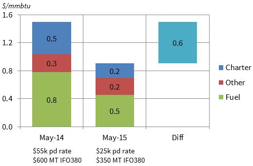
Battery storage technology costs have been declining at an impressive rate over the last 2 to 3 years. Interest in the investment growth potential for electricity storage has increased sharply as a result. Much of this is being driven by enthusiastic projections for the mass market role out of batteries. There has been a particular hype around electric vehicle batteries, led by the pin up boy of battery evolution, Tesla CEO Elon Musk.

But it is utility scale electricity storage solutions that have the potential to make a larger and quicker impact on wholesale power markets. The major hurdle for broader commercialisation of storage technology is cost reduction. But the full force of US technology innovation is working on addressing this problem. Intense competition between technology providers is the driving factor behind rapidly falling unit costs. This has led to bold claims by some bank analysts that there may be significant rollout of utility scale battery storage by 2020.

Against this backdrop, we are publishing a series of articles on investment in electricity storage. In this first article, we provide a brief overview of different technologies as well as defining a set of key storage parameters that are common across all technologies. We then summarise the drivers of storage value and cost. Finally we set out the main challenges that need to be overcome to achieve broader commercialisation. We will then come back in subsequent articles to look in more detail at the economics and potential market impact of storage investment.


Electricity storage technology

Utility scale electricity storage is not a new concept. Storage solutions have been commercially applied for decades, most commonly in the form of pump storage hydro assets. But the recent pickup in investor interest is focused on a number of emerging electricity storage technologies. These utilise a range of different methods for storing electrical energy as summarised in Chart 1.

Chart 1: Summary of electricity storage technologies

tech categories

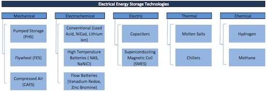
Source: Deutsche Bank, State Utility Forecasting Group

Developers are competing against each other and the clock to develop a commercially viable utility scale storage solution. The most promising signs of technology evolution are focused on the electrochemical category in the chart given rapid recent declines in the unit costs of battery storage.

We do not address the pros and cons of different technologies in this article. Instead we focus on defining a common set of parameters which can be used to characterise the performance of any storage system. Ultimately it is these parameters that will interact with wholesale market dynamics and cost structure to define the investment case for any particular storage project.


Storage physical characteristics

There are four key parameters that can be used to characterise any electricity storage technology (regardless of whether it is e.g. mechanical, electrochemical or thermal). These parameters are summarised in Table 1.

Table 1: Key electricity storage asset parameters
phys table 2

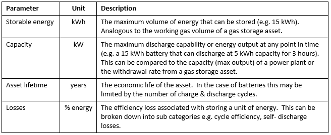
It is important to recognise the differences between a controllable generation asset (e.g. a thermal power plant) and a storage asset. Conventional generation assets are typically capacity constrained not energy constrained i.e. they have access to ample fuel supply (to convert into electricity) but are constrained by maximum capacity (or output). In contrast, the primary constraint for storage assets is the volume of stored energy rather than capacity to discharge energy. This is a commonly understood characteristic of hydro reservoir assets, but it applies equally to other forms of electricity storage e.g. batteries.


Storage value dynamics

The investment case for an electricity storage asset is driven by the interaction between the physical parameters described above and the dynamics of the market in which the asset is deployed. As with gas storage assets, the primary value driver of electricity storage assets is typically the ‘merchant value’ associated with the charging/storing of electricity in low priced periods and discharge/release of electricity in higher price periods.

But in contrast to gas storage, there are a number of other drivers of electricity storage value that combined have the potential to be as important as the merchant value. The different electricity storage value streams are summarised in Table 2.

Table 2: Electricity storage value streams

ElecStor Table2

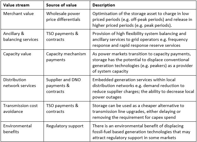
Storage has well defined access to the first two value streams (merchant & ancillaries) via existing revenue streams in wholesale power markets. Storage should also have good access to capacity payments as these evolve.

However access to value becomes more complicated for the other value streams. This is particularly true of some of the more unique benefits that storage can provide to transmission and distribution networks (e.g. capex cost avoidance and increased reliability). It is these areas where policy evolution will be required to facilitate a clearer price signal if storage is to access potential value (e.g. through evolution of regulated cost recovery mechanisms for TSOs and DNOs).

It is also possible that some market regulators will implement regulatory support to remunerate the environmental benefits of storage technology (e.g. in displacing thermal power generation).

While in theory storage appears to benefit from a diverse range of value streams, these may not be independent and additive. In other words benefiting from one value stream (e.g. merchant revenue) may inhibit access to other streams (e.g. transmission & distribution benefits).

However what is encouraging about storage from an investment perspective is that, unlike renewable technologies, the first five storage value streams in the table above are not driven by consumer subsidies. In other words, storage commercialisation should be possible on a standalone basis if value can be practically monetised and projected cost reductions can be achieved. But there are a couple of key ‘ifs’ in the previous sentence.


Storage cost dynamics

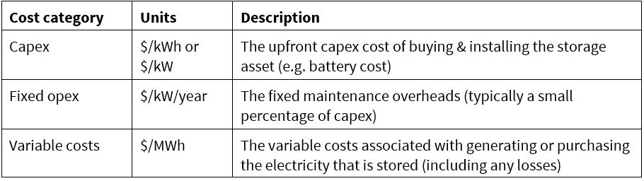
The costs of storage investment can be split into three broad categories shown in Table 3.

Table 3: Electricity storage cost categories

ElecStor Table3

It is important to note that for battery storage, the operational pattern of battery usage is important in defining its cost structure e.g. whether usage is focused on fast cycling to capture price differentials or providing network support services. There can also be significant non-battery capex costs associated with developing the storage system.

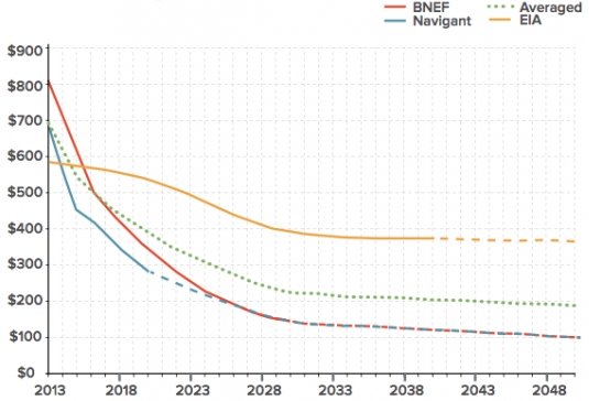
Capex costs are typically measured on a $/kWh stored energy basis, with current costs ranging upwards of 500 $/kWh. But investor focus is particularly on the potential for battery storage costs to fall rapidly over the remainder of this decade. A viable investment clearly depends on number of other factors as well as capex. But a commercialisation hurdle for storage costs of around 200 $/kWh is commonly cited as a reasonable benchmark.

Chart 2 illustrates shows some examples of published cost reduction curves for battery storage. We do not show this chart as an accurate representation of future storage costs, but rather to illustrate the aggressive cost reduction curves currently in circulation. The differences in forward projections illustrate the inherent uncertainty around technology cost reduction. What is clear however, is that battery storage is currently driving down the steep section of the cost reduction curve.

Chart 2: Example of projected battery storage cost reductions

 cost reduction


Path to commercialisation

Unlike renewable technologies, the major hurdle for storage investors is not gaining access to consumer funded regulatory support. Commercialisation of storage is likely to require cleaner regulatory definition of price signals. But broader commercialisation will need to happen on a standalone basis.

The key challenge in building an investment case is to access a set of revenue streams that will support investment costs and financing, within a palatable risk/return boundary. This relies on more than just a cost competitive source of storage capacity. It also needs to be built on a realistic view of the interaction between the physical parameters of the storage asset and the monetisation of different revenue streams in the market in which the system is employed. Given the challenges described above, we suspect early deployment of storage will be focused on particularly compelling localised opportunities e.g. ancillary services or embedded benefit payment streams that can be clearly monetised without adversely inhibiting the capture of merchant revenue.

In order to define and analyse electricity storage investment opportunities, it is useful to develop a framework that overlays the physical, value and cost parameters set out in Tables 1 to 3 above. This supports the consistent assessment of storage investment opportunities across different technology types and different wholesale power markets. We will come back to look at the investment economics of electricity storage in more detail in our next article in this series.


Article written by David Stokes and Emilio Viudez-Ruido

Shipping cost impact on LNG price spreads

The LNG market is adjusting to the new reality of regional price convergence.  Soft Asian demand, new liquefaction capacity and lower oil-indexed contract prices are all contributing to compress regional price differentials.  Under these conditions, LNG shipping costs are playing an increasingly important role in determining LNG flows and spot pricing dynamics.


Quantifying the fall in shipping costs

We recently published an article on the rapid decline in LNG vessel charter rates over the last three years.  This fall in charter rates has significantly reduced relative incremental shipping costs between delivering gas to Asia versus Europe.  In other words, the ‘strike price’ for diverting LNG from Europe to Asia has fallen. This effect has been reinforced by a fall in bunker fuel prices as the oil market has weakened.

Chart 1 illustrates an example of the reduction in LNG shipping costs over the last 12 months (from May 2014 to May 2015).  It focuses on the cost of diversion of a cargo located at a Spanish terminal (Huelva) to Japan (Sakai).

Chart 1: Cargo diversion costs for shipping from Spain to Asia
Shipping Cost Fall
Source: Timera Energy.

Assumptions 147k MT vessel.  19 knots average speed. 10014 NM journey via Suez.  Laden leg only.  USD 400k canal transit charge (one way) + other costs including port fees, brokerage and insurance.

The chart illustrates how the different components of shipping cost have contributed to the overall reduction in laden voyage direct costs.  The key factors driving the 0.6 $/mmbtu decline in shipping cost over the last year have been:

  1. A ~55% reduction in spot charter rates from $55k to $25k per day
  2. A ~40% reduction in fuel oil costs from 600 to 300 $/mt (IFO380 benchmark)

The days of the structural diversion of LNG from Europe to Asia are gone.  Cost reduction of cargo diversion to Asia, combined with much tighter regional spot price differentials, means LNG spot market flows and pricing are becoming much more dynamic.


The importance of shipping costs in driving LNG price spreads

LNG shipping costs are an important driver of the way LNG trading desks optimise cargoes.  But they also have a broader impact in determining how LNG volumes flow between regions and how regional LNG spot prices are determined.

Since summer 2014, Asian spot LNG prices have remained within a tight range of European hub prices.  The practical mechanism which is driving this convergence is the optimisation of flexible cargoes between the two regions.  And shipping costs play a key role in driving this as we set out above.

In order to understand how regional spot price differentials are driven, it useful to think of different tranches of flexible supply with diversion decisions influenced by relative shipping costs, for example:

  1. Reload and diversion of a European cargo to Asia
  2. Diversion of an Atlantic basin sourced cargo to Asia versus Europe
  3. Qatari decision to sell spot cargo into Asia or Europe

The spot price premium required to attract cargoes to Asia (from Europe) falls across these three tranches.  This is illustrated in Table 1 which shows shipping cost differential examples for Tranches 1 to 3 (with two examples shown for Atlantic Basin diversion Tranche 2: Trinidad and Nigeria).

Table 1: Asian / European Shipping Cost Differentials (@ 25kpd and laden voyage only)

Shipping Cost Table

Source: Timera Energy

When interpreting the numbers in the table, it is important to note that they reflect direct costs for a laden only voyage (i.e. do not allocate a cost for the return voyage).  In our view this is the most transparent and objective way to assess differentials.  But in practice there can be significant cost and risk premiums over and above the direct costs of cargo diversion.  This can add upwards of 0.5 $/mmbtu to the spread required for companies to exercise a diversion option.  An overview of the calculation of shipping costs and premiums can be found here.

The table illustrates how different sources of flexible LNG supply to Asia are ‘choked off’ as regional price spreads decline.  European reloads are the most expensive source of diverted LNG and are therefore the first to go.  There has been clear evidence of this over the last 12 months as European reload volumes have virtually dried up as the Asian price premium has collapsed.

Diversion costs then decline based on the incremental distance to ship cargoes to Asia (e.g. Trinidad higher than Nigeria).  Qatar plays a key role at the centre of the LNG market, with its location meaning that producers are largely indifferent on a shipping cost basis as to whether cargoes are sent to Europe or Asia.  At the point where Asian spot prices fall below NBP (as was the case earlier this year), the incentives to flow flexible LNG to Asia disappear altogether.


Current LNG spot price dynamics

Asian spot LNG prices are currently around 7.30 $/mmbtu.  This compares to UK NBP prices at around 6.70 $/mmbtu.  Asian spot prices have settled at a small premium above NBP over the last couple of months, although the current spot market is characterised by a lack of liquidity.  With Japanese and Korean importers well contracted and carrying high inventories, spot trade has been dominated by opportunistic buying of cargoes in a 7.00-7.50 $/mmbtu price range (e.g. from China and India).

Spot market liquidity is set to increase over the next two years as new liquefaction capacity comes online.  This is particularly true of destination flexible supply (e.g. US export capacity) that will flow to the highest netback spot price.  But the spot price dynamics that have evolved in 2015 are representative of what can be expected going forward in a world of price convergence.

The LNG spot market will remain anchored by European hub prices.  Asian spot prices will typically trade within a reasonably tight range of European hubs, although there may be volatility in regional spot prices at any point in time, reflecting shorter term fluctuations in supply and demand.  Under these conditions, shipping costs are set to play an increasingly important role in driving flexible LNG cargo flows and spot pricing dynamics.

This article was written by David Stokes & Olly Spinks.

Oil market illustrates risks of relying on price forecasts

Commodity price forecasts are widely used across energy markets. Forecasts are used as an input for a range of commercial activities including business plans, budgets and investment cases. In fact some view of the future evolution of commodity prices is a pre-requisite for many of these activities. But the principle danger associated with price forecasts is not recognising their limitations.

For want of a better source of information, price forecasts are often based on current forward market price information. This may be associated with the common misconception that forward curves represent a market consensus forecast of future spot prices. In today’s article we use a practical case study based on Brent crude oil price forecasting to illustrate the dangers of relying on price forecasts.

We published an article on Mar 30th setting out the importance of distinguishing between forward curves and forecasts of future spot prices. In this first article in a series on ‘forecasts vs. forward curves’, we described the superficial visual similarity between graphs of both, and the common but erroneous belief that the forward curve is somehow a ‘market consensus spot-price forecast’.

Spring 2015 marks a phase in the evolution of Brent prices, both spot and forward, when professional price forecasters have diverged dramatically in their views of what will happen over the next two years. Chart 1 shows the Mar 2015 spot-price predictions of ten leading oil market analysts for the remainder of 2015 and 2016.

Chart 1: Brent price history and forecast range

WSJ Chart

Source: Wall Street Journal

The remarkable spread in forecaster views is immediately obvious. Even for the current quarter of this year (Q2), the highest pick is 54% greater than the lowest, a disparity rising to 68% for the fourth quarter. The scatter is almost uniform for the third quarter, and bunching only emerges at the end of the year when the group splits into a cluster of four higher-than-average tipsters and a second cluster of six who go lower-than-average in their outlooks. Only one consistent theme emerges across all: the price of oil is seen as rising steadily from the levels of second-quarter 2015. It is probably no coincidence that this reflects the current Brent curve contago.

Many oil producers may be disappointed, if not surprised, to see no-one forecasting above $100. Although it may be fairly observed that an average for 2016 of $93 (the highest prediction) would suggest that the Brent price is seen going back into 3 figures for at least some of that year by that forecaster, if by no-one else amongst the ten.


A consensus view?

Chart 1 is hardly a picture of consensus. To the contrary, it is difficult to recall a time of more divergent views since the post financial crisis market turmoil of 2008-09. However, it should immediately be registered that throughout the oil market price turmoil of those years, and of 2014-2015, the Brent market has remained very liquid along the forward curve. In other words, the forward curve is entirely meaningful on its own terms. That is it represents an array of prices at which actual forward business is being conducted in large volume today, irrespective of what anyone might think about where spot prices will be in the future.

So the failure of analysts to agree on the future does not in any way undermine the forward market’s willingness to make prices. This is yet another challenge to the perception that ‘forwards are forecasts’: for if the forward curve is to be seen as a market consensus how can it exist at all when, as at present, essentially there is none?


Putting Your Money Where Your Mouth Is

It is interesting to consider conceptually the uses to which price forecasts might be put. In principle, if a forecast carries any weight with the recipient – who may have paid good money for it – he or she should be willing to act as though future prices may reliably be expected to settle at approximately the levels projected. This may inform (for example) budget provisions, investment decisions or whether it is necessary to hedge a given exposure. If a company is long oil, and believes a forecast that predicts prices will rise, why would they hedge?   The answer, amply illustrated over the years, is that whatever is ‘believed’ about the future, there can be surprises in store for anyone.

In circumstances such as now, when forecasters diverge so significantly in their views, few players with significant money at stake are likely to consider it safe to leave their exposed oil positions unhedged. The fact remains that at all times, even when there seems to be a consensus amongst professional pundits, if a position is technically open and the holder does not wish to carry the risk, then only a hedge will do. A chart with some numbers on it, whoever generated the numbers using whatever methodology and irrespective of their track record, can never substitute for a watertight forward hedge with a creditworthy counterpart.


What is ‘a good forecast’?

The writer is reminded of an incident of some twenty five years ago. Working for an oil company at the time, he was called in by his boss and told: “we need a good forecast” – a phrase often heard from many different people on many occasions since.   But what could this possibly mean? Is a “good forecast” the one that costs the most? The one that makes our projects look most attractive? How could we tell in advance which one is going to be the most accurate? At best, it might translate as: we need a forecast from a source or methodology which has a consistently good track-record over a long period of time.

Sadly, there is no such source or methodology. There is, however, a range of academic theories on the dynamics of forward prices, which we will consider in the next piece in this series.

This article was written by Nick Perry.

Capacity fallout in the UK power market

The system capacity margin for the UK power market fell to 4% heading into last winter. Across the winter generation margins have remained weak and the inaugural UK capacity auction cleared at a price level under 20 £/kW. This has left owners of less efficient coal and CCGT plants in a difficult position.

So far in 2015, 5 GW of coal and CCGT capacity has been closed or earmarked for closure over the next twelve months. An additional 5 GW of older capacity has failed to qualify for capacity payments in last December’s auction. These plant remain operational, but with forward market margins well below fixed costs, further asset mothballing or closure decisions are imminent.

The UK power market cannot afford to lose 10 GW of flexible thermal capacity. So the stage is set for a game of political and commercial brinksmanship to determine which plants will survive. As this plays out the UK system capacity margin is likely to remain very tight for the next three winters.


Market spreads hurting coal and doing little to help gas

The absolute level of power prices in the UK is determined predominantly by the cost of gas, given the dominance of CCGTs in setting marginal prices. So it is more important to focus on spark and dark spreads, or gas and coal plant generation margins, when assessing plant economics. However UK forward market spreads have so far shown a muted reaction to the tightening system capacity margin.

The evolution of baseload and peakload clean spark (CSS) and dark (CDS) spreads and current forward curves are shown in Charts 1 and 2.

Chart 1: Baseload spark and dark spreads (£/MWh)

Baseload UK Spreads

Chart 2: Peak spark and dark spreads (£/MWh)

Peak UK Spreads

Source: Timera Energy using ICE data (CCGT efficiency 49% HHV, coal plant efficiency 36%)

The most obvious observation from these charts is how much coal plant margins (CDS) have declined since the start of 2014. There are two important factors which have contributed to this:

  1. Weakening European gas hub prices (see here and here for drivers)
  2. An almost doubling of the UK governments carbon price floor (to 18 £/t) in April 2015

These factors combine to create a very tough margin environment for less efficient coal plants without a capacity agreement. Although CDS remain marginally higher than CSS, coal plant fixed costs (typically 40+ £/kW) are much higher than for CCGTs.

CCGT margins (CSS) have recovered somewhat from their weakest levels in 2013, but remain relatively weak on a forward basis over the next 2-3 years. Around 10 GW of CCGT capacity is out of merit (i.e. running at zero or very low load factors).

With a CCGT fixed cost base of 20-25 £/kW, the future does not look bright for older assets with no capacity agreement. Supplemental Balancing Reserve (SBR) contracts are about the only source of hope, but pricing of these contracts is likely to be competitive given the overhang of distressed gas and coal capacity.


More closures, tighter system margins

Somewhat counterintuitively, the first capacity auction has precipitated a number of asset closures (as we foreshadowed here). The auction has clarified expectations around capacity price returns going forward, which combined with the weak energy market conditions described above, has been too much to stomach for owners suffering ongoing fixed cost burn. In the case of Longannet, high transmission costs in Scotland have   also contributed to poor plant economics. 5 GW of capacity available last winter has either been closed or ear marked for closure as shown in Table 1.

Table 1: UK plants closed in 2015, or earmarked for closure in the next 12 months

Plant closure table

Source: Timera Energy

Another 5.7 GW of other older plants (4 GW coal, 1.7 GW CCGTs) remain open but under imminent threat after failing to secure capacity agreements. Expect further announcements of mothballing and closures as the year progresses.

Despite the system capacity balance being very tight, National Grid’s analysis of system margins last summer predicted 3-4 GW of additional thermal asset closures by 2017. This analysis showed tightness in the system capacity margin peaking in the coming winter (2015/16), before new capacity build (predominantly renewables) and declining system demand starts to improve security of supply. Grid’s assessment of de-rated system reserve margin for last winter is shown in Chart 3.


Chart 3: National Grid Winter 2014/15 de-rated system capacity margin

system margin

Source: National Grid

The chart illustrates the 2.3 GW reserve margin last winter in the context of the 5 GW of closures announced so far this year (note a ~85% derating factor needs to be applied to the 5 GW to make it comparable). Grid’s assumptions in calculating reserve margin (e.g. on peak winter demand and interconnector availability) are intentionally conservative. But nevertheless more closures and a cold winter would appear to leave the UK power market in a precarious position.

The last two winters have been relatively mild and windy causing little in the way of challenge to security of supply. Our suspicion is that the UK government and Grid will not be keen to ‘roll the dice’ on a third mild winter. The focus for alleviating system capacity issues is on Grid’s SBR contract auctions. SBR has become a somewhat opaque temporary mechanism to bridge the period until new capacity comes online from the first capacity market auction (by 2018). Plants that successfully secure SBR contracts may live to fight another day. But the remainder of the 10.7 GW of plants that failed to secure capacity agreements remain on the endangered list.

Article written by David Stokes, Olly Spinks & Emilio Viudez Ruido

Collapse in LNG charter rates continues

Oversupply in the LNG market is having a knock on impact on the LNG carrier market. LNG vessel charter rates have suffered another down leg in 2015, with spot charter rates falling to USD 25,000 per day. Rates have halved in the last six months, falling back to levels seen in the depths of the global financial crisis.

The breakeven cost for delivering new vessels is estimated to be around USD 60-70,000 per day. Term charter rates (12mths+) have now fallen below USD 40,000 per day, opening up a sizeable gap versus new build recovery. But despite these numbers, there is still a substantial volume of LNG vessel capacity under construction. New capacity and changing route dynamics are likely to ensure downward pressure on charter rates remains over the next two or three years.

The drivers behind charter rate decline

Chart 1 illustrates the interesting journey of LNG vessel charter rates over the last five years. A post financial crisis shortage of vessel capacity combined with longer post-Fukushima vessel journeys (Asian diversion), caused a sharp squeeze in charter rates from 2010-12. A reverse in these factors has driven the fall in charter rates from their peak above USD 140,000 in mid-2012.

Chart 1: LNG sport and term time charter rates

charter rates

Source: RS Platou Monthly (April 15)

We have previously set out why we believed LNG charter rates would decline, e.g.:

  • Jan 14: Steam coming out of shipping market here
  • Oct 14: LNG charter rates heading south here

The decline in charter rates over the last 12 months has been particularly impacted by changing LNG flow dynamics. Convergence in Asian & European prices since summer 2014 has undermined demand for vessels to facilitate high volume diversion of LNG from Europe to Asia. As a result the number of longer distance voyages and therefore vessel utilisation has fallen substantially.

In addition the smaller returns from LNG spot trading and portfolio optimisation have created a greater focus on the costs of diversion economics. Squeezing out an extra 0.05 $/mmbtu in shipping cost reductions is more important in a world of 0.5 $/mmbtu diversion margin than in one where 5 $/mmbtu is possible.

Fleet overcapacity set to continue

The number of new LNG vessel orders has almost dried up this year, an understandable reaction to plunging charter rates. However there are currently 150+ vessels on order (constituting a ~35% increase in the current global fleet of 430) as illustrated in Table 1.

Table 1: LNG fleet snapshot

carrier table

Source: RS Platou Monthly (April 15)

The vessels currently on order reflect long delivery lead times. These orders were committed on the basis of the wave of new liquefaction capacity currently under construction (as we set out here). Orders were also supported by the assumption that the majority of flexible and spot LNG supply would continue to be diverted to Asia, supporting vessel utilisation. The rapid convergence in global spot prices is a key factor weighing on charter rates in 2015.

Looking forward for signs of a recovery

The LNG carrier market is set to undergo a rapid phase of evolution with more than 150+ bcma of new liquefaction capacity to be commissioned by the end of this decade. New liquefaction capacity creates a requirement for shipping capacity. But much of the new liquefaction capacity is located in Oceania, under long term contracts to Asian buyers. Vessel orders to support these contracts were made on the basis of a tighter carrier market and substantially higher charter rates.

New vessels and anaemic charter rates present a threat to older vessels in the existing fleet. Scrapping or mothballing vessels has not been a strong feature of the LNG market to date, although two vessels have been removed from the fleet in 2015. A continuation of lower charter rates may start to take its toll on older vessels that are more expensive to operate.

Perhaps the most important uncertainty going forward is the evolution of LNG flow dynamics. A recovery in the Asian LNG price premium (over Europe and the US) will support higher vessel utilisation and in turn support charter rates. But if, as we suspect, the current period of global LNG price convergence continues towards the end of this decade, downward pressure on charter rates is likely to remain.

Article written by David Stokes & Olly Spinks


Look to the USD for oil price direction

The decline in crude prices that started last summer has been one of the sharpest selloffs in the history of the oil market. After stabilising towards the end of Q1 2015, crude prices have recovered in Q2. There are two schools of thought as to the meaning of this price rally:

    1. Correction: After a sharp move lower in crude prices, the recent rally is a temporary correction before prices fall again.
    2. New trend: The Q2 rally is the start of a more structural recovery in oil prices as supply has been curtailed by lower prices.

We subscribe to the former view. But whatever your view is on the oil market, it is worth considering the relationship between crude and the US dollar (USD). There is currently an important set of fundamental drivers, focused around US shale oil production, which is unique to the oil market. But the strength of the inverse relationship between the USD and crude prices provides a useful directional barometer.

Important price relationships

Global commodities are traded in US dollar terms. This supports a strong inverse relationship between commodities (priced in USD) and the strength of the USD itself (e.g. against a basket of other currencies).

This relationship does not just reflect basic arithmetic (i.e. a rising denominator). The oil price has fallen substantially in EUR terms, even though the EUR has also fallen against the USD. A rising US dollar tends to reflect a fundamental environment that is less favourable for commodity prices. For example, increasing US interest rates, a tightening of credit conditions and a general rise in market risk aversion.

The extent of the relationship between the USD, crude and a basket of all commodities (the CRB index) is illustrated in Charts 1, 2 and 3 respectively.

Chart 1: US dollar index

USD

Chart 2: WTI crude front month contract price

WTI

Chart 3: CRB commodity price index

CRB

Q3 2014 – Q1 2015: The sharpest rally in the USD in 30 years commenced in the summer of 2014. This was the same point in time at which crude began to fall. And crude prices were accompanied lower by other commodities (e.g. metals, agriculture).

Q2 2015: The peak of the USD rally towards the end of Q1 coincided with the bottoming of crude prices and those of other commodities. Through Q2, prices of oil (& other commodities) have recovered as the USD has weakened in a sharp counter trend move.

Q3 2015+: History shows that major currency trends tend to last significantly longer than 9 months. These trends tend to reflect structural macro drivers (e.g. a strengthening of US interest rates vs Europe and Asia) that can often last several years. This suggests that the Q2 weakness in the USD, and in turn the recovery in crude, is a temporary correction.

Back to the fundamentals

From the lowest price this year (around 42 $/bbl), front month WTI crude prices have recovered 50% to above 60 $/bbl. Over this period, the tail of the WTI crude curve has moved back up towards 70 $/bbl. This is an important level because it represents the lower bound of long run marginal cost (LRMC) benchmarks for investment in new US shale production.

The relatively short well life cycle of US shale means that the LRMC of new production is very important in driving US production volumes, as we set out here. The impact of the recent crude curve fall on investment in new US oil wells can be seen via the declining US rig count shown in Chart 4 (the red line).

But throughout the price decline of the last 9 months, crude prices have remained above the short run marginal cost (SRMC) of production for existing wells. This has led to a steady increase in US oil production, despite lower prices (the blue line in Chart 4).

Chart 4: US oil production vs rig count

US prod vs rig count

Source: Carpe Diem Blog, EIA, Baker Hughes

The recent rig count declines will start to impact US crude production going forward, although the fall in rig numbers is to some extent being offset by an increase in rig productivity. But this rig count decline will likely stabilise or even reverse if forward crude prices reach levels that again cover the LRMC of drilling new wells.

The way forward

The ongoing increase in US production and the fact that WTI prices are approaching LRMC benchmarks for new investment, suggests to us that the recent rally in oil prices may not have much further to run. If this is correct then the USD is likely to provide a useful indicator as to the next move lower in crude prices. If the USD resumes its climb then oil prices will likely face strong headwinds.

Production cost drivers point towards higher oil prices in the long term (e.g. 2020+). For example the LRMC of new deepwater and oil sands production investments is significantly higher than current crude price levels. But the evolution of oil prices in the short to medium term is likely to remain focused on US shale production. In our view, a longer period of lower prices is required to interrupt the US shale production investment cycle.

Gas vs coal switching in Continental power markets

Five years of coal price weakness has decimated the value of European gas-fired power plants. Spark spreads in Continental power markets have fallen into deeply negative territory as coal plants have dominated the setting of marginal power prices. Gas plant load factors and margins have plummeted as CCGTs have been relegated to a peaking role.

Against this backdrop, market sentiment on the value of gas plants in Europe is understandably very poor. Substantial volumes of existing gas-fired capacity is being closed or mothballed. Investment in new CCGTs has all but disappeared. Forward market pricing and the actions of asset owners point towards a consensus view of ongoing weakness in gas-fired generation margins.

However a more structural weakening in gas hub prices is quietly starting to undermine the competitive advantage of coal plants. This has not yet had much impact on realised gas plant margins on the Continent. But as gas prices fall, gas plant optionality is becoming less ‘out of the money’. This has a positive impact on expected margin capture and risk adjusted asset values.

Continental switching dynamics

In a recent article we showed newer CCGTs starting to displace coal plant in the UK merit order as gas prices fall. Gas vs coal switching happens in the UK before it does on the Continent as a result of the carbon price floor and dominance of gas plant in the UK generation mix. The picture in Germany is a different story, as shown in Chart 1.

Chart 1: Current German gas vs coal (36%) switching dynamics

DE coal gas switching

Source: Timera Energy

Chart 1 shows that gas hub prices need to fall from current levels around 7 $/mmbtu to below 5 $/mmbtu in order to bring CCGTs back into merit in the German power market (assuming a constant coal price level). As gas prices fall, the competitiveness gap between coal and gas plants is closing. But another significant hub price down leg is required before market pricing induces structural (baseload) displacement of coal plants by CCGTs.

We have chosen Germany to illustrate switching dynamics because it is the core of the NW European power market. But also because it is one of the most difficult European markets for gas-fired plants.  Black coal and lignite plants currently enjoy a significant variable cost advantage over CCGTs.  At the same time, increasing renewable output is eroding gas plant load factors, although the development of renewable capacity is starting to face some headwinds in Germany given concerns over rising customer bills.

The German market is important for its neighbours because it dominates the setting of marginal power prices in NW Europe across much of the year (particularly in summer and off-peak periods). However, the situation for gas plants in some other Continental markets is somewhat better. For example, in peak winter periods in Belgium and France, power prices separate from Germany as gas plants set marginal prices. In other words, gas plant load factors and margins in NW Europe start to increase at hub price levels well above the German baseload switching point.

Why switching on the Continent may have to increase

Russian oil-indexed gas supply contract prices (~ 7 $/mmbtu) are currently driving marginal pricing dynamics across Europe’s hubs (NBP, TTF, NCG) as shown in Chart 2. But European LNG import volumes (green supply tranche in the chart), may be close to the ‘tipping point’ where oil-index contracts are pushed off the margin, as we set out here.

At the point that the European gas market can no longer absorb more LNG imports by ramping down pipeline supply contract volumes, gas vs coal plant switching becomes a key source of incremental gas demand and hub price support. This is a key factor behind the downward slope of the European gas market demand curve, shown in Chart 2.

Chart 2: Projected European gas market supply and demand balance (2016)

EU Gas Supply Curve

The UK provides initial switching support for hub prices given the carbon price floor and dominance of CCGTs, approximately 20 bcma in a 5.50-7.00 $/mmbtu gas price range. But if the European gas market moves into a period of more significant oversupply (e.g. 2008-09), gas displacement of coal plant on the Continent may also be required to induce demand support. We estimate 60-80bcma of incremental demand in a 4.00 to $6.00 $/mmbtu price range. If LNG imports into the European gas market continue to rise, gas plant load factors may need to increase substantially in order to absorb surplus gas volumes.

Implications for gas plant value on the Continent

Chart 1 shows a significant gas price fall required to induce gas vs coal switching in Continental markets. While that is true for baseload displacement of coal by CCGTs, switching starts to take place at much higher gas prices when hourly price shape and price volatility is taken into account.

As gas prices fall, CCGT competitiveness is improving, albeit from a very weak starting point. In other words the ‘out of the moneyness’ of CCGT optionality is falling and peak margin capture opportunities are increasing. This is particularly the case in markets where gas plants play an important role in winter peak periods (e.g. Belgium & France).

There are two ways that the values of gas-fired assets can increase as a result of falling hub prices:

  1. Higher peak margins, increasing the right tail of asset value distributions & supporting the value suppliers place on ‘peak insurance’.
  2. Structural recovery in gas plant competitiveness, where falling gas prices cause displacement of coal plants and higher CCGT margins and load factors (e.g. if hub prices reach the tipping point as LNG imports rise).

The analytical challenge for asset owners and investors is to properly quantify the impact of 1. and 2. on risk adjusted asset value and asset risk/return dynamics. The traditional Base, High & Low scenario view of analysing asset values is of limited benefit in doing this. Instead it is important to use a probabilistic plant valuation model that generates asset margin distributions and allows a robust calculation of risk adjusted asset value.

The commercial challenge for owners and investors in CCGTs on the Continent is covering fixed costs over the period until asset margins recover. This is reflected in low (or zero) current asset values. Deep value discounts remain for Continental gas plants given more challenging risk/return dynamics and bearish CSS sentiment. These conditions are supported by the fact that most markets in NW Europe currently have healthy capacity margins.

However over the next five years, as less flexible and higher emission thermal plants close, capacity constraints are going to start to bind across European markets. Regulators and system operators are aware of this problem and capacity payment mechanisms are being progressed to support adequate volumes of flexible capacity.

Against a backdrop of increasing renewable intermittency, there will be a requirement across European power markets to maintain relatively high volumes of flexible lower load factor mid-merit and peaking capacity. Retaining existing gas-fired assets is the cheapest source of this flexible capacity, as the UK capacity market experience is showing.

The current ‘graveyard’ consensus on Continental gas plant value is consistent with asset margins today. But value dynamics look very different in a world where capacity payments cover fixed costs and there is asymmetric value upside from recovering wholesale energy margins (e.g. as gas prices fall & power volatility rise). The challenge is to successfully bridge this gap with the right asset in the right market. This relies on the ability to generate a robust view of risk adjusted asset values.

Article written by David Stokes, Olly Spinks & Emilio Viudez Ruido


Acquisitions and monetising asset value

European energy asset transaction activity is on the rise. After ambitious but largely unsuccessful growth and acquisition sprees last decade, utilities are selling off flexible assets & downsizing trading functions. In a world of unpredictable asset margins and lower price volatility, utilities are reverting to the perceived safety of core business and subsidised renewable asset development. E.ON’s intention to spin-off its thermal generation and commodity trading business is perhaps the most prominent example of this change in tack.

Infrastructure and private equity funds are showing an increasing appetite for energy assets. This is being fuelled by favourable lending conditions and growing pools of capital chasing yield. But funds are also facing competition from commodity trading companies, such as Glencore, Vitol & Mercuria. Commodity traders are acquiring assets and bolstering their energy trading capability, encouraged by the regulatory driven exit of investment bank competitors.

Asset buyers are being confronted with the challenge of determining how to monetise asset value in the traded energy markets. For example:

  • Determining a route to market
  • Defining a trading and risk management strategy
  • Developing a commercial and operational capability to support the assets

The approach to these challenges varies widely across asset buyers. But risk appetite and existing commercial capabilities are two important factors determining how companies approach monetisation of newly acquired assets. We explore those drivers in more detail today.

Risk appetite

In March we published an article providing an overview of the five most common monetisation strategies for flexible assets. These are summarised in Table 1 below:

Table 1: Five most common asset monetisation strategies

Strategy Table

Source: Timera Energy

Each of these strategies ultimately involves a trade-off between expected return and risk. So a company’s risk appetite is typically the primary driver of which strategy is adopted. Chart 1 provides a simple illustration of the risk/return trade-off for each of the different asset monetisation strategies.

Chart 1: Monetisation strategy risk / return dynamics rerun dynamics

Monetisation Diag

Source: Timera Energy

Strategy considerations can be summarised as follows:

  1. Spot: The decision to operate assets on a purely merchant basis is typically driven by necessity (e.g. peaking assets with little intrinsic value) or as a high level strategic choice (e.g. Exxon’s approach decision to undertake limited hedging of its spot oil exposures).
  2. Static intrinsic: This ‘hedge and forget’ approach is typically unnecessarily conservative, unless an asset is deep ‘in the money’ or operating in a very illiquid market.
  3. Static intrinsic + extrinsic: Selling the full flexibility of an asset via a structured long term contract (e.g. a tolling agreement), is attractive for more conservative investors (e.g. infrastructure funds). It allows the monetisation of asset extrinsic value (albeit at a discount to expected value), while avoiding the complexity and costs of developing a trading capability.
  4. Rolling intrinsic: This ‘risk free’ hedge improvement strategy is perhaps the most common strategy for realising asset value, given the relative attractiveness of its transparency and risk return trade-off.
  5. Delta hedging: Hedging forward exposures on a probabilistic basis is a strategy typically favoured by companies with sophisticated existing trading capabilities. It targets the capture of maximum expected value whilst directly reducing risks, but requires greater analytical and trading overheads.

As in our previous article on these strategies, we note again that in reality many companies adopt hybrid approaches that combine more than one strategy.

Business capability

The commercial and operation capability required to support asset monetisation is also an important driver of monetisation strategy choice. Business capability requirements vary widely across the different strategies. The cost of developing and maintaining an appropriate capability in-house is an important consideration and needs to be offset against expected asset return.

Table 2: Basic organisational capability requirements

Biz Capability Table

Source: Timera Energy

An increasingly common way for infrastructure funds to avoid substantial business capability development costs is to outsource their ‘route to market’ to a third party. This can be done for example via an energy management services contract (and applies to all the boxes marked in the table with an asterisk). Whether or not it is outsourced, a basic operations, scheduling, risk control and finance/invoicing function is required for all strategies.

All five of the monetisation strategies require a mandate from senior management (e.g. the Board) setting out the boundaries within which value capture takes place. Typically this involves clear delegation of authority for:

  1. Structural asset hedging and risk management decisions (where these are relevant), often managed by a hedging or risk management committee.
  2. Day to day trading and optimisation decisions, usually managed in real time by a trading desk.

A full trading capability and supporting functions are required to implement more sophisticated spot, rolling intrinsic and delta hedging strategies. Whereas a static intrinsic and a more passive static intrinsic/extrinsic strategy require less regular contracting & hedging decisions and only a basic operations and back office function.

As an example, decisions around implementing a rolling intrinsic or delta hedging strategy will typically be made at the trading book level. Whereas contracting and hedging decisions for a more active static intrinsic/extrinsic strategy are likely to be developed by the asset owner’s commercial strategy function. But in both cases these decisions are guided by overall a company’s risk appetite and commercial strategy.

Asset monetisation driving new partnerships

The transfer of energy assets from utilities and producers to investment funds looks set to continue. But these funds are showing little interest in developing their own energy trading capabilities, due to a combination of business model considerations, overhead costs and risk appetite. This is supporting strong growth in ‘route to market’ and ‘energy management’ services.

The logic of these service partnerships is simple. It makes sense for funds to outsource ‘market facing’ capabilities to companies that already have an established market presence. This includes commodity traders, banks and (somewhat ironically) the trading functions of utilities and producers.

However the challenges of structuring a robust ‘route to market’ or ‘energy services’ contract are far from simple. These contracts need to capture the:

  1. Clean ongoing transfer of asset exposures from owner to trading counterparty
  2. Holistic coverage of the evolution of different margin streams over the contract lifetime
  3. Appropriate alignment of incentivisation between owner and trader (e.g. margin/risk sharing)
  4. Definition of a robust trading performance measurement framework

Capturing an effective balance of these factors in a long term contract is a big hurdle. But contractual structures are starting to become more standardised as fund transactions increase. We will return to set out some of the key principles behind a successful contractual partnership in an article to follow.

Gas plant competiveness is increasing

Over the last five years, European coal plants have developed a substantial variable cost advantage over gas plants. This has been driven by relative weakness in coal and carbon prices over a period where gas hub prices have been supported by oil-linkage.

But coal’s competitive advantage has suffered a pronounced decline since summer 2014. A growing global oversupply of LNG and falling oil prices have driven down European gas hub prices. This is reducing the variable cost gap between gas and coal plant.

Looking ahead, this trend of increasing gas plant competitiveness may continue. Europe is set to absorb higher volumes of LNG as a market of last resort for surplus cargoes. This may tip the European gas market into pronounced oversupply. In this environment CCGTs play a key role in soaking up surplus hub gas, meaning higher plant load factors and margins.

An increase in gas plant competitiveness feeds through into higher risk adjusted asset values. CCGT assets are becoming less ‘out of the money’, increasing their ability to capture margin from power price shape and volatility. This supports an increase in asset values, even before CCGTs come back into merit on a more structural basis. In our view these are important dynamics to understand in a world where asset owners are heavily discounting the value of their CCGT portfolios.

Gas vs coal plant marginal cost

Competition between CCGTs and coal plants is driven by short run variable cost. CCGTs are more efficient and less carbon intensive, but need to burn gas (which is relatively expensive per energy unit). Coal plants are disadvantaged on an efficiency and carbon intensity basis, but benefit from cheaper per unit fuel costs. Chart 1 shows the relative composition of gas vs coal plant SRMC for the UK across the coming summer, where newer CCGTs (52% efficient) are starting to displace older coal plants (36% efficient).

Chart 1: UK CCGT vs Coal SRMC (Summer 2015)

UK Power SRMC

Source: Timera Energy

We focus initially on the UK because it is the European ‘canary in the coal mine’ when it comes to gas/coal switching. This is a function of the UK’s carbon price support (now 18 £/t) and the dominance of gas in the generation mix.

Gas vs coal switching is already a reality in the UK. Chart 2 illustrates the significant displacement of older coal plants by newer CCGTs last summer, when hub prices fell as the flow of LNG imports increased. The 2015 step up in carbon price support from 9 to 18 £/t has furthered closed the gas vs coal competitiveness gap.

Chart 2: UK Coal vs CCGT output over the last 12 months (GW)

UK coal gas output

Source: Timera Energy

Gas vs coal switching dynamics

Structural switching of coal plants for CCGTs is not yet reflected in forward market pricing, even in the UK. By structural switching we mean the return of more efficient CCGTs to baseload running as they displace coal plants. But Chart 3 illustrates that this switching point is not far away.

Chart 3: Current UK forward market view of gas vs coal switching

coal gas switching

Source: Timera Energy

The chart axes show the cost of gas and coal (in traded units). The upward sloping lines show the gas & coal price boundaries for CCGT displacement of coal plants at different CCGT efficiencies:

  • 52% efficiency: A benchmark for the newest plants built since 2005
  • 49% efficiency: A benchmark for average system CCGT efficiency (equating to assets built around 2000)
  • 47% efficiency: A benchmark for older CCGT assets (e.g. pre 1998)

Gas and coal price combinations below the upward sloping lines, favour CCGT operation over coal. Price combinations above the lines favour coal over gas.

The two clusters of coloured dots on the chart show current forward market pricing points for gas and coal over the next few seasons. CCGTs are relatively more competitive in the summer given lower seasonal gas hub prices.

While CCGTs are not yet structurally displacing coal, forward pricing over the next three summers show newer CCGTs starting to displace older coal plants. Gas plant competiveness is a lot higher than it has been over most of the last five years.

Importantly market price trends in 2015 may be moving in favour of gas plants. Hub prices remain under pressure from LNG imports, while coal prices in European currency terms have been supported by a strengthening US dollar. Europe looks particularly vulnerable to a further decline in gas hub prices this summer which may cause a significant increase in UK CCGT load factors. This may also start to increase CCGT run hours in Continental power markets.

What does this mean for gas-plant values?

The roll of CCGTs in European power markets is structurally changing as intermittent renewable capacity increases. CCGTs have become mid-merit and peaking assets. This means that CCGT asset optionality in capturing margin needs to be properly valued. The traditional Base, High & Low scenario approach to asset valuation does not do this justice, as we summarised here.

It is easy to write off CCGT asset values based on weakness in forward spark spreads. But this oversimplifies asset value dynamics. Realised asset margin capture from prompt price shape and volatility tend to increase before forward spreads react (as has been witnessed recently in the UK). And margin capture from shape and volatility is sensitive to changes in gas vs coal switching dynamics.

As the SRMC of gas plants becomes closer to that of coal plants, the number of hours of positive margin capture increases. At the same time, the costs of capturing margin tend to decrease (e.g. via a reduction in start costs and sub full load efficiency degradation). This means that plant margin increases in a non-linear relationship to gas plant competitiveness. In other words there is typically a big value difference between a gas plant running at sub 5% load factor versus one running at 30%.

Chart 4: CCGT gross margin distribution chart (€m)

thermal plant margin

Source: Timera Energy power plant valuation model

The characteristics described above contribute to the asymmetric upside exhibited by CCGT asset margin distributions. This can be seen in the example CCGT margin distribution shown in Chart 4. The blue line shows expected asset margin, in this case increasing as gas competiveness rises over time. The shaded envelope around the expected (50th percentile) margin line reflects the 5th and 95th percentiles of the margin distribution. This margin distribution can be used to quantify the risk/return dynamics of the plant and to properly value asset optionality.

The nature of gas/coal switching and asset value

Gas vs coal switching is often perceived to be a binary affair: at the point when the SRMC of gas plants falls below that of coal plants, CCGT load factors and margins rise at the expense of coal plants. But the reality is that switching has a more gradual impact across different assets, time periods and markets.

UK CCGTs are already starting to realise the benefits of increased gas plant competitiveness. Gas plants on the Continent remain ‘out of the money’ on a forward price basis, but as hub prices fall their ability to capture margin from price shape and volatility in peak periods is increasing. These dynamics should translate into higher risk adjusted asset values. As a result, analysing how asset values can increase with gas plant competiveness is an important area of focus for gas plant owners and investors.

We will come back shortly with an expanded analysis of gas vs coal switching dynamics on the Continent.

Article written by David Stokes, Olly Spinks & Emilio Viudez Ruido

Watch out for Chinese & European gas demand

The European gas market’s ability to absorb surplus global LNG flows may be tested over the next five years. More than 150 bcma of new LNG supply is under construction for completion by the end of this decade. Surplus LNG supply above Asian and emerging market requirements will primarily flow to Europe.

European hubs should be able to absorb additional LNG flows in an orderly fashion as long as European suppliers retain the flexibility to reduce pipeline contract volumes. But once swing flexibility above contract ‘take or pay’ levels is exhausted, European hubs may reach a tipping point, as we set out in a recent article.

Beyond this tipping point, hub prices may fall sharply and disconnect from oil-indexed contract prices, as was the case in 2008-09. The interaction between Chinese and European demand growth will play a key role in determining whether this tipping point is reached.

China: the world’s marginal LNG buyer

Anticipated growth in Chinese gas demand has underpinned much of the 150+ bcma of new LNG liquefaction capacity under construction. The fundamental logic behind this is robust. China has made clear its intentions to orchestrate a centrally planned shift away from coal towards gas for power generation, in order to address local pollution issues.

But Chinese gas demand and Chinese LNG demand are two different things. China signed 68 bcma of framework agreements for oil-indexed pipeline imports from Russia in 2014. Although the terms of these agreements are far from concluded, they reflect China’s intent to ensure gas supply diversification. This is in addition to anticipated growth in existing pipeline imports from Turkmenistan and Central Asia via the West – East Pipeline. China has also made clear it wants to develop its own unconventional gas production as a third pillar of supply (although this is unlikely to start to have a significant impact until next decade).

Chart 1 shows the relative importance of Chinese LNG demand in a global market context. It assumes an 18% compound annual growth rate for Chinese LNG demand which means current Chinese regas capacity is broadly fully utilised by the end of the decade. This would be broadly in line with presentations from CNPC of November 2014.

Chart 1: Breakdown of global LNG demand (source Howard Rogers)

Sc 1 LNG

The chart also illustrates the importance of Chinese LNG demand growth in relation to:

  1. Other Asian markets (bottom chart)
  2. Niche and new LNG markets (outside the big 5 Asian buyers)

The volume of Chinese LNG demand will be price sensitive. If the current conditions of lower LNG prices continue, China may provide key LNG spot price support as an opportunistic buyer of surplus LNG.  We looked at factors driving Chinese LNG demand here.

But why is Chinese LNG demand so important for Europe? In an oversupplied global gas market, the majority of surplus LNG that is not bought by China (and to a lesser extent other opportunistic buyers) will flow into European hubs.

Europe: the world’s LNG sink

Europe plays a key price support role in an oversupplied global LNG market as we explained here. The volume of European gas demand growth over the remainder of this decade will be a key determinant of Europe’s ability to absorb LNG flows in an orderly fashion.

Chart 2 shows the European gas market balance assuming recovery from 2014’s weather related demand levels and a 1.5% pa growth thereafter, based on a combination of economic recovery and nuclear and coal retirement substitution. . The chart has been developed based on the global LNG demand projections shown in Chart 1. In other words LNG supply over and above aggregate LNG demand shown in Chart 1 is assumed to flow into Europe (the turquoise shaded area in Chart 2). The chart illustrates LNG flows displacing flexible Russian pipeline contract volumes.

Chart 2: European gas market balance (source Howard Rogers)

Sc 1 EU

Chart 2 shows a finely balanced European gas market. Virtually all of the flexibility to ramp down pipeline contract volumes to the traditional 85% take or pay levels is utilised to allow the European market to absorb LNG flows. It is important to note that there is likely to be some additional flexibility to ramp pipeline volume take below 85% ToP levels as we set out here.

But Chart 2 suggests that a slower pace of European demand growth, for example induced by continued economic stagnation or a new recession, may be enough to upset the European gas market balance. If instead of the recovery described above (and shown in Chart 2), European demand in 2019 was only 8% above that of 2014, this would be enough to push the European market beyond the tipping point.

If China doesn’t absorb surplus LNG, Europe will have to

Questioning the robustness of Chinese LNG demand was a somewhat controversial view in early 2014. But the industry consensus on Chinese LNG demand growth volumes has been shaken by over the last twelve months. This in conjunction with 150 bcma of new supply (predominantly from Australia and the US), has focussed attention on the ability of China doing the ‘heavy lifting’ to absorb new supply, via its growing fleet of regas terminals. Even at the lower spot LNG prices of the last year, this is not a foregone conclusion given the reduction in China’s industrial growth rate.

Europe has in the past been the receiving market for LNG supplies surplus to Asia’s requirements. This was demonstrated in 2010 when weather induced high demand allowed volumes to be absorbed with albeit minor difficulty in meeting Russian pipeline contract take or pay commitments. Between 2015 and 2019 the path of European demand will be key in determining this market’s ability to absorb large new LNG volumes while meeting Russian contract take or pay levels. Events will of course be subject to uncertainties of economic performance and power sector fuel mix in addition to weather.   But if Europe cannot absorb surplus LNG, the tipping point phenomenon we have described will become evident in hub price falls and a significant pick up in prompt price volatility.

Article by David Stokes, Olly Spinks & Howard Rogers