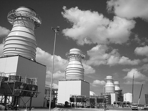
By all reports commissioning of Cheniere’s Sabine Pass terminal has been progressing smoothly and will export its first cargo in the next few weeks. This marks the start of the ‘1st wave’ of North American export capacity that will reconnect the US gas market with the global LNG market. More than 80 bcma of US liquefaction capacity is now contracted and under construction. Behind this is a similar volume of ‘2nd wave’ projects that are in an earlier stage of development.
US exports are set to drive a transformation in LNG market trading & pricing dynamics. This is because US export contracts are structured very differently to standard LNG supply contracts. They allow contract buyers to source gas on a Henry Hub rather than an oil-indexed price basis. They also allow buyers complete destination flexibility to respond to prevailing global spot price signals.
It is no coincidence that a substantial majority of US export volumes have been contracted by LNG portfolio aggregators. The inherent flexibility in US export contracts is set to be a catalyst for the evolution of LNG trading. As aggregators utilise contract flexibility it will drive both an increase in LNG market liquidity and in the influence of Henry Hub on global gas pricing.
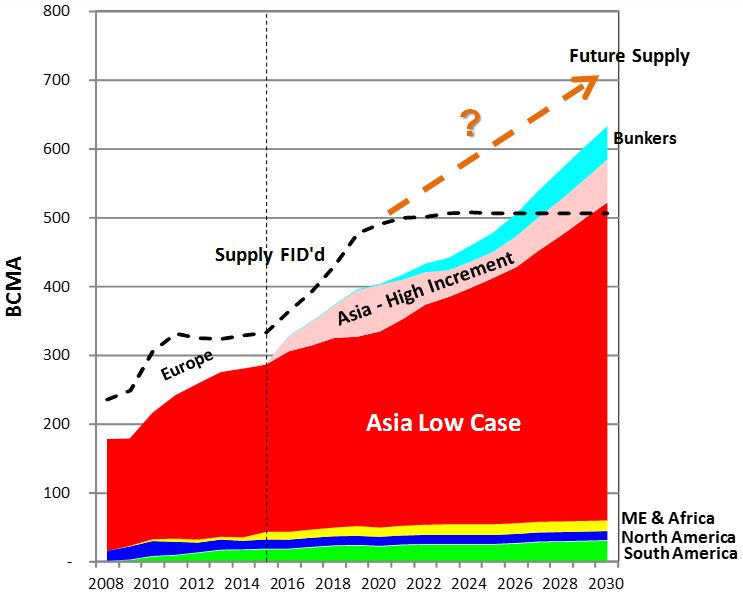
The wave of new US export capacity
There is 83 bcma of committed US LNG export capacity which is contracted, has passed the Financial Investment Decision (FID) hurdle and is under construction. This includes the Sabine Pass, Freeport, Dominion Cove, Cameron and Corpus Christi projects. There has been much anticipation around the first cargo from Sabine Pass. But most of this 1st wave of US export capacity is not scheduled to come on-stream until 2018-19.
In addition to the core 1st wave projects listed above, there are several other projects (Lake Charles, Golden Pass, Jordan Cove) that have negotiated offtake contracts but have not yet given a clear commitment to proceed. The current state of oversupply in the global gas market will not help these projects, particularly when it comes to securing financing, but for the moment we include them as potential 2nd wave candidates. All except Jordan Cove are ‘brownfield’ investments adding to existing facilities of regas import terminals which were ‘built in haste’ prior to the realisation of the shale gas boom.
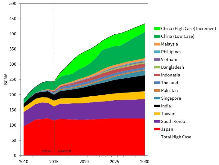
Chart 1 shows a build-up of 1st wave US export volumes, with the less certain projects on top. The bottom section of the chart shows a breakdown of capacity ownership for these projects. Some volumes have been contracted by Asian utilities. But the majority have been signed up by LNG aggregators & portfolio players. LNG export contract structures and a lack of fixed destination restrictions will greatly enhance the liquidity of LNG trading in the back end of this decade and early next decade.
Chart 1: Ramp up in US LNG exports
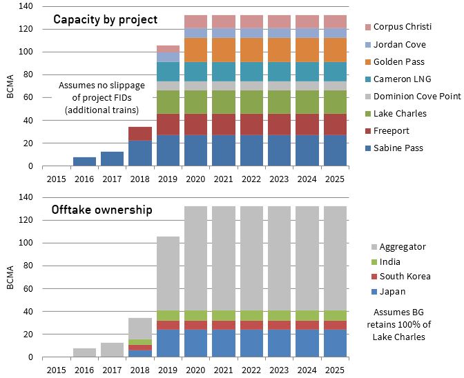
Source: Howard Rogers (OIES)
Impact of falling gas prices on US exports
There has been some confusion amongst LNG market commentators and the trade press as to how the current fall in global gas prices will impact US export projects. It is important to separate the impact of falling gas prices on:
- Investment: i.e. the ability of new US export projects to contract and reach financial close, and
- Flow: i.e. the LNG flow dynamics of committed projects once they come online.
Given that current Henry Hub prices are depressed by excess supply relative to US demand, one should not assume that by 2020, when the US may be exporting 80+ bcma of LNG, that Henry Hub will remain at present levels. Although estimates vary, $4/mmbtu is a more realistic view of the Henry Hub price needed to support the US production levels required to satisfy US demand and LNG exports in the longer term.
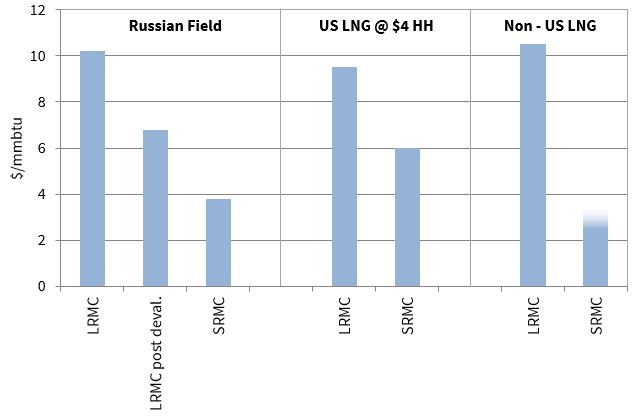
The Long Run Marginal Cost (LRMC) hurdle for new US LNG export projects is around $8.5 – 9.5 /mmbtu. This assumes a future long-term sustainable Henry Hub price of $ 4/mmbtu, the 15% premium to cover transport and feed-gas process consumption ($0.6/mmbtu), the export facility tolling fee of around $3/mmbtu and shipping/regas costs ($0.5 to $2.0/mmbtu). US netback price levels from current Asian and European LNG prices are well below this cost, meaning that new projects are going to struggle to reach FID until gas prices recover.
However this does not mean that the 1st wave US export terminals will not flow gas when they come online. The flow decision for US export contracts will be driven primarily by two factors:
- The variable cost (or SRMC) of US export contracts i.e. the Henry Hub gas price plus the (~15%) premium to cover transport and feedgas process consumption
- The US netback from global spot price signals that represent the market value for exported gas, adjusted for appropriate shipping and regas costs from the US.
Chart 2: US Export flow utilisation and pricing dynamics
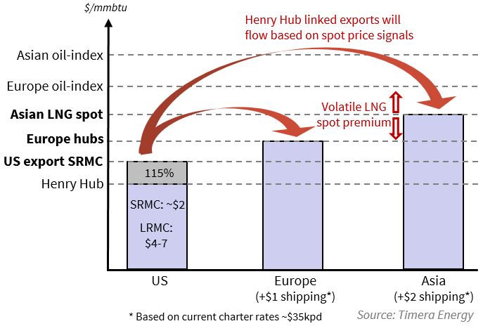
Source: Timera Energy
As illustrated in chart 2, As long as market conditions are such that 2. exceeds 1. then US gas will flow into the global market, constrained by the volume of US export capacity. The sunk capacity cost component of US export contracts (~3 $/mmbtu) will have no impact on flow decisions.
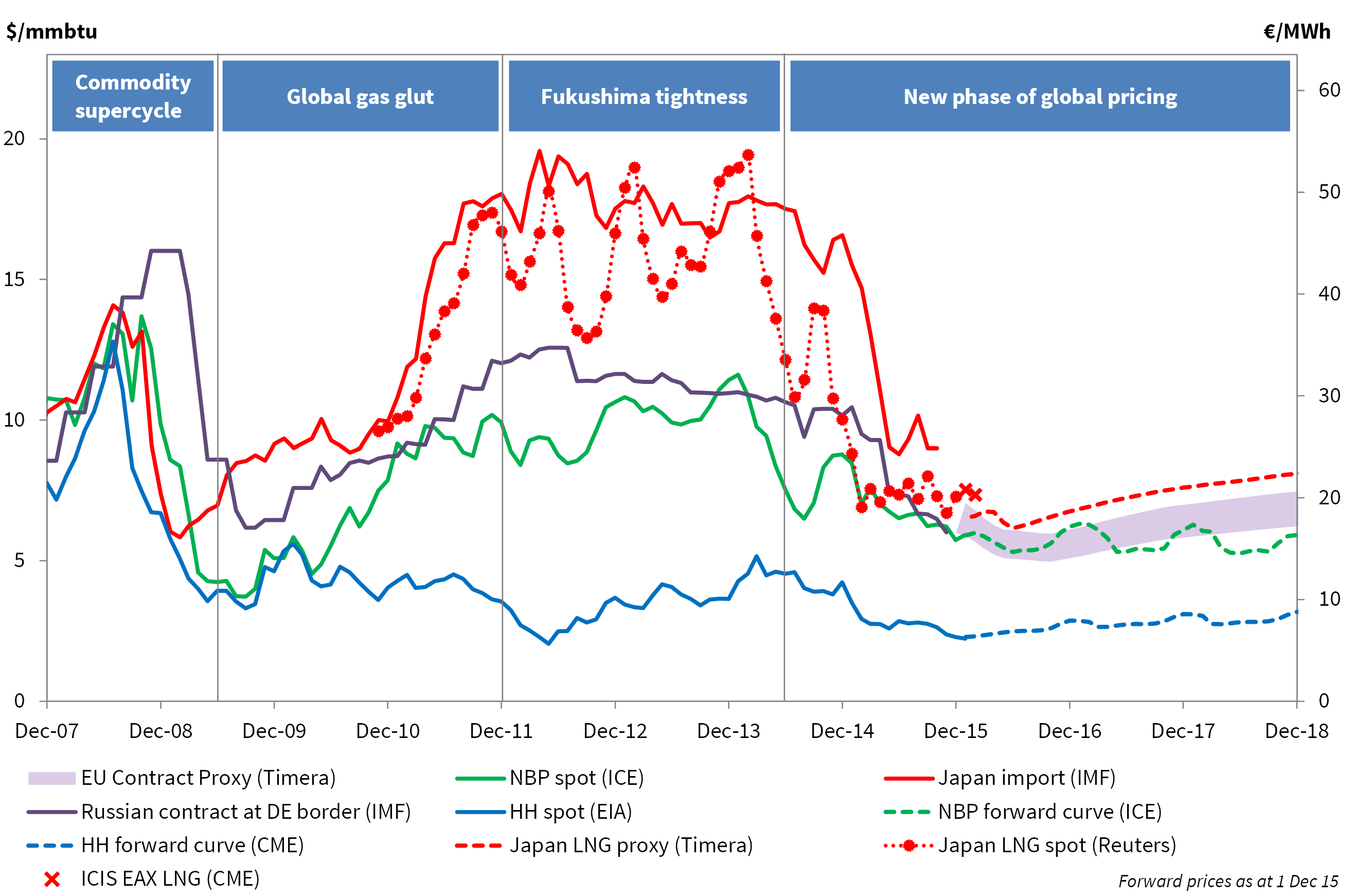
On a variable cost basis, US exports in the near term are still relatively cheap. Front month Henry Hub futures prices closed 2015 at around 2.35 $/mmbtu. Adding a 15% variable liquefaction cost premium gives an all in variable export cost around 2.70 $/mmbtu .
Falling fuel and vessel charter rates mean shipping & regas cost benchmarks are currently around 0.50-1.00 $/mmbtu to Europe and $1.50-2.00 to Asia. At the end of 2015, European spot hub prices are around 5.00 $/mmbtu and Asian JKM spot prices around 7.00 $/mmbtu. That means US netback prices of around 5.00 $/mmbtu. In other words US export contracts are still around $2.00 $/mmbtu in the money.
What US exports mean for the global gas market
The ramp up in US exports will have an important impact on the traded LNG market. Currently only a relatively small volume of global LNG supply has the contractual flexibility to respond to market price signals. BG estimates that only about 13% of contracted supply volumes are currently flexible as shown in Chart 2 (this is higher if you include uncontracted Qatari production volumes). US exports are estimated to almost double the amount of flexible contracted LNG to 25% by 2025.
Chart 2: Evolution of flexible (price responsive) LNG volumes
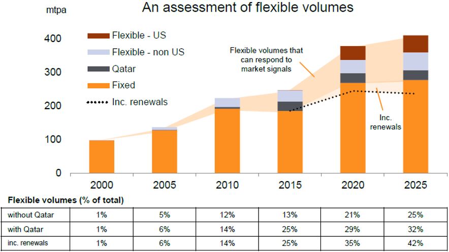
Source: BG
This ramp up in flexible LNG volumes will be a shot in the arm for LNG market liquidity. But flexible US export volumes will also have an important impact on global pricing dynamics by acting to drive:
- Global price convergence: given US LNG will tend to flow to the highest price market on a netback basis.
- Reduced LNG spot price volatility: given US exports will increase the volume of flexible gas to respond to fluctuations in global spot prices, dampening volatility.
It was assumed when US export contracts were signed that gas would primarily flow to Asia. But the Asian vs European price convergence that has prevailed in 2015 suggests that a substantial volume of US exports will now be sent to Europe, given a more attractive netback price.
The current discount of Henry Hub to Europe & Asia implies a baseload export profile for US LNG. But as LNG oversupply intensifies with the ramp up in new liquefaction capacity later this decade, it is possible that there is further compression in regional price spreads.
If spot LNG prices in Europe and Asia fall to the extent that they no longer cover variable liquefaction and shipping costs from US export terminals, it will start to choke off LNG flow from the US. This US export ‘shut in’ dynamic may become an important global price support mechanism if oversupply intensifies.
Article written by David Stokes, Howard Rogers & Olly Spinks
Global LNG and European gas workshop
Timera Energy offers tailored workshops exploring the evolution of the global LNG and European gas market fundamentals and pricing dynamics. These workshops involve Howard Rogers who, as the Director of the Gas Programme at the Oxford Institute for Energy Studies, is acknowledged as a leading industry expert in the global gas market.
If you are interested in more details please email olly.spinks@timera-dev.positive-dedicated.net