Keep an eye on the US dollar, yields and inflation

The US dollar has surged since the election. The dollar index hit its highest level in over a decade last week suggesting that the next leg of the dollar rally that started in 2014 may be under way.

A renewed dollar rally is important for energy markets because of an historically negative correlation between the dollar and commodity prices. But the factors driving the current dollar rally may have broader implications for commodity markets. A recent rise in US bond yields and a recovery in cost and wage benchmarks suggest the first uptick in inflation since the financial crisis.

USD and commodity prices

Chart 1 shows how the USD rally in 2014-15 broke a 30 year downtrend extending back to the mid 1980s.

Chart 1: US dollar index (1980-2016)

macrochart1

Source: Stockcharts.com

The USD has been consolidating in a range for the last 18 months (since early 2015). But last week the US dollar index (against a basket of major currencies) broke out of this range, rising to levels not seen since 2003. If this breakout holds, it may foreshadow the next leg of a USD rally into 2017.

We have written before on the important negative correlation between the USD and global commodity prices (e.g. oil and coal). The dollar rally in 2014-15 coincided with a sharp decline in commodity prices, shown in Chart 2.

Chart 2: CRB commodity index (1980-2016)

macrochart2

Source: Stockcharts.com

After forming what looks to be a major bottom in Q1 2016, commodity prices have surged this year, defying consensus expectations of a prolonged slump. This commodity price rally has happened against a backdrop of a range bound dollar.

If the dollar resumes its uptrend in 2017, history suggest this may create some headwinds for the current rally in commodity prices. There was already evidence of this last week, as the US dollar breakout coincided with sharp corrections in a number of commodity markets including coal.

Look to yields and inflation to explain USD rally

The 30 year down trend in the USD has coincided with a similar downtrend in US bond yields (the implied interest rates on longer term fixed income assets). This is no coincidence given yields strongly influence the cross-border capital flows that drive exchange rates.

Chart 3 shows the evolution of the US 10 year bond yield (which acts as a benchmark for global yields).

Chart 3: US 10 year bond yields (1980-2016)

macrochart3

Source: Stockcharts.com

In July 2016, US yields retested the all-time historical low level set in 2012 at around 1.35%. But yields have recovered rapidly since. Since the US election week, US 10 year yields have seen their sharpest two week rally in 15 years. As a result US yields have broken out of their major post financial crisis downtrend (as shown in Chart 3).

There are two key factors driving this move higher in longer term interest rates:

    1. Monetary policy: Global central banks appear to be stepping back from more extreme easing monetary easing policies. Support for a push towards negative yields is waning given the damage it is doing to the balance sheets of financial institutions (Deutsche Bank being a prominent example).
    2. Inflation flag: Early signs of a recovery in inflation are appearing on the horizon, after a post financial crisis period of strong disinflationary forces. The commodity price rise in 2016 looks to be an important contributing factor.

Chart 4 shows a set of US inflation benchmarks moving towards their highest levels since the financial crisis. The recovery in some forward inflation indicators, such as the Economic Cycle Research Institute Forward Inflation Gauge, is even more pronounced.

Chart 4: US inflation benchmarks

macrochart4

Source: DoubleLine Capital

What could this mean for commodity prices?

The USD may cause some headwinds for commodity prices in the near term. It is possible that a strong 2017 USD rally could even cause a sharp correction in commodity markets. But there are other factors that suggest that any weakness is likely to be temporary.

China has allowed its currency to weaken significantly against the rising USD since 2014, particularly across the second half of 2016. That should represent a shot in the arm for Chinese export industries which are a key driver of global commodity demand.

Periods of inflationary pressure have historically coincided with rising commodity prices. This is supported by the logic that commodities are priced in currency terms (predominantly in USD). And inflation erodes the value of the currency denominator.

Finally commodity market fundamentals are cyclical in nature. There is a well spoken saying that the cure for low commodity prices is low prices. Commodity prices have been trending down since 2008 and have slumped since 2014. This is resulting in a hiatus of investment in new supply and the curtailment of existing supply.

Cycles occur at different paces in different markets. For example, oil and coal markets look to be more advanced in the current cycle than the gas market. But cycles also tend to be correlated across commodities given the broader macro drivers described above.

Despite near term dollar strength, evidence appears to be building that points to a major recovery in commodity prices over the next decade.

Article written by David Stokes and Olly Spinks

Asian demand response to lower LNG prices

The Economics 101 textbook tells us that ‘if prices fall, demand should rise… all other things being equal’. It is an unfortunate reality of the real world that all other things are rarely equal. This leaves us with the practical challenge of trying to understand how LNG demand may respond to lower prices.

Price-induced LNG demand growth is one of several market clearing mechanisms that can help absorb the imminent global LNG supply glut. LNG demand response in Asia is particularly important given high levels of LNG import growth and relatively low levels of existing contract cover.

So does evidence to date support the economic theory? And how could Asian demand response evolve across the remainder of this decade? We take a look in today’s article.

2014 vs 2015 case study

We start with the empirical evidence to hand. Asian LNG spot prices fell by almost 50% from 2014 to 2015. Table 1 shows volumes of LNG consumed (and % change) across the two years.

Table 1: 2014 vs 2015 LNG demand

asian-demand-table

Source: Timera Energy

Total Asian demand fell in 2015 (year-on-year) rather than rose, confounding economic theory (in the LNG market context). This was driven by declining demand from the three biggest Asian buyers, Japan, Korea and China. China, Asia’s biggest growth market, recorded its first ever decline in LNG demand in 2015. As always, it is important to consider a wider set of drivers in play.

Falling LNG demand in these larger markets was a function of substitution to cheaper coal fired generation (coal prices also fell sharply), combined with warmer winter weather and weaker economic activity. In other words all other things were ‘not equal’.

Looking beyond the three largest importers the evidence was somewhat different. The ‘top 5’ Asian buyers are rounded off by India and Taiwan, both showing single digit percentage increases in demand. It is challenging to define how much of this volume rise relates to ‘business as usual’ demand growth versus demand response induced by lower prices.

Some of the smaller Asian markets saw significantly higher percentage rise in imports (e.g. Thailand, Singapore and Malaysia), although for several countries these rises come off a very low base e.g. Indonesia only began importing LNG in mid-2014.

But in absolute volume terms, the increases from these smaller importers is relatively limited. Asian LNG demand is predominantly driven by the top 5 buyers. Chart 1 shows the recent evolution of LNG demand across these top 5 markets.

Chart 1: LNG demand evolution of larger Asian buyers


asian-lng-demand-by-country

Source: Timera Energy

Is the picture changing in 2016?

It is dangerous to read too much into one year of empirical evidence. Demand data for 2016 is still coming in and does not yet capture the important Q4 winter consumption period. But so far LNG imports for the two big Asian buyers, Japan and Korea, are weaker over the first three quarters of 2016 (vs 2015 levels).

China on the other hand looks to have returned to import growth mode. Imports over the first three quarters of 2016 are up by more than 19% (vs 2015). But this in part reflects increases in LNG purchases as a result of an over-contracted LNG position. China has not been a particularly active buyer of spot LNG cargoes so far in 2016.

The release early next year of full year LNG demand data for 2016 will provide an interesting point of comparison. But in the meantime, let’s consider some of the factors likely to drive the evolution of Asian demand response.

Dynamics of Asian demand response looking forward

In the absence of an economic shock, it is reasonable to expect ‘business as usual’ demand growth to continue across emerging Asian LNG markets into next decade. This is supported by powerful tailwinds from expansion in energy consumption with economic growth and an increasing policy focus on emissions favouring gas over coal as a fuel.

But we suspect that several factors will limit specific increases in demand from Asian buyers in response to lower prices:

  1. Limited market mechanisms: Clear and liquid price signals are an important catalyst for price induced demand response. In Europe, liquid gas and power markets support power sector switching of gas for coal as relative prices fall. But Asian energy markets are heavily regulated and lack clean market mechanisms to induce fuel substitution. Substitution may take place anyway (e.g. there is evidence of this in 2015), but it is likely to be in lower volumes at a slower pace.
  2. Policy vs market drivers: Because gas markets are more highly regulated, procurement policy plays an important role in driving changes in demand behaviour. Changes in the procurement policy of state buyers (e.g. China) or large utilities with long term contract cover (e.g. Japan, Korea) is typically slower and more cumbersome than direct market response to price signals.
  3. Infrastructure constraints: A number of secondary buyers (e.g. Taiwan, Pakistan, Singapore) do not currently have the regas capacity headroom to ramp up demand significantly above current levels. There are also energy infrastructure constraints within a number of markets that limit the substitution of gas for other fuels e.g. limited gas-fired capacity in the power sector.

As is often the case with commodity demand, China looks to be key. In Nov 2014 CNPC laid out 115 bcma of gas to coal switching potential across the remainder of this decade (covering the power, industrial and heating sectors). But it is unclear to what extent this will (i) be met by LNG versus other sources of supply and (ii) be volume responsive to lower LNG prices.

Before the plunge in prices, China viewed LNG mainly as a source of flexible top up supply (e.g. for gas storage and peak shaving). But that was based on the premise that LNG was uncompetitive versus alternative pipeline and domestic supply. Global LNG oversupply is reshaping that competitive balance, at least for the moment. The extent of China’s policy reaction to lower LNG prices will likely be the key factor determining the potential for incremental Asian demand response.

Article written  by David Stokes, Howard Rogers and Olly Spinks

Client briefing pack

Timera Energy has published a client briefing pack ‘Global Gas Market – the path to market recovery‘. This includes an overview of current global pricing dynamics, how the LNG glut will be absorbed and the market evolution into next decade. You can download the briefing pack by clicking on the title link above or going to Latest Insights.


Global LNG and European gas market workshop

Timera Energy offers tailored in-house workshops exploring the evolution of the global LNG and European gas market fundamentals, pricing dynamics and the implications for asset values and commercial strategies. These involve Timera Senior Advisor Howard Rogers (also Chairman of the Gas Programme at the Oxford Institute for Energy Studies), who is acknowledged as a leading industry expert in the global gas market.

For more information please contact Olly Spinks.


Coal price dump and jump in animation

Spot coal prices continue to surge around the world. As winter approaches, Pacific Basin steaming coal prices have broken above 100 $/tonne. Coking coal prices are above 250 $/t.

The price action in the coal market is being driven by Chinese demand. Power plant coal inventories in China are relatively low heading into winter. Chinese steel production is also recovering at an unexpected pace.

Asian tightness is feeding through into European coal pricing, with the ARA coal price benchmark topping 85 $/t last week. Rising coal prices are reshaping the fuel cost balance in European power and gas markets.

The competitive advantage that coal fired generators have enjoyed over CCGTs for most of this decade is rapidly being eroded. Higher coal prices have supported a surge in CCGT load factors in 2016 (supported by extended nuclear outages in France). European power sector gas burn has been particularly robust since the summer, running at levels more than 50% above last year.

The sustainability of the current coal price rally looks to be one of the defining factors for European energy markets heading into 2017. So today we look at an animated view of the evolution of coal prices this decade for clues on what lies ahead.

Back to the movies: coal in animation

We have previously published animations of the spot and forward price evolution of Brent, NBP gas and UK sparkspreads. Chart 1 applies to same technique to the evolution of ARA coal prices since 2010.

Chart 1: Animated evolution of European (ARA) spot and forward coal prices (2010-2016)

coal-animation-nov16

Source: Timera Energy (based on ICE data)

Some interesting characteristics from the animation:

  • Parallel shifts: There is a very strong correlation between movements in spot prices and forward prices. In other words spot tends to drive the curve. This is a characteristic that we have shown previously with crude, gas and power prices, and a great illustration of why forward prices are not a good forecast for future spot prices.
  • Curve slope: The shape of the coal curve has undergone a transformation as the decade has progressed. From 2010-14 the coal curve was predominantly in contango (upward slope), reflecting a positive convenience yield. But as the market tipped into a more pronounced state of oversupply from 2015, the curve flattened and then shifted into backwardation (downward slope). This is consistent with market expectations of continuing oversupply.
  • Occasional prompt stress: There are occasional periods of deviations of prices in the front 3 months of the curve from the rest of the curve. These are typically short lived, with either the curve ‘catching up’ or spot ‘falling back in line’, and indicate some temporary shock to the supply/demand balance.
  • Current shape: The current shape of the curve shows quite extreme states of both backwardation and prompt stress. Spot prices sit at about a 30% premium to 2018 forward prices. The majority of that premium is located across the current winter period. History suggests to us that there is likely to be an imminent transformation in curve shape.

A self-defeating rally?

Coal supply, as for many other commodities, tends to be inelastic over the short term (i.e. it is relatively unresponsive to price). The accelerating pace of the price surge over the last three months has all the hallmarks of a market being driven up an inelastic short term supply curve. This is consistent with price insensitive Chinese buying given low inventories and a cold start to winter.

Supply may not be able to respond immediately, but it is unlikely to take too long. A key factor supporting the 2016 recovery in prices has been Chinese policy to reduce a glut of domestic production. The Q4 price rally has already seen China materially soften its policy stance on mine closures.

There is also strong recent evidence of market supply reaction from big coal producers. For example at least 8 mines are in the process of being re-opened in Australia. Most of these are anticipated to be producing by the end of this quarter or early in Q1.

The blistering rally in commodity prices since February 2016 has steamrolled bearish market sentiment. Coal has seen the sharpest rally of all. But current extreme backwardation in the coal curve suggests to us that the recent rally may be close to a near term peak.

Article written by David Stokes & Olly Spinks

The UK’s battle for new capacity: peakers vs CCGTs

An aggressive government capacity target in the Dec 2016 UK capacity auction is fuelling an intense battle to deliver new power plants.  As much as 5GW of new capacity may be required to meet the target.  Developers are competing to acquire lucrative 15 year capacity agreements, with indexed annual fixed payments that may exceed 30 £/kW.

There are only two heavy weight contenders in the battle to provide new capacity:

  1. Large scale grid connected CCGTs
  2. Small scale distribution connected peakers

Rounds one and two of the fight went to the small scale peakers.  A multitude of small peaker projects, most of them diesel fired, were successful in the 1st and 2nd UK capacity auctions.  These delivered a combined 1.5GW of de-rated capacity, despite capacity clearing prices below 20 £/kW.

In contrast, only one new build CCGT project was successful across the first two auctions (Trafford).  Construction has not yet started on this project and doubt remains as to whether it can be delivered to meet its capacity obligation at such a low capacity price.

CCGTs vs peakers: competitive balance

The rules of engagement are under review ahead of the 3rd auction in December.  Potential changes on three policy fronts may result in a revenue handicap for peakers relative to previous auctions:

  1. Ofgem announced in July that it intends to address what it sees as an unfair advantage to small scale peakers in the form of ‘embedded generation benefits’ that flow to distribution connected assets.
  2. The new UK Department of Business, Energy and Industrial Strategy (BEIS) launched a consultation last Friday on a set of adjustments to the Capacity Market rules also aimed at removing unfair advantages to small scale embedded generators (e.g. ‘double payment’ for the Capacity Market Supplier Charge on top of the capacity price).
  3. BEIS may also specifically penalise diesel peakers with new emissions limit rules, likely to be announced in advance of the December auction.

The outcome of these policy changes may substantially shift the competitive balance in favour of CCGTs.

CCGTs have higher capital costs, but also benefit from higher efficiency.  This means that they can generate significant additional revenue from the wholesale energy market, on top of capacity payments.  However, developers need to find investors or tolling offtakers willing to bear associated market risk.

Gas-fired small scale peakers (e.g. reciprocating engines) have a significant capex cost advantage over CCGTs. This helps supports high project leverage and a lower cost of capital.  But lower unit efficiency means peakers earn little in the way of energy market revenues.  Instead peaker economics are strongly influenced by revenues from embedded generation benefits.

What are embedded generation benefits?

Distribution connected peakers can service local demand, reducing the system cost burden on electricity suppliers.  Suppliers typically pass around 90% of these saved cost benefits back to the generators via Power Purchase Agreement (PPA) contracts.  The associated embedded generation benefit revenue streams that generators receive are a key factor underpinning the investment economics of small scale peaking plants.

There are several categories of embedded generation benefit revenues that peakers can access.  These include avoided transmission (TNUoS) charges, avoided system balancing charges (BSUoS) and avoided capacity market supplier charges (CMSC).  If you are interested in the details of these the categories of embedded benefits, they are summarised in Table 1.

Table 1: Summary of key categories of Embedded Generation (EG) benefits

EG benefit Overview
Avoided TNUoS charges (‘Triad benefit’) TNUoS charges are levied on suppliers based on the load measured in the 3 highest demand periods (or Triad periods). If EG is running in the Triad periods it reduces supplier net demand and TNUoS costs. Suppliers typically passes on ~90% of benefit of avoided TNUOS cost to EG. Typically most lucrative EG benefit (e.g. up to 50% of total). Significant increase in benefit by 2020.
Avoided BSUoS charges EG output reduces net demand and hence BSUoS cost burden for supplier. ~90% of this passed through to EG.
Avoided CMSC charges Capacity Market costs are recovered via CMSC charges levied on suppliers. As for TNUoS, suppliers can avoid these charges if EG is run to reduce demand. Suppliers pass on this benefit accordingly, although this revenue stream is now under review by BEIS.
Other avoided losses & charges EG can help suppliers avoid other losses and charges e.g. distribution network charges (GDUoS) and losses. These typically make up a relatively small portion of EG benefits and are likely to be more stable.

Source: Timera Energy

The BEIS consultation released last week may result in removal or reduction in revenue associated with CMSC charges.  But most important for peaker economics is Ofgem’s key concern relating to the embedded benefit revenues from avoided transmission charges, which National Grid is forecasting will rise substantially by 2020.

Potential changes to embedded benefits

Revenue gained from transmission charge avoidance is commonly referred to as the ‘triad benefit’.  Based on Grid’s forecasts of transmission cost charge increases, the triad benefit may increase by more than 50% by 2020.  This is driven by Grid’s forecast of a rapid rise in the TNUoS residual charge (the main non-locational element of TNUoS), from 45 £/kW today to 72 £/kW in 2020 as shown in Chart 1. Triad benefit increases represent a key source of projected revenue growth for distribution connected peakers, helping developers to bid projects at competitive levels into the capacity market.

Chart 1: Grid forecast increase in TNUoS residual charge

grid-residual-charge

Source: National Grid

There are two main factors driving an increase in the triad benefit:

  1. Significant transmission investment cost increases associated with the connection of new renewables capacity, specifically offshore wind in the North of the UK
  2. An increasing portion of transmission cost burden being pushed onto suppliers, in order to comply with a 2.5 €/MWh EU cap on generator burden.

Ofgem published an open letter in July 2016 setting out a specific set of concerns relating to the increasing triad benefit.  These included:

  • Prevention of a level playing field between grid connected and distribution connected power plants, which may result in an inefficient gen mix (i.e. favouring peakers over CCGTs)
  • Distortion in wholesale price signals (via peakers running out of merit during triad periods to ensure suppliers avoid transmission charges)
  • Distorting capacity market price signals (via peakers bidding in at lower prices given access to embedded generation benefits)

The open letter suggests Ofgem intends to act in some form to constrain (or reduce) the triad benefit available to peakers, prior to this year’s T-4 capacity auction in December.

Looking forward to round 3 of the battle

The December capacity auction pitches more than 8GW of new grid connected CCGT projects (and 1 GW of OCGT) against around 6GW of smaller scale distribution connected generators.  There is also a ‘wild card’ third category of capacity in the form of 2.4GW of battery storage projects. We suspect that current battery units costs are unlikely to be competitive with thermal capacity yet, but this is something to watch as a future source of capacity.

Embedded generation benefits may seem to be an obscure component of the UK power market investment landscape.  But the outcome of Ofgem’s review may swing gigawatts of new generation capacity investment in favour of CCGTs.  If Ofgem takes a light touch approach to reform of embedded benefits, then peakers may retain their advantage over CCGTs.  But larger cuts may spell the end for peakers as a competitive source of new capacity.

This is where politics may play an important role.  The government has indicated a clear preference for the delivery of large scale grid connected capacity.  This is consistent with a strong lobby from the big six utilities and UK IPPs, the dominant developers of new grid connected generation.  In contrast, the voice supporting embedded generation benefits is spread across a number of smaller developers and aggregators.

Ofgem is expected announce its decision on embedded benefits over the next few weeks.  The outcome of this policy announcement, along with the BEIS consultation on capacity market amendments, should provide a clearer view on the rules of play for the Dec auction.  Then the results of the auction itself are set to provide an important indication as to whether it will be CCGTs or peakers that dominate the delivery of new capacity next decade.

Article written by David Stokes and Olly Spinks

Long term contracting to support asset financing

Infrastructure investors are set to feature as prominent buyers of conventional supply assets, as utilities ramp up asset sales in Europe. European utilities have traditionally had the capacity to hold power stations and midstream gas assets on balance sheet. But infrastructure and private equity funds have a much greater focus on creative financing in order to maximise return on capital.

The financing of asset purchases is set to play an increasingly important role in determining transaction structures and prices. A number of assets tagged for sale come with a significant merchant (or market) exposure. Financing of these assets will depend to a large extent on the ability of buyers to secure long term contracts.

Traditionally it has been tough to secure financing without long term (10-15 year) fixed price contracts in place to cover the majority of market risk. However the interaction between Long Term Contracts (LTCs) and financing is evolving, driven by transaction deal flow, development of new assets and the refinancing of existing assets.

Today we explore the interaction between long term contracts and financing in this our final article in a series on the long term contracting of flexible supply assets.

Contracting to facilitate project finance

There are three key counterparty types that feature in a typical conventional supply asset transaction: equity investors, lenders and capacity offtakers (via LTCs). Each of these parties has conflicting interests:

  • Lenders are by nature risk averse and primarily focused on ensuring adequate cashflow to cover interest and principal repayment costs. They do not want the equity investors to default, but aside from that they have little interest in asset value upside.
  • Offtakers are primarily focused on negotiating a competitive price for capacity, while contracting as much value upside in the form of asset optionality as possible. They also have a strong incentive to push availability risk onto the asset owners (given an inability to manage it).
  • Equity investors: need to balance their primary goal of achieving a reasonable expected return on equity, against facilitating lenders with downside protection and managing value upside & availability risk via the structuring of offtake contracts.

LTCs facilitate asset financing via the protection they provide lenders on cashflow to debt. But contracting acts to narrow the distribution of asset earnings in order to achieve downside protection i.e. it reduces expected asset returns and limits value upside to equity. We illustrate this in Chart 1 by returning to our example of a tolling contract on a UK CCGT asset to illustrate the principles involved. 

Chart 1: Illustrative annual project cashflow distribution

Margin Distributions

Source: Timera Energy

Chart 1 illustrates the impact of a long term offtake contract in narrowing the asset’s margin distribution. Lenders are focused on the left tail of this distribution. They want to be protected from market downside risk even in the case of more extreme outcomes i.e. lenders want to ensure that the left hand tail of the margin distribution does not extend down into the debt service zone.

As equity investors negotiate offtake terms, they are typically concerned with three important considerations relating to the margin distribution illustrated in Chart 1:

  1. Expected return: The level of expected asset margin above debt service and fixed costs determines the expected return for equity investors.
  2. Covering fixed costs: The left tail of the margin distribution determines the likelihood of equity investors suffering negative cashflows.
  3. Upside access: The right tail of the distribution defines upside potential, with investors being particularly interested in any asymmetric value upside that acts to skew the margin distribution to the right.

The considerations set out above are driving the evolution of financing structures in European power and gas markets.

Financing innovation to incorporate market risk

Lenders have traditionally shown a strong aversity to market risk exposure. This has driven a requirement for high levels of long term contract cover to insulate asset margins from market risk, at least until the majority of debt has been paid down. But record low interest rates and a search for yield is pushing lenders to take a more open minded approach to financing structures.

Hybrid financing structures are now being developed that allow equity investors to retain a certain level of market risk. The key to these structures is giving lenders enough security on cashflow to service debt. Table 1 below sets out a high level example of terms under this hybrid approach, versus the more traditional 100% LTC model.

Table 1: Traditional vs hybrid financing structures

Traditional 100% contracted model
  • 100% capacity sold via fixed price LT contracts (e.g. 10 year)
  • Debt term to match contract (e.g. at an interest rate of 4%)
  • 1.3 x Debt Service Coverage Ratio (DSCR) requirement
  • DSCR driven by fixed long term offtake contract price
  • Up to 60% project leverage achievable
Hybrid 50% contracted model
  • 50% capacity sold via fixed price MT contracts (e.g. 5-7 years)
  • Debt term to match contract (e.g. at an interest rate of 6%)
  • 1.3x DSCR requirement
  • DSCR tested against a downside market case
  • 20-50% project leverage

Source: Timera Energy

The traditional model usually requires a relatively high level of intrinsic asset margin in order for equity investors to be able to secure an adequate fixed price on a long term contract. However extrinsic value makes up an important portion of overall margin for thermal power and midstream gas assets under current market conditions. This makes the traditional financing model difficult to achieve given the haircuts incurred when contracting extrinsic margin.

The hybrid structure opens up opportunities to finance assets that have lower levels of intrinsic value. This is particularly important for thermal power stations and midstream gas assets which are suffering from cyclically depressed market conditions. The issues involved are best illustrated via some practical case studies.  

UK-Continental interconnector

Let’s start with an asset that does benefit from substantial intrinsic margin. The premium of UK over Continental power prices means the owners or developers of interconnectors can sell long term capacity contracts at healthy price levels. This facilitates the traditional approach to asset financing. A base tranche of capacity can be sold to provide lenders with cashflow protection to service debt. As a result interconnector projects can be financed with a high ratio of debt to equity (gearing).

New UK CCGT assets

One of the drivers of the evolution of hybrid financing structures is the requirement for new CCGT capacity in the UK power market. With system reserve margins at historical lows there is a clear requirement for new capacity. However it is difficult to source long term (10+ year) tolling contracts in the UK to support traditional financing.

Project developers are focusing on using the 15 year capacity agreements as protection to secure financing under the hybrid approach set out above. Lenders appear to be comfortable with lending up to the level of capacity payments, but have a strong preference for further margin protection above this e.g. in the form of a shorter term toll or strong equity buffer. As a result, project debt levels are likely to be relatively low. This means that CCGT financing will depend on an equity structure that is prepared to take on the remaining market risk (above and beyond the level of any toll).

Continental CCGT

We finish with an example of an asset type that is likely to require pure equity financing under current market conditions. Given the level of CCGT generation margins on the Continent, it is very difficult to secure a tolling contract at a price that supports any debt. The other key challenge in Continental markets is an absence of the capacity price support that is available in the UK.

The exception to this logic is if an asset has legacy long term contracts in place for power, fuel or steam (e.g. CHP plant with steam and onsite offtake contracts). In this case these contract cashflows can be used to service debt.

These three case studies illustrate the financing challenges facing the buyers and developers of flexible supply assets in Europe. These are relatively simple examples in what is an ongoing process of evolution of contracting and financing structures that are more tolerant towards market risk.  This evolution is being fueled by the scale of European asset sales coming to market and the new sources of capital competing to invest.

Article written by David Stokes and Olly Spinks

The impact of rising coal prices

2016 has delivered its fair share of commodity market surprises. But none have been more unexpected than the sharp recovery in coal prices.  European benchmark ARA coal prices have increased by more than two thirds since January, from below 45 $/t to more than 75 $/t.

This coal price rally has been the principal driver behind the pronounced rally in European power prices since Q1 2016.  While coal prices have increased sharply, European gas prices have remained relatively weak, supporting a competitive shift across Europe towards gas-fired generation.

In this article we take a look at the drivers behind the rally, the shape of the current coal forward curve and some implications for European gas and power markets.

What is behind the rally?

Some important context precedes this year’s recovery.  Coal prices halved across 2014 and 2015 as shown in Chart 1.  As is often the case with the coal market, events have been evolving around China.

Chart 1: Evolution of key global coal price benchmarks
global-coal-prices

Source: Timera Energy (based on ICE futures settlement prices, forward prices as at 6th Oct)

China experienced negative coal demand growth in 2014 and 2015, as economic growth slowed and government measures were implemented to reduce air pollution.  Over the same period, growing domestic production overcapacity in China helped to aggravate a global supply glut.

The sharp move higher in prices in 2016 has been supported by a reduction in production overcapacity on two fronts.  Firstly, the Chinese government is taking measures to close 500 million tonnes of production capacity over the next 3-5 years (~15% decline).  Secondly, lower prices have been driving a supply side market response from global producers in the form of mine closures and mothballing.

As well as these more structural drivers, there are some shorter term factors behind the price rise.  Heavy rain has temporarily disrupted production in some big producer countries (e.g. Indonesia & China).  There has also been a big squeeze in the coking coal market as global steel production has recovered and this has fed through into thermal coal prices.

As is often the case in commodity markets, the big spot price rally has dragged the coal forward curve higher.  But Chart 1 also shows a strong current backwardation in the coal curve.  This is consistent with market expectations that some of the shorter term constraints of 2016 will ease into next year.

Implications for European power and gas prices

Despite current backwardation, coal prices for 2017 still remain around 65 $/t.  The rally in the coal forward curve has supported a 40% rise in 2017 power prices in Germany, which broke back above the 30 €/MWh last week (from around 21 €/MWh in Q1 this year).  Similar power price rises have occurred across other Continental European power markets where marginal pricing is dominated by coal plants (e.g. France, Netherlands).

European gas hub prices on the other hand have remained relatively weak in 2016, held down by robust pipeline volumes and the global LNG glut.  Up until 2016 coal and gas prices had declined in a correlated manner.  But this year’s price divergence has sharply reduced the competitive advantage that coal-fired power plants have enjoyed over CCGTs for most of this decade.

This relative change in gas plant competitiveness is having an important impact on the European gas market, as well as on power markets.  Gas-for-coal plant switching is playing a key role in influencing marginal hub prices in Europe.  The 2016 rise in coal prices has increased the gas price levels at which switching takes place.

The gas price levels at which switching takes place are an important factor determining European hub price support, also influencing spot LNG prices (given their linkage to European hubs).  For a given level of gas prices, a rise in coal prices increases gas demand from CCGTs.  Or to look at it another way, if coal prices had not risen in 2016, lower gas price levels would likely have been required to induce the CCGT load factors required to absorb surplus hub gas.

Higher prices driving coal plant out of the capacity mix

There may also be an important longer term impact of the recent reduction in coal plant competitiveness.  Rising coal prices are materially eroding coal plant generation margins. This comes at a bad time for plant owners as it coincides with an increasing European policy shift against coal generation as efforts increase to tackle emissions.

The 2016 coal price rally appears to be the nail in the coffin for most of the UK coal plant fleet, which is penalised by the additional burden of the carbon price floor.  France looks to set to introduce a similar carbon penalty on its coal generators in 2017 which should induce a similar result.

More broadly across Europe, accelerated coal plant closures are likely to be an important topic of discussion in utility boardrooms.  If Europe wants to decarbonise, cheap gas and rising coal prices are making it easier.

Article written by Olly Spinks & David Stokes

Gas rebalancing 2: the path to price recovery

The first half of this decade saw an LNG investment boom.  High gas prices and optimistic Asian demand projections supported a flood of Financial Investment Decisions (FIDs) in new LNG liquefaction capacity.  These investment decisions are the source of the current oversupply and depressed gas prices, conditions that are set to dominate the second half of the decade.

However since 2015, investment in new supply has almost dried up as global gas prices have crashed & converged.  The impact of this investment drought is being concealed by a deepening supply glut.  Long delivery lead times on projects already signed off mean there is more than 150 bcma of capacity still under construction to be commissioned by 2020.  But a lack of investment beyond the current pipeline of new supply is creating the conditions for a price recovery early next decade.

While investment in new supply has ground to a halt, important structural drivers continue to support global demand growth.  European import dependency is increasing as domestic gas production declines.  Asian demand growth, while slower than the optimistic estimates of earlier this decade, is still a force to be reckoned with.  And there are tailwinds for global gas demand from a growing focus on decarbonisation and reduction in coal burn.

The global gas market may still be descending into the tunnel of oversupply.  But we suspect that this tunnel is shorter than many people think. And with long delivery lead times in the gas investment cycle, light may already be visible on the other side.

3 phases of global market rebalancing

In today’s article we set out our view of the path to global gas market price recovery.  We break this recovery out into three phases:

  1. LNG glut: clearing the current global glut associated with committed new liquefaction capacity
  2. Russian pricing power: absorbing approximately 100 bcma of ‘shut in’ Russian production capacity
  3. New supply: A global requirement for incremental new production capacity

Last week’s article focused on a deeper dive analysis of Phase 1 and the mechanisms that can clear the current LNG glut.  Today we use the same scenario framework but adjust our perspective to focus out over a longer time horizon into next decade.

Chart 1 shows the global market volume balance diagram from last week, overlaid on a schematic illustration of price dynamics for each of the three phases.

Chart 1: Schematic illustration of 3 phases of price recovery

global-pricing-chart-1

Source: Timera Energy

Phase 1: LNG glut

Phase 1 represents the world we are already in. Downward price pressure from a global surplus of LNG is forcing the convergence of Asian and European prices towards US Henry Hub support. Regional price spreads are increasingly converging to levels driven by the variable cost differentials of moving gas between regions. Phase 1 conditions are summarised in Table 1.

Table 1: Summary of Phase 1 – LNG glut

Market balance Volume response Price dynamics
  • Global oversupply, as committed new LNG liquefaction capacity outstrips demand growth
  • 4 market clearing mechanisms act to clear surplus LNG (see description last week).
  • Key balancing role for European power sector switching & US LNG shut ins
  • Asia, Europe & US prices converged to variable transport costs.
  • Potential for oil vs gas price divergence if oil market recovers ahead of gas.


We set out last week the 4 key market clearing mechanisms likely to provide the incremental volume response to clear the LNG glut (European switching, Asian demand response, US & Australian LNG shut ins). If you believe Russia will materially change its strategy in response to lower prices then consider this is a 5th mechanism. The influence of these clearing mechanisms erodes the influence of long term oil-indexed gas contracts and shifts the focus towards Atlantic basin hub prices (e.g. NBP/TTF and Henry Hub).

The increasing importance of hub price signals and a rapid rise in flexible US export volumes, is set to support an increase in global gas market liquidity. Oversupply itself is a great catalyst for the development of market liquidity, given the requirement to clear surplus gas volumes via spot markets (e.g. as seen in Europe in 2008-10). These conditions set the stage for a declining influence of long term oil-indexed contracts and a rising importance of short to medium term hub linked deals.

Oversupply and maturing gas market liquidity also support the potential for a structural divergence of oil and gas prices. If the oil market stabilises and recovers before the gas glut is absorbed, then gas oversupply is likely to dampen the influence of oil-indexed contract prices in driving a parallel gas price recovery.

Phase 2: Russian pricing power

Phase 2 commences once the LNG glut has been absorbed and the world needs incremental supply. In our view that does not mean a sudden return to Long Run Marginal Cost (LRMC) driven market price signals, as many analysts assume. The reason for this is an existing surplus of Russian gas, over and above current contracted volumes. Phase 2 conditions are summarised in Table 2.

Table 2: Summary of Phase 2 – Russian pricing power

Market balance Volume response Price dynamics
  • Global gas glut absorbed
  • Europe and/or Asia need incremental gas supply
  • Asian demand growth may pull LNG away from Europe, to be backfilled by Russia
  • 100+ bcma of ‘shut in’ Russian gas well placed to meet incremental demand
  • US exports flow to balance Asia & Europe
  • Russian flows have a strong influence on marginal pricing, reviving the influence of gas price linkage to oil
  • Asian & European prices remain converged but with rising short term volatility


The key dynamic of the 100+ bcma of ‘shut in’ Russian gas is that it can be flowed into Europe based on Short Run Marginal Cost (SRMC) price signals. This shut in gas is located in West Siberian gas fields developed by Gazprom in anticipation of higher European demand growth. Loss of Russian market share from Gazprom to other Russian ‘independents’ has also contributed to the volume of shut in gas.

Prior to the building of a possible future Altai pipeline, this shut in gas is entirely in Europe-facing Russian fields. But it can also indirectly satisfy Asian demand growth by allowing flexible LNG flows (e.g. US exports) to be diverted to Asia, while Europe ‘backfills’ these with incremental Russian gas.

Gazprom has historically chosen not to flow this gas at price levels below existing long term oil-indexed contract prices. To do so would act as a catalyst for hub versus contract price divergence and development of hub liquidity, both of which Gazprom considers to be against its strategic interests.

This surplus of ‘shut in’ gas puts Russia in a very strong pricing position once the current LNG glut is absorbed. As long as Russia sells this gas at a sufficient discount to new LRMC, it can block new supply (e.g. in the form of new ‘second wave’ US export projects).

It is unlikely that Gazprom will significantly undercut its existing oil-indexed contract prices.  This points towards a resurgence in the influence of oil-indexed pricing on hub prices (as has been experienced across much of the last 20 years).

It also sets up the conditions where European gas prices can diverge from Henry Hub. High volumes of flexible US export flows (80+ bcma capacity by 2020) are likely to ensure Asian and European prices remain structurally converged to variable transport cost differentials. But a tightening global market may result in greater short term inter-regional price volatility.

Phase 2 represents a key step on the path from SRMC to LRMC driven market price signals. While Russia is in a position to delay new LRMC driven supply, this is only a temporary situation. 100 bcma of Russian gas is likely to satisfy only 3 to 4 years of incremental supply requirements, less if you assume more robust global demand growth. Beyond that, the LRMC of new supply is set to reassert its influence on gas pricing.

Phase 3: New supply

Phase 3 is about the transition to investment in new LNG production capacity. This may seem a long way off (mid 2020’s in our illustrative scenario). But project delivery lead times are typically around 5 years. That means producers needing to convince themselves of a price recovery to cover LRMC, 5 years in advance of new supply coming online. The dynamics of Phase 3 are summarised in Table 3.

Table 3: Summary of Phase 3 – New LNG supply 

Market balance Volume response Price dynamics
  • Russian ‘shut in’ gas volume absorbed
  • Incremental global gas supply required
  • LRMC competition to provide new supply
  • 5+ year delivery lead times on new projects
  • Global prices rise to support new project LRMC
  • Structural European and Asian price convergence, but with significant shorter term regional price volatility


The sources of new supply are not yet clear. But there appears to be a cluster of potential options in a 9-11 $/mmbtu LRMC range. These include ‘second wave’ US export projects, new Russian supply & Non-US LNG projects (e.g. East Africa & Canada). Wherever new gas comes from it will require a price signal from Europe and/or Asia.

As for Phase 2, market tightening is unlikely to result in structural Asian vs European price divergence (e.g. as seen post-Fukushima). By the end of this decade there will be large volumes of flexible supply that can arbitrage any structural price differences, including US export volumes and other LNG supply contracts with diversion flexibility.

Asian and European prices may diverge from Henry Hub in order to provide a market signal for new supply.  But the extent of any structural diversion should be limited by the costs (fixed & variable) of developing new US export capacity.

The conditions for short term regional price volatility in a tightening market remain. There are structural lead times, often 2 to 3 weeks, for the LNG supply chain to respond to shorter term price regional price divergences. This volatility will be an important price signal for LNG portfolio supply flexibility.

What does the path to price recovery look like?

Breaking gas market rebalancing into phases of recovery helps focus in on the transition between the different drivers of global gas prices. The dominant driver of marginal pricing across the different phases is as follows:

  • Phase 1: Atlantic Basin hub prices (Henry Hub, NBP/TTF)
  • Phase 2: Russian pricing power and the revival of oil-indexation
  • Phase 3: LRMC based competition to provide new supply

In Chart 2 we show how the three phases come together, in an illustrative scenario of the evolution of global gas prices to 2030.  It is not a price forecast.  The intention of this scenario is to present a reasonable view of the relationship between LNG market balance and regional price evolution through the three phases.  To the extent your views differ on key assumptions such as demand growth, market balance and Henry Hub price evolution, the scenario can provide a useful point of contrast.

Chart 2: scenario projection of global price recovery (2016-30)

global-pricing-chart-2

Source: Timera Energy

The scenario shows the convergence of regional prices until 2020, with Henry Hub providing key global price support in an oversupplied global market.  Asian and European prices then undergo a significant recovery in the early 2020s as the LNG glut is absorbed.  This is driven by the ability of Russia to exert its pricing power to lift prices back towards LRMC. This is likely to coincide with a revival of the influence of oil-indexed contracts on European hub prices.

New supply is required from the mid 2020’s.  In practice this means upstream investors needing to convince themselves of a price signal to cover LRMC costs of new production, 4 to 5 years in advance.  This LRMC price signal may start to emerge via long term contract prices underpinning investment in new supply, in advance of spot prices returning to LRMC levels.  Or it may be that producers have to bear significant price risk in anticipation of market recovery.

Long investment lead times can actually result in the boom to bust cycle of this decade working in reverse.  Price recovery may seem a distant prospect from the depths of the supply glut in 2018-19.  But if new supply is not FID’d shortly after, the global market may once again be very tight by the mid-2020s.  These boom/bust dynamics are an inherent characteristic of long upstream delivery lead times.

The timing of phase transition is a key source of uncertainty.  Our scenario in Chart 2 is based on reasonably conservative demand growth assumptions.  If global demand recovers more quickly, then the phasing logic is accelerated.  Similarly, if demand growth is weak and/or investment in new supply comes too early, then there may be a slower progression through the phases.

But there are some important pricing dynamics that are likely to emerge regardless of phase timing:

  1. Europe will play a pivotal role in clearing the global gas market, given its liquid hubs, alternative supply sources, power sector switching potential and supply contract flexibility.
  2. European and Asian prices are likely to remain structurally converged, given a rapid growth in volumes of flexible LNG supply (driven particularly by US export growth).
  3. Short term inter-regional price volatility will not disappear, given there are structural lead times for the LNG supply chain to respond to market price signals.
  4. Gas market maturity will erode the dominance of long term contracts, with a shift in focus to managing exposures over shorter time horizons against liquid hub price signals.
  5. Intermarket linkages are becoming increasingly important, with growing connectivity between gas vs coal prices and US vs Europe vs Asia gas prices (and these are likely to grow in importance relative to the traditional gas vs oil price relationship).

The current gas glut is acting as a catalyst to support the evolution of these dynamics. Rebalancing, price recovery and the requirement for new upstream investment may be closer than you think. And the path to recovery is likely to drive a transformational evolution of the global gas market from the interlinked regional markets we know this decade.

Article written by David Stokes, Olly Spinks and Howard Rogers

Client briefing pack

Timera Energy has published a client briefing pack ‘Global Gas Market – the path to market recovery‘. This includes an overview of current global pricing dynamics, how the LNG glut will be absorbed and the market evolution into next decade. You can download the briefing pack by clicking on the title link above or going to Our Publications.


Gas rebalancing 1: Clearing the global gas glut

The global gas market has been shocked by the pace and scale of transition from boom to bust. At the beginning of 2014 suppliers were paying a lofty 20 $/mmbtu for LNG in a market that was anticipated to remain tight for years. By early 2016 producers were struggling to sell surplus cargoes for 5 $/mmbtu, 75% below the levels of just two years earlier. A bust of these epic proportions was not supposed to happen.

The initial shock has now passed and gas market consensus has digested the phenomenon of a state of global oversupply. But global demand growth remains sluggish and supply continues to grow. More than 50 bcma of new LNG liquefaction capacity has been commissioned since 2014. In addition, there is a visible pipeline of at least another 150 bcma of committed new capacity coming to market by 2020.

But as the dust from the bust starts to settle, attention is shifting to some key questions. How will the global market clear the evolving gas glut? And how will this impact the evolution of pricing dynamics and the gas market investment cycle?

Almost everyone in the gas and power industries has a vested interest in the answers to these questions, either explicitly or implicitly. In the next two articles we set out our take on the answers.

Global market rebalancing series

Rebalancing of the global gas market is a complex area with a heavy dose of uncertainty. But it is our view that the drivers behind market rebalancing can be broken down via a relatively simple logic. Over the next two weeks we set out our thesis on:

  1. The market mechanisms that will clear the current gas glut
  2. The path to global gas price recovery and why this may start sooner than expected

We will do this as much as possible using a practical scenario illustration of the evolution of global supply and demand volumes and regional gas prices.

In today’s article we focus on the key price/volume mechanisms that we believe will interact to clear the current market glut.

Evolution of the global market balance

In a nutshell, the current global oversupply of gas is the result of new LNG supply outpacing demand growth. Investment decisions in new liquefaction capacity earlier this decade were based on overly optimistic forecasts of demand growth, particularly in emerging Asian markets. The legacy of these decisions is still feeding through in the form of committed new supply, given relatively long delivery lead times for new liquefaction projects (around 5 years).

This overhang of surplus LNG is the primary driver behind the current global oversupply of gas. There are important domestic gas market dynamics at work behind this within regional markets across Asia, Europe and North America. But understanding how the global surplus of LNG can be cleared is a key starting point.

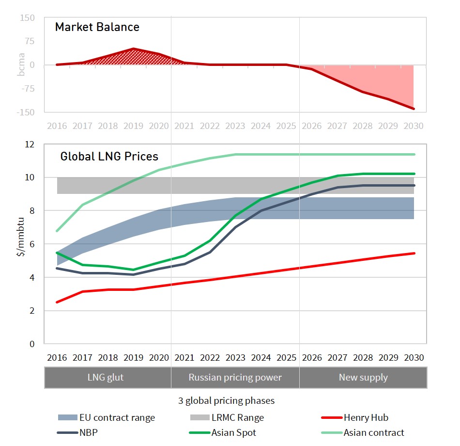
Chart 1 illustrates the LNG supply glut in the context of a scenario of the evolution of the global LNG supply and demand balance to 2030.

Chart 1: LNG supply glut and scenario evolution of global market balance (2016-30)

global-gas-balance-scenario

Source: Timera Energy

There is a cascading logic to the progression of the charts:

  1. Top chart: In the top chart we show a combined LNG market balance for non-European LNG importing nations. These consist of Asian importers plus ‘other’ smaller importers, predominantly in South and Central America. ‘Asian and other’ buyers typically have first call on global LNG supply, given demand is dominated by less flexible buyers with long term contracted volumes and LNG specific import requirements.
  2. Middle chart: The middle chart shows how LNG sits in the aggregate European gas market balance. Europe is broken out separately from other markets because it has liquid hubs, alternative supply sources and relatively flexible LNG supply contract structures. This means Europe plays an important role as a swing market to help clear the global LNG balance. Any surplus or deficit of LNG from the top chart (‘Asian and other’) can be thought of as cascading down into the European market.
  3. Bottom chart: Supply volumes in the top two charts assume LNG liquefaction capacity operates at full target production levels. Demand volumes assume ‘business as usual’ demand based on current market price levels. Any surplus or deficit of LNG that cannot be absorbed via European market swing flexibility under these conditions, creates a global LNG imbalance (surplus or deficit) shown in the bottom chart.

For simplicity the North American gas market is not explicitly shown in these charts, primarily because it is largely gas self sufficient (i.e. a net exporter of LNG).  The US market however plays a very important implicit role in clearing an oversupplied global market which we set out in more detail below.

As growth in new LNG liquefaction capacity outpaces demand growth over the next three years, a growing global surplus of LNG emerges over and above ‘business as usual’ Asian & European requirements. The surplus in this scenario, peaking at 68 bcma (49 mtpa) in 2019, is represented by the red shaded ‘LNG glut’ triangle in the second and third charts.

The scale of the LNG glut is actually relatively small (e.g. versus aggregate European demand).  But even small volumes of oversupply can induce big price moves in order to induce an adequate market clearing response.

It is important to note that while this glut triangle is a representation of LNG oversupply, the market will always clear. What the triangle illustrates is the incremental supply and demand response required to allow the global market to clear (versus a business as usual scenario). But what are the market mechanisms that act to clear this LNG glut?

Clearing mechanisms at work

Clearing the glut of LNG is about inducing incremental volume response. In other words, it is about inducing market participants to adjust the volume of their production and consumption decisions in response to market price signals.

In our view there are four key mechanisms that can drive this. Two of these involve incremental demand response (as a result of lower gas prices) and two involve the ‘shut in’ of price sensitive supply. The four mechanisms are summarised in Table 1 below, along with a range of potential volume response.

Table 1: Summary of four key clearing mechanisms to clear the global LNG glut

Clearing mechanism Potential volume Volume dynamics Key price relationships
European power sector switching 10-40 bcma Power sector gas demand increases as CCGT load factors increase at lower hub prices Relative gas vs coal price levels driving switching relationship between gas and coal plants
Asian demand response 5-20 bcma Asian buyers (e.g. China, India) purchase incremental volumes as prices decline Available LNG purchase price terms vs alternative energy supply terms e.g. pipeline contracts, oil
Shut in Australian exports 0-10 bcma Australian export volumes may fall if netback spot LNG prices don’t cover feed gas costs Netback cost of LNG sales vs variable cost of liquefaction feed gas
Shut in US exports 0-80 bcma US export volumes may fall if netback spot LNG prices do not cover variable costs Premium of Europe and Asian spot prices vs US Henry Hub (+ variable transport)

Source: Timera Energy

There is arguably a fifth clearing mechanism in the form of Russian production flexibility.  The reason we have not specifically broken this out is that we assume that through the duration of the LNG glut, Russian acts to maintain its European market share (at around 150 bcma) rather than responding to prices.  This is consistent with historical behaviour.

Our scenario summary on how the four mechanisms interact to clear the LNG glut shown in Chart 2.

Chart 2: Scenario projection of how 4 clearing mechanisms clear the LNG supply glut

gas-glut-zoom

Source: Timera Energy

European power sector switching:

Clear evidence is emerging in 2016 of European power sector demand response to lower gas hub prices. CCGT load factors in gas dominated power markets such as the UK and Italy have risen substantially year on year. Even Continental power markets dominated by cheaper coal plants have seen switching to CCGTs over the summer.

There are two important price drivers behind this switching. A weakening of gas hub prices, caused in part by a steadily growing flow of LNG imports. Coal prices have also been recovering in 2016, lowering the gas price hurdle required to induce higher CCGT load factors.

European power sector switching is currently a key driver of marginal pricing dynamics across European hubs. It will also in our view be an important clearing mechanism as the LNG surplus grows (2016-19). We set out here why we think there may be up to 30-40 bcma of potential switching demand response in Europe.  Some of this switching volume may end up being permanent, with weakening coal plant economics resulting in the closer of older coal assets (as is happening already in the UK).

Asian demand response:

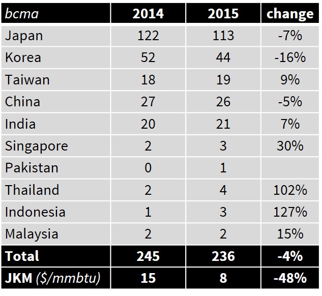
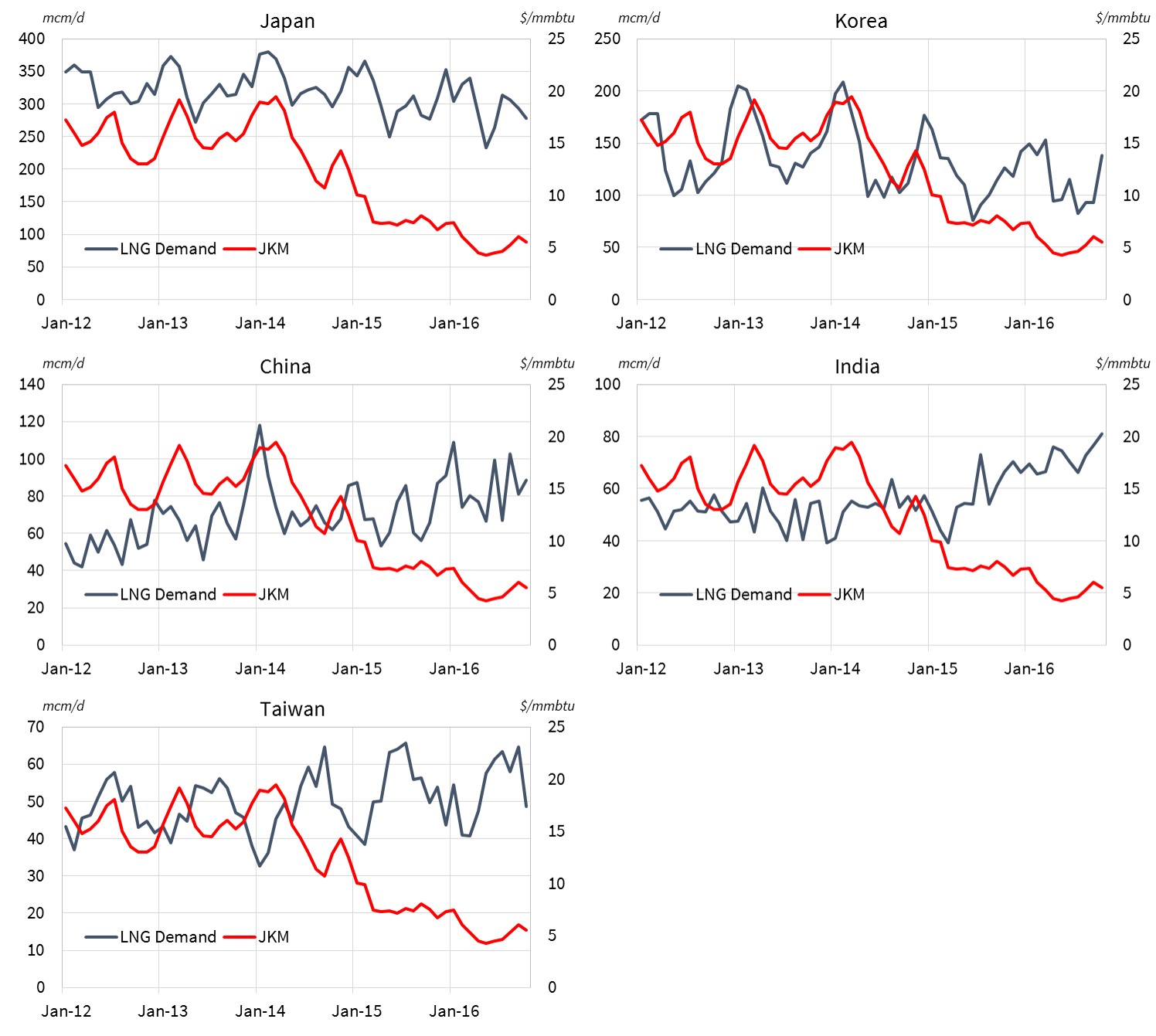
In theory Asian buyers should also be able to respond to falling LNG prices by increasing import demand volumes. But the practical evidence of this is so far limited. Despite a 50% fall in Asian LNG spot prices from 2014 to 2015, Asian LNG demand actually fell 4%.

Practical opportunities for physical substitution of gas for other fuels (e.g. coal and oil) are relatively limited. Some markets also face regas import capacity constraints. But most importantly, demand response is hampered by a lack of transparent market price signal mechanisms to induce the purchase of higher LNG volumes.

Asian LNG purchasing strategies tend to be driven by national policy and domestic portfolio considerations, in markets that consist largely of captive end users. Under these conditions the emergence of LNG demand response to lower prices is likely to have both a gradual and a limited impact in clearing the LNG glut.

Australian LNG exports shut in:

There is some speculation that low spot prices may induce a reduction in export volumes from the three Queensland liquefaction terminals (QCLNG, APLNG, GLNG) that have been developed based on coal bed methane feedgas. The logic here is that exports are uneconomic if netback spot prices don’t cover feedgas costs.

The most vulnerable of the three projects to export volume reductions is the Santos GLNG terminal given a shortage of feed gas relative to export capacity. If Santos needs to purchase incremental feedgas, it has a clear cost base against which exports may be reduced. But in practice this volume is relatively small and may not exceed the level of long term contract cover (around 85%).

In our view Australian exports under long term contract which are backed off by coal bed methane feedgas resource are less likely to be shut in. Coal bed methane production cost signals are relatively complex. There is also an environmental angle to ramping down production given a powerful domestic anti-fracking lobby (led by the agricultural sector). These factors suggest to us that disruptions to targetted production levels are likely to be limited.

US LNG exports shut in:

The US is a different story to Australia. The cost base of LNG terminal feedgas is driven by a liquid and transparent price signal in the form of Henry Hub. LNG export contract structures are also highly flexible in their ability to respond to price signals.

As long as netback spot prices cover the variable costs of Henry Hub, liquefaction and transport, LNG will flow out of the US. But if netback spot prices (e.g. in Europe & Asia) fall below this hurdle then US LNG will be shut in. US shut ins are likely to be highly price responsive i.e. within a 1 $/mmbtu range in netback spot prices, there could be upwards of 80 bcma of shut in volume response by 2020.

As a result, we view US shut ins as the backstop global clearing mechanism for the evolving LNG supply glut. In other words it is US LNG flexibility that can provide whatever additional volume response is required over and above the other three clearing mechanisms.

How do clearing mechanisms interact to clear the glut

The scenario we set out above shows an LNG supply glut of 68 bcma (49 mtpa) evolving by 2019 as new liquefaction capacity outpaces demand growth. Of the four sources of incremental volume response, we anticipate European power sector switching and US shut ins interacting to play the most important role.

US shut ins are likely to play a particularly important role as the marginal clearing response mechanism in the global market given their sensitivity to price signals. If the supply glut turns out to be less severe than we show in the scenario, then a lower volume of US LNG shut ins is required. If the glut is more substantial, then higher volumes of US shut ins are needed to make way for less flexible supply sources. This balancing role of US export flows significantly increases the importance of Henry Hub in driving global gas pricing dynamics (something we come back to next week).

It is our view that the current LNG glut is more of a 5 year than a 10 year phenomenon. There are important structural factors eroding the LNG surplus, as well as the market response mechanisms we describe above. These include declining European production, emerging Asian demand growth and the current hiatus of investment in new supply.

There is currently a strong industry focus on the immediate issues of a deepening supply glut. But rebalancing and recovery may not be that far out of sight, particularly given a 5+ year lead time to develop new LNG supply.

So how does the path to recovery look? What happens to global gas prices as the market rebalances? What are the implications for portfolio exposures and the gas investment cycle? These are questions we address next week as we look beyond the current glut at the three phases of market recovery.

Article written by David Stokes, Olly Spinks and Howard Rogers

Client briefing pack

Timera Energy has published a client briefing pack ‘Global Gas Market – the path to market recovery‘. This includes an overview of current global pricing dynamics, how the LNG glut will be absorbed and the market evolution into next decade. You can download the briefing pack by clicking on the title link above or going to Our Publications.


Global LNG and European gas market workshop

Timera Energy offers tailored in-house workshops exploring the evolution of the global LNG and European gas market fundamentals, pricing dynamics and the implications for asset values and commercial strategies.  These involve Timera Senior Advisor Howard Rogers (also Director of the Gas Programme at the Oxford Institute for Energy Studies), who is acknowledged as a leading industry expert in the global gas market.

For more information please contact Olly Spinks.


Evidence of a 2016 recovery in gas price volatility

Prompt gas price volatility is the key market price signal for short term supply flexibility response.  Volatility plays a key role in determining the risk that gas suppliers face in supplying customer portfolios.  Volatility also has a strong influence on the value of flexible supply assets. For example, it is an important driver of capacity sales revenue for the owners of storage, pipeline & interconnector assets.

Spot volatility at European hubs has remained subdued since the start of this decade.  This has been due to weak gas demand and a prolonged surplus of supply flexibility at European gas hubs.  But evidence is building in 2016 of what may be the start of a more structural recovery in European gas price volatility.  Recent issues with the UK’s Rough storage asset, and uncertainty over it’s long term future, are playing an important role.

We provide fairly regular updates on historical volatility.  Today we also look at an alternative measure of gas price fluctuations: implied volatility.  This is a benchmark “implied” from the prices of traded gas options (see boxed section below) and is becoming an increasingly useful source of information on volatility as gas options liquidity at the UK NBP and Dutch TTF hubs improve.


Implied volatility on the rise

The attraction of implied volatility as a benchmark, is the immediacy of its responsiveness to changes in market conditions.  It represents a current, forward looking, market view on the level of volatility. This is in contrast to historical volatility which is by definition backward looking.  For further details on the characteristics of implied vs historical volatility see the box below and a previous article on the subject.

Historical vs implied volatility

Volatility can be estimated from historic price movements (‘historic volatility’).   Volatility can also be estimated or implied from traded options prices (“implied volatility”).  This is done by reverse-engineering the volatility consistent with the observed option price using a standard option pricing model. Implied volatility benchmarks have the advantage over historic volatility measures in that they are forward looking and include information on market expectations of future volatility (rather than what has happened historically). Implied volatility relies on access to prices or quotes for traded options.  This means that implied volatility benchmarks are less accessible than historical volatility benchmarks (which can more easily be calculated from publicly available price information).


In layman’s terms, an increase in implied volatility can be interpreted as an increase in the market risk premium priced into traded options.  This can be seen in practice in Chart 1 which shows a pronounced pickup in the implied volatility of NBP gas contracts across 2016.  The volatility measure displayed on the chart comes from the front month NBP ‘at the money’ call option, based on Marex Spectron* data.

Chart 1: Implied volatility of UK NBP front month “at-the-money” call option

nbp-implied-volatility

Source: Timera Energy (data from Marex Spectron)

The rise in NBP implied volatility at the start of the 2016 was driven by rapidly declining oil and gas hub prices.  Volatility rose again in Q2 2016 as the result of a pronounced short squeeze.  Since June, NBP volatility levels have been elevated by the outage issues at the UK’s Rough storage facility.  Brexit has also helped by increasing the impact of GBP exchange rate volatility on NBP gas prices.

Rough storage plays an important role in dampening gas price fluctuations at the UK NBP.  This is because gas is withdrawn from Rough in periods of higher prices and gas is injected in lower priced summer periods.  The complete injection outage on Rough this summer has been a big factor driving higher NBP volatility, as prices have fallen more than they otherwise would have without Rough to absorb surplus gas.  Looking ahead to the coming winter, reduced Rough withdrawal capability is likely to continue to support volatility via more pronounced periods of higher prices.

An interesting observation on Chart 1 is that the implied volatility benchmark is itself quite volatile.  This reflects the limited liquidity in the gas options market in Europe.  Price swings in relatively thinly traded options contracts can translate into big fluctuations in implied volatility.  This is particularly the case when demand for options rises sharply relative to available liquidity e.g. the surprise Rough outage announcement this summer.  However these sharp swings in implied volatility are typically short lived as liquidity returns and the market responds to arbitrage opportunities.


Historical volatility tells a consistent story

One key limitation of implied volatility as a benchmark is the relatively short available historical data set. It is only over the last three to four years that gas options liquidity has evolved to the point that supports sensible estimation of implied volatility.  To understand the evolution of NBP price behaviour over a longer 15 year time horizon we return to historical volatility in Chart 2.

Chart 2 Evolution of NBP historical volatility (2001-16)

nbp-historic-volatility

Source: Timera Energy

The recovery in historical volatility in 2016 (Chart 2) is not as pronounced as the one in implied volatility (Chart 1).  But the perspective of a 15 year horizon also appears to suggest that 2016 may be marking the start of a volatility recovery.
Recovering volatility is consistent with several important fundamental drivers at work in the European gas market:

  • Ageing & closing supply flexibility infrastructure (e.g. Rough and Groningen)
  • A lack of investment in new flexible supply infrastructure this decade given weak market price signals
  • Increasing swing demand from gas-fired power stations as load factors recover
  • Increasing intermittency as development of wind and solar capacity continues

The fact that implied and historical volatility benchmarks are both pointing towards a recovery is an important sign that these fundamental drivers are starting to make an impact.

Article written by Olly Spinks & David Stokes

*For more information about the Marex Spectron implied volatility data please contact Richard Frape.

The impact of declining offshore wind costs

Competition between European utilities to deliver offshore wind projects is hotting up as companies refocus their business models towards renewable generation development. The low carbon generation technology landscape has been redefined by the results of two offshore wind tenders over the last month.

DONG won a July tender to develop two 350MW projects off the Dutch coast at a jaw dropping 72.70 €/MWh.  Only to be out done by Vattenfall who won a 350 MW Danish offshore tender last week for 63.80 €/MWh.  These numbers have smashed a cost target set by DONG in 2012 to reduce offshore costs below 100 €/MWh by 2020 (at the time costs were around 160 €/MWh).

Costs reductions are being driven by factors such as technology innovation, larger turbine sizes, falling raw materials prices and lower financing costs. Low tender prices in the Dutch and Danish auctions also reflect governments de-risking tendering processes by easing consenting, providing relevant wind & ocean data and excluding grid connection costs.

Falling offshore wind costs come at an important time for the European renewables industry.  Consumers and governments across Europe have become more sensitive to rising low carbon subsidy related charges on electricity bills.  But the combination of falling offshore wind costs and lower commodity prices is helping to alleviate consumer pain.

In this article we set out five factors to consider in relation to falling offshore wind costs and their impact on the evolution of European energy markets.

1. Offshore wind is an increasingly competitive technology 

Because of its rapidly declining cost curve, offshore wind now appears to be gaining a significant advantage in the low carbon technology race. Onshore wind sites are increasingly hard to find and technology costs are maturing.  The costs and delivery risk associated with nuclear plant are rising rather than falling.  The lifecycle environmental and sustainability benefits of large scale biomass look to be increasingly dubious. And large scale solar is a difficult prospect in most of Europe given winter peak loads and lower load factors.

The UK National Audit Office published a report in July 2016 which contained analysis of different low carbon technology costs.  Chart 1 shows how mature (2025) technology costs estimates have evolved over the last six years.  The downwards trend is clear and this analysis does not account for the shock cost reductions this summer which are clear evidence of faster cost decline rates for offshore winds.

Chart 1: Forecast of levelised costs in 2025 for renewable technologies in the UK

nao-renewable-costs

Source: Nuclear Power in the U.K, National Audit Office, July 2016

2. Support and competition is driving down offshore wind costs   

The scale and cost of European support for low carbon technology has not been without its critics.  On a global scale, the direct emissions reduction benefits from European renewable generation development are relatively small.  But a key argument supporting consumer-borne subsidies has been that they spur technology cost reduction benefits that can be enjoyed globally.

Support for offshore wind appears to be paying clear dividends in the form of falling costs.  This has been assisted by genuine benefits from using competitive allocation mechanisms for development support, as opposed to governments trying to negotiate bilateral agreements.  The recent Dutch offshore tender also illustrates the benefits of improved quality and transparency of information on project value drivers such as project permitting, wind speed data and sea floor characteristics which benefit both project developers and investors who need to incorporate lower risk premiums into their project evaluation.

The same cannot be said for nuclear technology.  Falling offshore wind costs make last week’s decision by the UK government to proceed with the Hinkley Point C project, and its 35 year £92.50 (108 €/MWh) guaranteed inflation adjusted fixed price, even more controversial.  The government has indicated it intends to try and renegotiate terms with investors to reduce the estimated cost burden of the project (~£30 billion).  But as it stands, Hinkley Point looks to be an increasingly bad deal for consumers, particularly in a world of lower commodity prices and declining offshore wind costs.

3. Higher volumes of offshore wind development    

Falling costs and the increasingly competitive nature of offshore wind are likely to provide a boost to the volume of capacity developed across Europe.  This may be particularly important in countries that are constrained in their ability to develop onshore wind.

Some of the big hurdles that faced offshore developers at the start of this decade are also starting to fall away. Regulatory frameworks are being developed to deal with the complexity and cost of offshore transmission networks. Governments are implementing streamlined and de-risked tender processes to ease the burden on project developers.  Investors are getting more comfortable with project financing.  Wind farm sizes are also increasing in parallel with the development of larger turbines (with unit sizes now approaching 10MW) leading to increasing economies of scale. These factors combine to suggest higher capacity build rates in offshore wind.

4. Knock on cost implications to maintain security of supply    

Unfortunately the headline tender price levels for offshore wind do not tell the whole story.  Part of the reason that the recent Dutch and Danish tender results look so low is that the system costs that result from offshore wind development are being pushed onto the consumer via other charges.

Transmission connection costs and risk vary significantly by project based on wind turbine distance from existing networks and the ability of multiple closely located projects to share new connection costs.  And the direct costs of connection are only part of the cost burden that offshore wind places on electricity markets.

There can be significant knock on cost requirements to upgrade the onshore transmission network to accommodate wind. This is particularly the case if the development of offshore wind is focused in areas that are isolated from customer load centres, such as those off Scotland in the UK.  Higher wind volumes also act to increase system balancing costs given the intermittency of wind output.

The intermittent nature of wind also means it needs to be backed up by flexible generation capacity particularly where there is insufficient grid interconnection to allow market forces to balance volume variability within and across national borders.  This means higher costs in the form of capacity payments to support adequate flexible capacity.

Large scale electricity storage may one day reduce the requirement for flexible generation, but current costs and capabilities of utility-scale storage suggest this will not be for many years into the future. Demand-side response offers further potential to balance intermittent generation, but similarly is dependent on smart grid and development of new incentive mechanisms.

5. Higher power price volatility     

There is set to be a strong relationship between increasing volumes of European wind capacity and higher power price volatility.  Volatility comes both from price rises when wind levels are low and increasing periods of low/negative prices during high wind periods.

There are sometimes geographical diversification benefits in wind patterns that can help smooth the impact of intermittency as interconnection between European markets improves.  But the speed and scale of volume swings in wind output will continue to feed through into higher prompt volatility.

While increasing volatility may make governments nervous, it is an important price signal for the developers of flexible generation capacity.  Developers and owners of gas-fired power plants are adapting as intermittent generation increases in order to focus more on returns from flexible operation in response to volatile power prices.

Wind likely to be backed by development of new gas-fired plants

Europe is going to need to replace large volumes of conventional generation capacity over the next decade.  Coal plants are facing closure across Europe as governments tackle emissions.  The European nuclear fleet is set to shrink significantly next decade with net closures scheduled in many countries (e.g. Germany, Sweden, UK, Belgium and Switzerland).  Many of the first generation of European CCGTs are also approaching the end of their economic lifetimes.

Offshore wind can play an important role in helping to plug the capacity gap caused by conventional plant closures.  This will need to be supported by substantial increases in pan-European interconnector capacity to help manage intermittency.  But before the arrival of competitive large scale storage technologies, it looks like another generation of gas-fired plants will be developed in order to maintain adequate system flexibility.

Article written by David Stokes and Olly Spinks