TTF animation shows wild gas curve swings

Given the complex nature of energy markets, a good chart can be worth a thousand words.  Animating a series of charts and turning them into a movie can be even more valuable. In our article today we apply this approach to illustrate the evolution of TTF prices over the last two years.

Chart 1 is an animated view of the evolution of front month TTF prices (the blue line) and the liquid front two years of the TTF forward curve (the black line).  To give a clearer view of shifts in the forward curve we also show the position of the forward curve for the two previous months (the grey lines).  As you can see TTF has been on quite a wild ride since 2016.

Chart 1: Animation of front month TTF vs forward curve


Source: Timera Energy

The spot price story

A brief recap of TTF spot price evolution across the 2016-19 horizon shown in the chart:

  • The bottom: TTF prices formed a major bottom in 2016 (along with other global commodity markets e.g. oil, coal & base metals), above 10 €/MWh.
  • Seasonal recovery: In 2016 and 2017, prices exhibited classic seasonal behaviour, rising across Winter 16-17 (strong gas demand given French nuclear outages) and falling into Summer 17 (inducing power sector switching).
  • The top: Prices rose again into Winter 17-18, but shirking the seasonal trend, remained elevated in 2018 around 20 €/MWh, before rising again across Summer 18 to almost 30 €/MWh (as European switching levels rose with carbon and LNG was diverted to satisfy strong Asian demand).
  • Big retracement: Price action across Winter 18-19 has been one way (as surplus LNG has flooded back into Europe and economic growth expectations have slowed). TTF again ignoring seasonal trends has plunged back below 18 €/MWh. More here on the drivers of this fall in TTF prices.

Across the 2016-19 period you can think of the European gas market having been through a mini-cycle which begun in Summer 2016 (~10 €/MWh) and peaked in Summer 2018 (~30 €/MWh), with prices retracing more than 60% of this rally in the last 6 months.

The forward price story

Within this mini-cycle there have also been some major shifts in the shape and behaviour of the forward curve:

  • Flat & rising: During the recovery stage of the move up in TTF prices across 2017, there was a virtually parallel shift up in forward prices (which retained a relatively flat curve shape across the front two years).
  • Surge to backwardation: In 2018, forward prices continued to move higher with spot, but this time with the front of the curve rising faster and opening up a pronounced backwardation by the end of Summer 2018 (an unusual condition in gas markets).
  • Slump to contango: Across Winter 18-19, not only have spot prices plunged, but the shape of the TTF curve has undergone a major shift from backwardation to contango. This reflects a huge shift across the last 6 months in the market’s expectations of the nearer term availability of gas (from drought to flood).

The change in curve price shape has been most pronounced over the first two months of 2019 as we set out in our Snapshot column chart last Friday, which shows 2019 summer/winter spreads blowing out to 3.6 €/MWh, their highest level since 2012.

Across the swings of 2018-19, particularly the recent steep decline, prices in the tail of the TTF curve (two years forward and beyond) have been more stable than the front of the curve. This differentiation in forward price movements is consistent with market players more actively managing positions across the curve. This is a good indication of a maturing forward market at TTF.

Power price uncertainty: a UK case study

Baseload power prices are becoming irrelevant.  This is down to the simple fact that a diminishing number of power assets run to a baseload profile.  Asset values are instead increasingly dependent on fluctuations in power prices close to delivery (‘prompt prices’).

The value of flexible assets, such as gas-fired power plants, hydro storage, batteries & demand response, is driven by prompt price shape and volatility. Value is created by dispatching asset flexibility to respond to fluctuations in prompt price signals, whether within wholesale or balancing markets.

The behaviour of prompt prices is also increasingly important for wind and solar assets.  As renewable capacity rollout increases, so too does price cannibalisation. In other words, in periods when wind & solar output is high it is driving down captured prices.

In today’s article we look at the dynamics driving the evolution of prompt power prices, recognising the uncertainty created by fluctuations in wind output, solar output and demand.  We do this by analysing the evolution of technologies setting marginal power prices across the day, using a UK power market case study.

Marginal price setting: a UK case study

Chart 1 illustrates the evolution of the distribution of marginal price setting plant categories across different parts of the day as the UK market evolves from 2020 to 2030.

Analysis is built on a projected distribution of net system demand i.e. it captures the uncertainty associated with fluctuations in wind output, solar output and demand.  This draws on the logic we set out in an article two weeks ago on modelling power market uncertainty.

Chart 1: Evolution of UK marginal price setting technologies


Source: Timera Energy

The chart shows a projection of the percentage of time different technology types set power prices across the 24 hours of the day, aggregated into traded four hourly EFA blocks.

For example, the bottom panel shows that in 2030 in EFA block 4 (11:00-15:00):

  • CCGTs set prices 65% of the time
  • Low/zero variable cost plants (e.g. wind, nuclear) set prices 16% of the time (e.g. in periods of high wind & solar output)
  • Gas peakers, batteries & DSR set prices 19% of the time (e.g. in periods of low wind & solar output).

Several key dynamics can be observed in Chart 1:

  • Gas dominance: CCGTs continue to dominate UK marginal price setting through the 2020s, but with their influence being steadily eroded over time.
  • Low renewables: In periods of low wind & solar output and high demand, high variable cost peaking capacity (e.g. engines, batteries, DSR) sets prices.
  • High renewables: In periods of high wind & solar and low demand, low variable cost capacity (e.g. wind, solar, nuclear) sets prices at low or negative levels.

The analysis of evolution of marginal price setting plants allows us to draw some important conclusions on the evolution of price behavior over the next decade.

Conclusions on price behavior

  1. Support for peak prices

The retirement of coal & CCGT plants from the middle of the UK supply stack is set to increase the role of peaking flexibility (engines, GTs, batteries & DSR) in setting marginal prices. This peaking flex has higher variable costs than coal/CCGT plants, acting to support peak prices.

However, the evolution of peak price shape is also influenced by the pace and scale of shifting load shape. This depends on a combination of technology evolution (e.g. electric vehicle roll out, smart appliances & software) and the roll out of enabling infrastructure (e.g. across distribution networks).

  1. Downward pressure on offpeak prices

As wind & solar output volumes rise, so do the percentage of periods where low variable cost capacity (e.g. wind, solar, nuclear) set marginal prices at low or negative levels.  This acts to drag down prices in these periods, which are more prominent in the lower demand offpeak hours of the day.

Reports of the death of gas price linkage have been somewhat exaggerated.  CCGTs, gas engines and GTs will continue to dominate the price setting section of the UK supply stack well into the 2030s, even under high renewable rollout scenarios.  But there will be a gradual erosion of price linkage over time, particularly of capture prices for wind and solar assets.

  1. Support for price volatility

The rapid rise in wind & solar output across next decade increases supply stack fluctuations.  For example, we estimate 17GW wind and 14GW solar intraday swing ranges by 2030.  At the same time a steepening of supply stack increases the price impact of wind/solar fluctuations i.e. output swings can tip market from negative prices to 100+ £/MWh in hours.

The impact of shifting load shapes & rising battery flexibility is outweighed by intermittency.  For example National Grid estimates battery capacity in the UK to be 3-5GW by 2030.  The flexibility provided by this is much smaller than wind/solar swing volumes. As a result, power price volatility is set to increase.

Confronting uncertainty

Power asset values are becoming increasingly dependent on price dynamics close to delivery. The resulting problem that confronts asset owners and investors is prompt price uncertainty.

Being able to understand this uncertainty is key to quantifying and managing asset risk/return. This problem is tackled by analysing the evolution of prompt price distributions, rather than relying on forecasts of baseload (& peakload) price levels.


Europe & Asian gas prices slump

European hub prices have fallen 40% since Sep 2018. This is a substantial move over a five month period. It is even more impressive because the price decline has occurred across winter.

In today’s article we look at why gas prices are falling hard in Europe and Asia.  We also consider the important shift in European gas forward curves that has occurred at the same time.

A price jump followed by an even more rapid decline

Less than 6 months ago a carbon price surge pushed TTF prices to 10 $/mmbtu (almost 30 €/MWh).  This happened against the backdrop of an unusually tight LNG market across summer 2018. European and Asian markets were competing for available LNG cargoes, driving Asian LNG spot prices towards 12 $/mmbtu.

Chart 1 shows that the associated summer 2018 surge in European spot prices from 8 to 10 $/mmbtu was short lived, with prices falling back to 8 $/mmbtu by early Q4.  But the chart also shows an even more rapid decline in spot gas prices across December and January (from 8 to 6 $/mmbtu).  That is quite unusual behaviour across the coldest months of winter.

Chart 1: Global gas price benchmarks


Source: Timera Energy

It is no coincidence that the decline in gas prices since the end of Q3 2018 has been accompanied by a sudden rise in LNG flows to Europe.

Europe is soaking up surplus LNG

Europe’s liquid hubs (TTF & NBP) act as a sponge to mop up surplus cargos from the LNG market. With Asian LNG portfolios well contracted into Winter 18/19, Asian buyers have been net sellers of spot cargoes this winter. This is coinciding with the LNG market entering its most intense phase of volume ramp up from the current wave of new LNG supply projects.

These two factors combined to tip the LNG market into surplus in Q4 2018. As a result, the Asian spot price spread over TTF has fallen back under 1 $/mmbtu. This no longer covers the variable cost to transport LNG to Asia and there has been an associated surge in LNG imports into North-West European hubs as shown in Chart 2.

Chart 2: European LNG send out vs Asia/TTF front month price spread


Source: Timera Energy

Spot LNG charter rates have also declined towards $50k per day from above $200k in Q3 2018. This is consistent with reduced journey durations as LNG flows via shorter routes to Europe.

It is European power markets that are soaking up most of the incremental gas supply as LNG imports rise.  Falling gas prices are reducing the variable cost of CCGTs and tipping the competitive balance from coal towards gas plants.

Increased power sector gas burn so far this winter has been most pronounced in Germany and the Benelux region.  Gas for coal plant switching looks set to continue gathering pace as 2019 progresses.

While the impact of these large moves in spot gas prices is interesting, it is perhaps more important to understand what the impact has been on gas forward prices.  These have a stronger influence on asset hedging, investment and retirement decisions.

A major shift in European gas curves

Chart 3 shows the current TTF forward curve compared to curves at the end of Q3 and Q4 2018.

The transformation of the TTF forward curve since Q3 2018 can be considered as the combination of two dynamics:

  1. Falling: Between Sep and Dec 2018, the whole TTF curve declined. This was driven by a revision of market expectations on (i) European economic growth & therefore gas demand and (ii) the volume of surplus LNG available to flow to Europe.
  2. Flattening: In 2019, the quite steep backwardation that existed in 2018 has been driven out of the TTF forward curve as it has flattened. The curve has tilted relative to its position in Dec 2018, falling at the front and rising at the back.

Chart 3: Evolution of the TTF forward curve since Q3 2018


Source: Timera Energy

There has been a particularly sharp move lower in the front months of the TTF curve this year.  Spring appears to be making an early appearance with warmer than usual weather.  This has contributed to European storage inventories sitting at unusually high levels.

A flat forward curve through summer offers little value from further storage withdrawals.  However this 2019 curve flattening has significantly increased the 2019 summer/winter spread at TTF (up from 1.5 around 3.0 €/MWh).

The factors pulling down the front of the gas curve are really 2019 ‘within-year’ effects.  The back of the TTF curve has actually risen since December as a broader recovery in commodity & financial markets has taken place since the Dec 2018 slump.

2019 is set to be a year to watch intermarket relationships closely. Interaction with the LNG market will be an important driver of the European supply picture.  The relationship between gas and coal plants in European power markets will be the key price responsive mechanism on the demand side.

Movements in the gas forward curve help shed some light on how market expectations of these intermarket relationships are evolving.

Confronting power market uncertainty

Everyone is familiar with the Base, High & Low scenario approach to power market analysis.  This is rooted in common sense. What is our best guess of what could happen (Base)? How could we be wrong (High & Low)?

However, the large scale roll out of intermittent renewable capacity in power markets has undermined this traditional scenario approach.  The inherent uncertainty of wind & solar output patterns and the substantial range of volume swings requires something new.

Probabilistic (e.g. simulation) based analysis of power markets is needed to properly understand:

  1. The distributions of potential market outcomes (both prices and volumes)
  2. The risk/return distributions of individual assets operating in those markets.

In today’s article we use a UK power market case study to illustrate how power market uncertainty can be deconstructed and analysed.  We look at some of the key market impacts of higher renewable penetration on market prices and asset values.

Why the traditional approach is broken

Traditional power market modelling involves creating detailed deterministic scenarios (e.g. Base, High, Low), that model a power system under a fixed set of conditions.

These deterministic scenarios are based on ‘average’ or ‘historical’ conditions for key sources of uncertainty in the market, for example:

  • Intermittent solar and wind output
  • Demand (e.g. short-term deviations due to weather).

This deterministic approach may have been adequate when these sources of market uncertainty were in aggregate not large enough to have a significant impact on price & volume outcomes.  But the large scale roll-out of renewables is changing that.

As a result, it is important to specifically capture uncertainty within the market modelling process, to understand market and value dynamics.  Important examples of issues that cannot be properly dealt with via the traditional scenario approach are summarised in Table 1.

Table 1: examples of where traditional modelling breaks down

Example Description Impact
1. Price cannibalisation The extent of renewable price erosion and its impact on achieved capture price Key value driver for wind and solar projects
2. Scarcity premiums The evolution of market scarcity premiums i.e. the premium of power prices over variable cost of price setting plants Key value driver for all flexible assets e.g. CCGTs, gas peakers, batteries
3. Price shape & volatility The evolution of intra-day price shape and spot wholesale & Balancing Mechanism price volatility Particularly important for value of peaking flex e.g. engines, batteries & DSR


It is in the interests of asset owners and investors to properly account for uncertainty.  Applying traditional scenario analysis to flexible assets such as gas peakers or batteries, typically undervalues optionality.  It can also significantly misrepresent the risks around price cannibalisation for renewable assets.

Deconstructing the impact of uncertainty

Commodity prices have historically been the largest source of power market uncertainty.  They remain a key driver, but for the purposes of today’s article we focus on the impact of uncertainty from wind output, solar output and demand.

Each of these three factors (wind, solar & demand) has its own unique behavioural characteristics.  But these can be aggregated to generate a combined distribution of net system demand (= demand – wind output – solar output).

Net system demand is effectively what the dispatchable portion of the power market supply stack must cover in order to clear the market.  Chart 1 illustrates a distribution of UK net system demand overlaid on the dispatchable (or controllable) portion of the supply stack.

Chart 1: UK net system demand distribution vs dispatchable supply stack


Source: Timera Energy

The chart shows the portion of time that different sections of the supply stack are required to clear net demand. For example:

  • High load & low wind/solar periods in the right tail of the distribution result in peaking units setting prices
  • Low load & high wind/solar periods in the left tail result in renewable or must run capacity setting zero or even negative prices.

The chart illustrates the foundation of a probabilistic approach to supply stack modelling. Multiple simulations of net system demand can be run through the stack model to generate distributions of market price & volume outcomes.  These then allow analysis of the impact of net demand uncertainty on asset value (e.g. some of the drivers outlined in Table 1).

Analysing market evolution: UK case study

In Chart 1 we show the relationship between net demand and the supply stack at a given point in time.  But from an asset investment perspective it is important to understand how a power market will evolve over at least 15-20 years (i.e. a capital payback horizon).

Chart 2 shows the evolution of both the dispatchable supply stack and net system demand distributions for the UK power market in 2020 versus 2030.

Chart 2: UK net system demand distribution vs dispatchable supply stack


Source: Timera Energy

Chart 2 illustrates two key themes summarised below.

  1. Increase in wind & solar output
  • Growth in wind & solar output shifts the center of the net demand distribution left over time
  • But the right tail remains anchored around the level of peak demand (i.e. there are still periods of very low wind & solar output that need to be covered by peaking flex)
  • The net demand distribution widens over time reflecting the increasing range of wind & solar fluctuations e.g. ~17GW wind & ~14GW solar intraday swing ranges by 2030.
  1. Stack steepens
  • The supply stack steepens over time as (1) coal & older CCGT plants retire from the middle of the stack and (2) they are replaced by higher variable cost peaking flex to the right of the stack (e.g. batteries, engines, GTs, DSR).
  • The steepening of the stack, increases the price impact of wind & solar fluctuations, i.e. output swings can tip the market from negative prices to 100+ £/MWh across several hours
  • The impacts of rising battery and demand side flexibility are substantially outweighed by swings in wind & solar output
  • In summary, ‘wind trumps batteries’ i.e. battery capacity (e.g. 4-6 GW by 2030) is much smaller than wind/solar swing volumes (30+ GW by 2030).

It is analysis of the interaction between changing supply and demand distributions that shines the light on how power markets will evolve.  Uncertainty may be an inconvenience for asset owners & investors, but capturing it underpins the meaningful analysis of asset value dynamics.  Applying the traditional Base, High and Low scenario view is a bit like trying to find a black cat in a dark room.

LNG market balance in 5 charts

2018 was a year that confounded LNG market expectations of winter squeezes and summer lulls.

The market was tight over summer, with Asia pulling available cargoes away from Europe. At the same time, a carbon price induced rise in TTF helped drive Asian spot LNG prices to their highest levels of the year across the summer (~ 12 $/mmbtu).

Then as winter commenced, a surge of surplus cargoes flowed back into European hubs across Q4. Spot prices in Asia and Europe fell in sympathy, reconverging near 8 $/mmbtu by year end (see our 2018 surprises article for a chart and more details).

But behind the within year excitement of 2018, some key structural trends continue to define the evolution of the LNG market.  In today’s article we take a step back to look at these trends across 5 charts that tell the story of the market supply and demand balance.

The LNG demand story

It’s all about China… isn’t it?

The most established structural trend in the LNG market is Chinese demand growth. China accounted for 61% of the 51 mtpa (69 bcma) of Asian demand growth from 2015-18, as shown in Chart 1.

Chart 1: China center stage in Asian demand growth story

Source: Timera Energy

While Chinese demand growth continued at a blistering pace in 2018 (37% y-o-y), this actually represented a slowdown versus the two previous years.  The less acknowledged driver of Asian growth last year was South Korea as shown in Chart 2.

South Korea had a 7.5 mtpa (10.1 bcma) increase in demand (21% higher than 2017), driven by a surge in LNG demand for the power sector given a series of nuclear shutdowns (as we covered in our recent Snapshot piece).

Chart 2: But Sth Korea is also key in 2018

Source: Timera Energy

The other under-represented contributor to LNG demand growth is Europe. In the last 3 years, European LNG imports have risen by 30%  (11.4 mtpa, 15.5 bcma) as shown in Chart 3.

Chart 3: European demand growth is not trivial

Source: Timera Energy

The Q4 surge in surplus LNG flows into North West Europe supported European demand growth in 2018.  But this followed a European demand growth trend established in 2016-17 by:

  1. Iberian demand – helped by relatively low hydro balances lifting power sector gas demand
  2. Medditernean demand – with strong Turkish power sector demand and a pick up in Italian imports.

The LNG supply story

The supply side of the LNG market has less of a tendency to spring sudden surprises than the demand side. This is a function of the long lead times for delivery of new liquefaction projects (4 to 5 years).  Aside from project delays, start-up teething troubles, outages and the occasional geo-political issue, supply side visibility tends to be pretty good.

Chart 4 shows the ramp up in global supply from the current wave of new liquefaction capacity.  About half of this 2016-21 wave of new capacity is now online, with large volumes of new supply focused in the 2019-20 period.

Chart 4: Current wave of new supply continues

Source: Timera Energy

Three countries are dominating the current wave of new supply:

  1. Australia: doubling exports since 2015 to 64.6 mtpa (87.8 bcma) in 2018, with more to come this year
  2. US: exporting 22.9 mtpa (31.1 bcma) of LNG in 2018, with substantial additional volumes to follow in 2019-20
  3. Russia: with a healthy 17.8 mtpa (24.2 bcma) export growth in 2018

The importance of these three producing nations in contributing to 2018 supply growth can be seen in Chart 5.

Chart 5: Three large newcomers dominate 2018 supply growth

Source: Timera Energy

Combining the supply & demand pictures for 2019

2019 may be a critical year in determining the path of LNG market evolution.  A number of projects are queueing for Financial Investment Decisions (FID).  These could join the Qatari expansion and the Shell led LNG Canada project to form the next wave of new supply (2022-25).  Prospects looked good for a spate of 2019 FIDs until the cargo surplus and price slump of Q4 2018.

The combination of Asian and European demand growth comfortably kept pace with new supply over the last three years, until Oct 2018.  Softening conditions in the LNG market since Oct have also coincided with a broader selloff in global financial markets, as evidence mounted of a significant slowdown in economic growth, particularly in China.

So 2019 is important for two reasons. Firstly in 2019 we approach peak delivery levels for new supply from the current wave or projects under construction.  Any significant softening in demand this year may tip the market into a temporary (e.g. 1-3 year) period of surplus. Secondly the volume of new project FIDs taken in 2019 will be key to determining the LNG market balance in the 2023-25 period.

Somewhat counterintuitively, a temporary period of oversupply in 2019-20 which chokes off new FIDs, could well set up an uncomfortably tight market across 2023-25.

Variable cost a key differentiator for storage

Like cars, gas storage assets come in a range of sizes and speeds.  Any conversation comparing the relative merits of different storage assets tends to focus on:

  1. Working volume – how much gas you can store
  2. Cycling performance – relative rates of injection and withdrawal.

These headline attributes are definitely important in evaluating a storage asset.  But there is another characteristic that often gets less attention than it deserves: variable cycling costs.

Lower variable costs mean a lower hurdle to capture market price spreads. This translates directly into higher utilisation and higher expected returns on storage capacity.  It also offers downside protection in a low seasonal spread environment (such as the last five years).  For this reason, low cycling costs are a boon for traders and storage owners alike.

Illustrating variable costs dynamics via a case study

The most practical way to illustrate the impact of lower variable costs is via a simple case study. In Chart 1 below we compare value capture for two different UK storage assets:

  1. A salt cavern facility with lower variable cycling costs (0.5 p/th)
  2. A depleted field seasonal storage facility with higher cycling costs (1.2 p/th)

For simplicity of illustration we have assessed value capture against a ranking of Day-Ahead (D-A) versus Within-Day (W-D) price spreads. This assumes a basic D-A vs W-D trading strategy as follows:

  • When W-D price > D-A price plus variable cycling costs then capacity holder can buy D-A & inject and sell W-D & withdraw
  • When W-D price < D-A price minus variable cycling costs then capacity holder can sell D-A & withdraw and buy W-D & inject

Chart 1: Impact of variable cycling costs on value capture against DA/WD spread


Source: Timera Energy

The grey line shows the ranked NBP Day-Ahead to Within-Day price spread for across 2015-2018.  For both storage facilities there are a range of lower spreads where no action is profitable i.e. where variable cycling costs exceed price spreads.  But the ‘no action’ range for the fast cycle storage (red lines) is significantly smaller than for the depleted field (green lines).

Lower cycling costs mean greater utilisation & cycling opportunities for the salt cavern facility.  Lower costs also mean that the salt cavern captures a higher margin from spreads than the depleted field can capture.  Both these dynamics help protect margins for assets with low cycling costs when operating in a low price spread environment.

Factors influencing variable cost

The variable costs of storage can often be influenced by asset owners as a way of enhancing returns and optimising asset value.  Key factors influencing variable cost are:

  1. Asset design: For example, relative cavern pressure vs grid.
  2. Infrastructure: The age and configuration of facility infrastructure (e.g. compressors) can impact cycling efficiency/cost.
  3. Cavern type: For example, salt cavern variable costs are generally lower than for depleted fields.
  4. TSO charging structure: For example, German storage assets have historically had relatively high variable costs due to inclusion of D-A entry / exit capacity costs. These costs tend to be bundled into capacity products in UK/NL. There are currently EU wide and UK regulatory transmission charging reviews aiming to harmonise charging principles. 

There is ultimately a cost / benefit trade off for owners in optimising the variable costs of storage assets. Taking actions to reduce variable costs makes sense as long the incremental spend to achieve reductions is less than the risk adjusted market returns it yields.

Storage asset owners have suffered several tough years of lower market returns. In this environment, optimising asset variable costs can be a key source of value upside.

LNG shipping distances drive up costs

LNG shipping has grabbed an unusual amount of headline space across the last year. The primary reason has been a tripling in spot LNG vessel charter rates between Q1 and Q4 2018.  Charter rates rose from $70k to $220k per day, before falling back towards $150k towards the end of the year.

A shipping cost increase of this magnitude has a material impact on the LNG market.  For most sources of destination flexible LNG production, higher charter rates tend to support cargo flows into Europe given shorter delivery routes (vs longer routes to Asia). The 2018 increase in shipping costs has been an important factor behind the ramp up in European LNG imports since Q4 2018.

Voyage distances pulling up charter rates

The market for LNG vessels is increasingly commoditised and liquid.  Like any other competitive market, supply and demand drive pricing. One of the key factors tightening supply over the last two years has been an increase in average voyage distances.  Longer voyages mean that vessels are tied up for a greater period of time in delivering each cargo.

Chart 1 shows the evolution of average voyage distances in the LNG market across the last 15 years.

Chart 1: Global average LNG vessel voyage time

Source: Timera Energy. The commissioning of the Panama Canal expansion in 2016 has shortened voyage times from the US to Asia. To illustrate the impact of this structural change, the second dotted line shows an estimate of average voyage time if the Panama canal expansion had not taken place.

Over time, new supply (e.g. from the US) has been located further away from key demand centres (primarily in Asia). This dynamic has been the structural driver behind rising average voyage times across the chart horizon.

But beneath this key trend are some other interesting observations.  Firstly, voyage times increase in periods where strong Asian demand results in diversion of cargoes to Asia e.g. 2011-13 post Fukushima and 2016-18 strong Asian demand.

Secondly, voyage times tend to decline or stabilise during periods of LNG market weakness as a greater volume of cargoes flow into Europe (typically via shorter delivery routes vs Asia) e.g. during the 2009-10 post financial crisis slump and the 2014-16 period of oversupply.  This dynamic is also behind the steep decline in average voyage distance at the end of 2018 (as LNG flowed back into Europe in Q4).

In summary, voyage distances matter because they impact the tightness of the LNG vessel charter market.  And charter rates matter because they have an important influence on LNG flow patterns to Europe versus Asia.


Renewables in action: a German case study

The roll out of wind and solar capacity is transforming power markets across Europe.  If you want to understand the practical impacts of high renewable penetration, Germany is a great place to start.

Renewable generation output contributed about 38% of gross German electricity consumption in 2018.  The German market is particularly interesting because renewable production is dominated by intermittent sources:

  • Wind: 59GW of installed capacity (53GW onshore, 6GW offshore)
  • Solar: 45GW of installed capacity.

Wind and solar combined make up more than half of Germany’s 205GW of installed capacity, as well as dominating new capacity growth.

In today’s article we look at a Dec 2018 case study of swings in renewable output and their impact on German power prices.  This is an interesting ‘lab experiment’ for much bigger things to come next decade.

The behaviour of renewable intermittency

Perhaps the most important impact of rising intermittency is its effect in increasing market uncertainty.  Despite leaps forward in the ability to analyse weather data, it is difficult to predict wind & solar output tomorrow, let alone next month. The inherent uncertainty of renewable output is reshaping the risk/return profile of power assets.

Despite uncertainty, wind and solar output follow seasonal patterns that help define the range of output uncertainty.  For example, current German generation output distributions show that:

  • On sunny summer days solar output can reach nearly 30GW, but output rarely rises above 10GW in mid-winter.
  • Wind output can reach 45GW in winter but rarely breeches 30GW across the summer.

These numbers can be compared to annual peak demand around 84GW (gross).

Wind output is a much greater source of uncertainty than solar.  This is because wind speeds can ebb and flow substantially over the space of just several hours.  For more details see our article on analysis of quantifying wind and solar output distributions.

But fluctuations in wind and solar output are only half the story.  What is more important from a commercial perspective is the impact of these swings on market prices and plant load factors.  That is well illustrated via a recent German market case study.

A December 2018 case study

Chart 1 provides a summary of generation output (top panel), prices (middle panel) & cross border flows (bottom panel) in the German power market across the first half of Dec 2018.


Source: Fraunhofer ISE

Two events across this horizon illustrate some of the practical impacts of swings in renewable output.

Event 1: High wind output, low prices

The 8-9th of Dec was a relatively mild weekend. As a result, system demand was lower than average.  This set up an interesting combination of events:

  1. Wind output levels were very high across the weekend, above 44GW on 8th Dec (top panel)
  2. This drove both day-ahead and within-day prices below 10 €/MWh, with negative levels in some periods (middle panel)
  3. All flexible thermal generation units (gas, coal & lignite) were forced down to minimum output, with nuclear units providing marginal flexibility (top panel)
  4. Germany exported large volumes of low priced surplus power into neighbouring markets such as Austria, Switzerland, Denmark, Czech Republic & the Netherlands (bottom panel).

Event 2: Low wind output, higher prices

Several days later, on Fri 14th Dec the situation had flipped. Being a weekday, German demand was higher, but there was also a cold snap in Scandinavia that saw Sweden & Denmark pulling on German exports:

  1. Wind output levels were low (5-6GW)
  2. Imports from Scandinavia rose towards 2GW (vs 2GW exports on 8-9th Dec)
  3. Day-ahead prices topped 90 €/MWh, with intraday prices above 175 €/MWh
  4. German coal, lignite and CCGTs were running at high load factors with more expensive peaking flex (e.g. gas peakers & pump storage) setting prices.

A lens into the future

Germany has set a 65% renewable target by 2030 (vs current 38%).  Whether or not it achieves this target, there are concrete steps being taken to roll out substantial volumes of wind & solar capacity in the 2020s.  Many other markets in Europe are following suit.  Events like the two described in the case study above are set to become more frequent and larger as renewable penetration increases next decade.

Understanding the impact of renewable output uncertainty on power price dynamics is one of the key commercial challenges that the energy industry faces over the next 5 years. We will return in an article shortly that looks at how renewable uncertainty can be captured in power market modelling.

5 energy market surprises for 2019

Welcome back to our first feature article for 2019.  As has become tradition we start the year with five surprises to watch for on your radar screens.  Usual caveat: these are not forecasts or predictions but cover areas were we think it is worth challenging prevailing market consensus.

1.UK capacity payments reinstated

The sudden suspension of the UK capacity market was one of the major surprises of 2018. It has left many asset owners with gaping holes in their business plans, in some cases resulting in an inability to cover fixed costs.

The UK government was caught completely off guard by the European Court of Justice (ECJ) ruling. BEIS (the government department responsible) has been scrambling to reassure capacity owners that the situation is under control.  But industry confidence is understandably low given the scale of uncertainty set against a chaotic backdrop of Brexit politics.

Given these conditions, it is easy to build a ‘train wreck’ scenario.  BEIS is pushing plans for an extra T-1 auction to cover next winter, but the timelines & complexity of delivering that solution appear to be uncomfortably optimistic.  Adding to confusion is a lack of clarity as to (i) whether previous capacity payments may be recovered or (ii) what capacity owners and investors will face beyond next winter.

Wouldn’t it be surprise is some form of common sense prevails, even if initially via a messier ‘stop gap’ solution.  The capacity market has underpinned security of supply in the UK. The ECJ ruling may accelerate some market reforms that were already underway, but it is very unlikely that it will derail the capacity market.

BEIS appears to be aware of the urgency to reinstate some form of capacity payments before next winter in order to avoid accelerated asset closures.  They are also looking at solutions that could ‘backfill’ halted payments. Ultimately, some form of reserve mechanism payments via Grid (the TSO) could provide an initial emergency backstop.  Our first surprise for the year is that the issue of capacity payment reinstatement is substantively resolved in 2019.

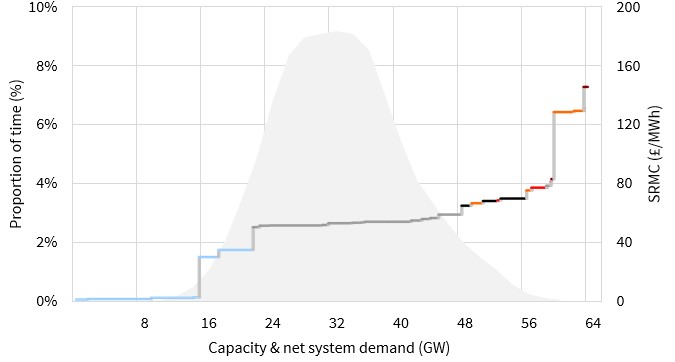
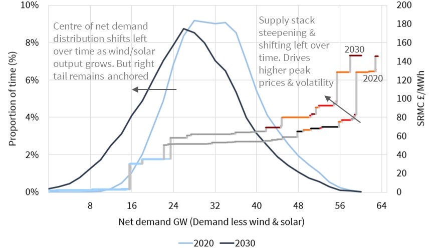
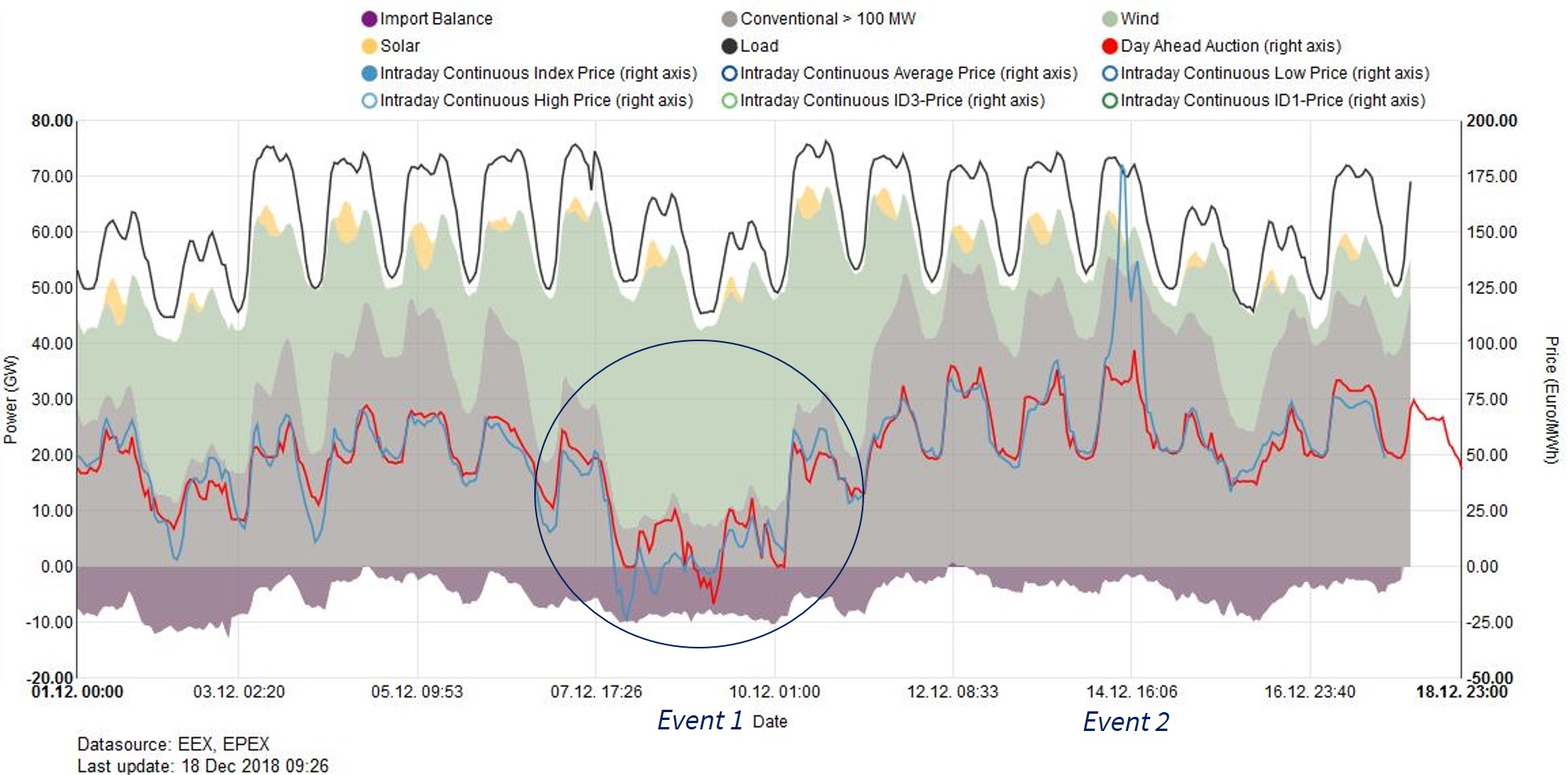
2. Merchant battery investment takes off

Battery storage projects to date have been underpinned by ancillary services revenues, particularly for frequency response.  But this business model is being rapidly undermined by falling ancillary services revenues.  Over the last two years, frequency response prices have plunged in both the UK and Germany (Europe’s two leading markets for battery deployment). This is forcing battery developers to change tack and focus on merchant revenue models.

The merchant business model for batteries is a very different proposition. Most value is captured very close to delivery, by optimising battery flexibility from the day-ahead stage through to real time balancing.  This means that owners and investors need to bear substantial market risk, relying on projections of extrinsic revenue to support investment decisions.  We recently set out some of the challenges facing merchant battery investors.

Despite the headwinds described above, the pick up in investment momentum behind merchant battery projects may be a surprise in 2019.  Developers are focusing on short duration lithium batteries where cost declines are currently fastest.  There also appears to be strong investor interest in the scaling potential of merchant batteries despite the associated market risk.  What has been missing to date has been a clear track record of bankable projects.  That could change this year.

3. Gas demand shock

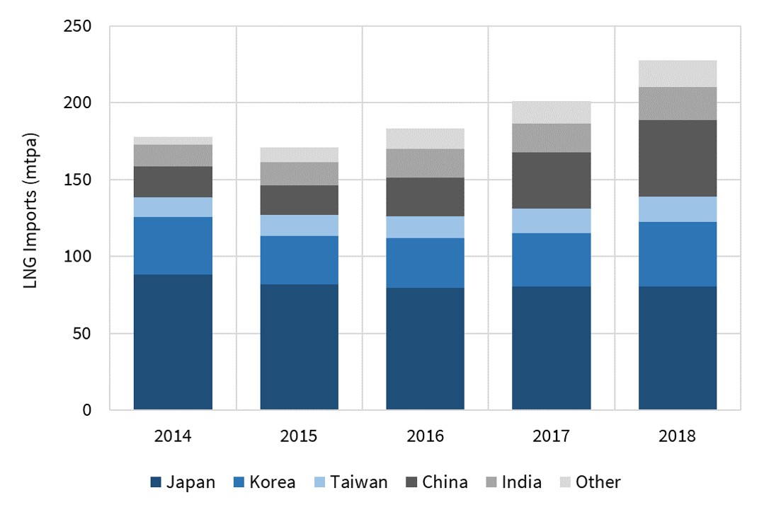
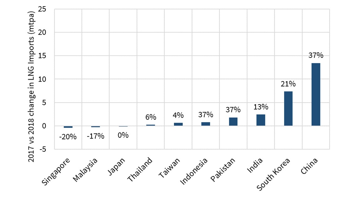
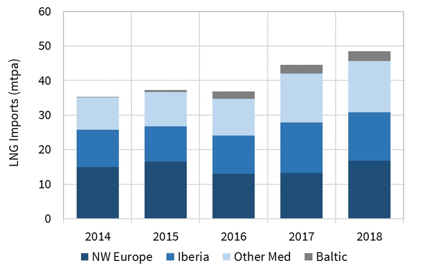
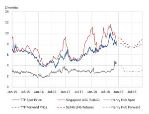
Global LNG demand has had a strong run since 2016, underpinned by Chinese annual demand growth of around 40%.  European gas demand has also recovered significantly over the last 3 years, helped by stronger economic growth and power sector demand.

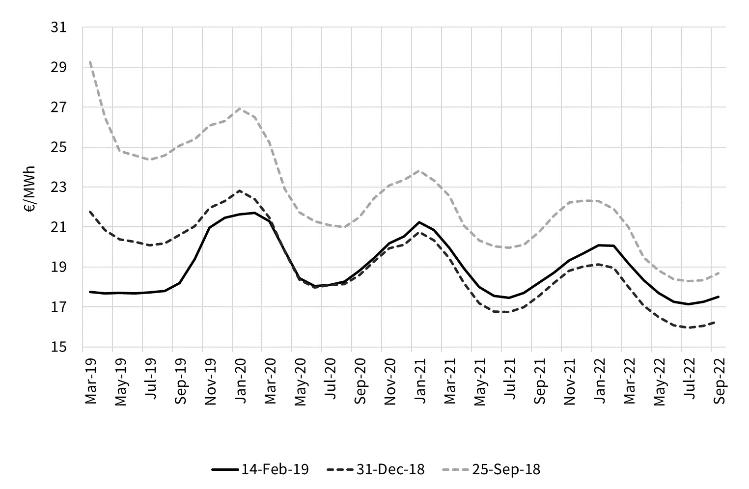
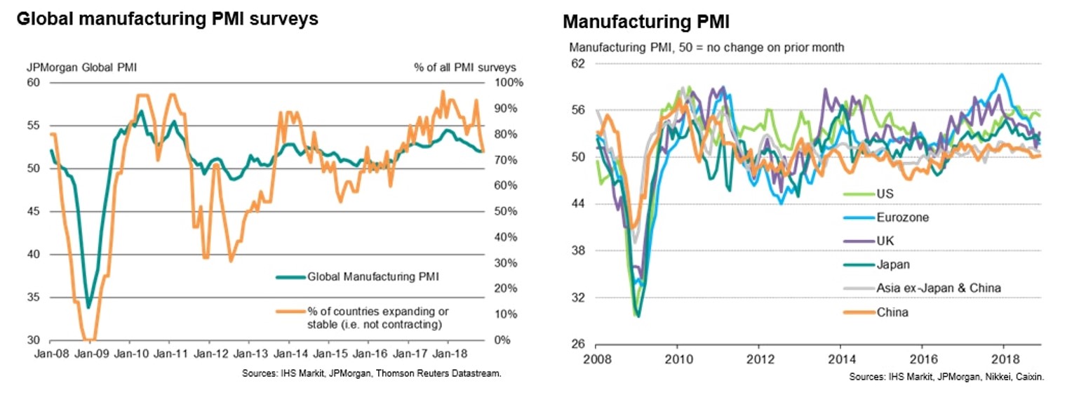
Global gas demand growth was driven by buoyant economic conditions across 2016-17, tagged by economists as ‘synchronised global growth’.  As 2018 drew to a close this had transitioned to ‘synchronised global slowdown’.  The 2018 slowing of growth in Chinese and European manufacturing data (as shown in Chart 1) is a particularly important warning sign for global gas demand.

The global economy is now entering its 11th year of consecutive economic expansion since the financial crisis.  An expansion of this length is unprecedented in modern times.  It raises the risk of a sharper slowdown or recession in 2019. Sharp declines in oil prices and global stockmarkets in Q4 2018 are flagging the risk of a weaker economic outlook.

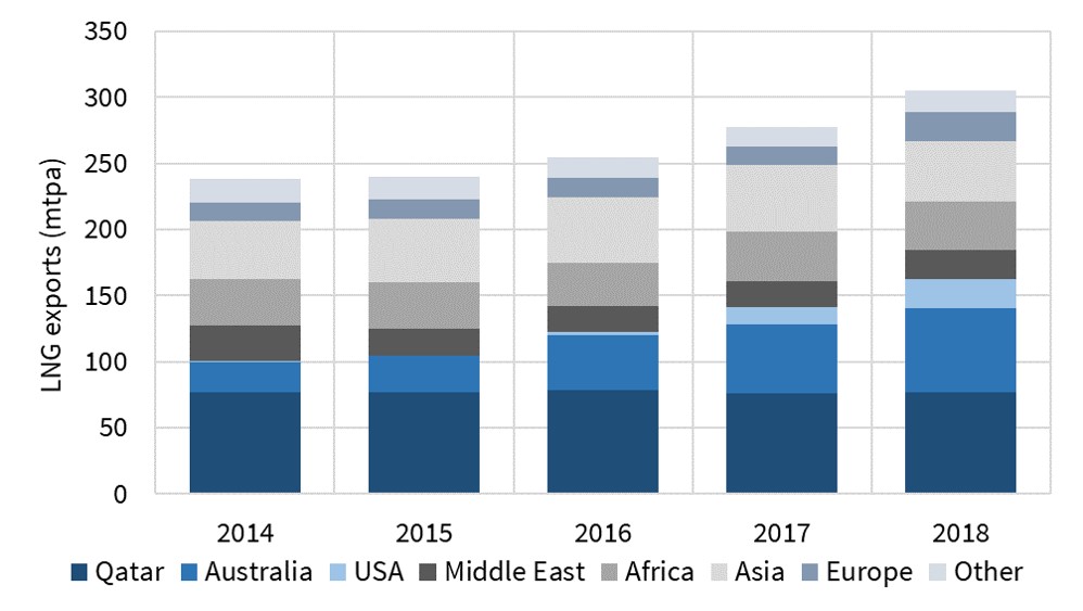
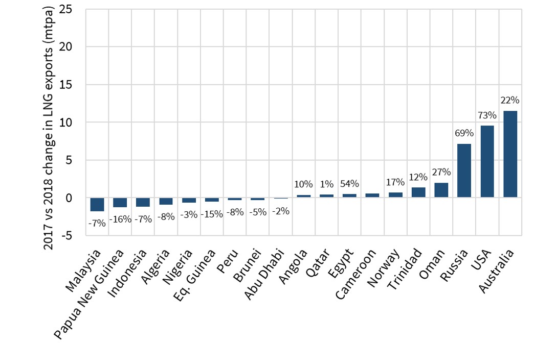
Strong gas demand in Asia & Europe has seen large volumes of new LNG supply absorbed with relative comfort across 2016-18.  This has diminished the risk of a prolonged supply glut. But a gas demand shock in 2019 would come at a time when the largest volumes of the current wave of new LNG supply are coming onto the market.

Gas prices surprised to the upside in 2018.  But a major demand shock in 2019 could cause a temporary slump in TTF & Asian spot prices, particularly if accompanied by falling coal & carbon prices dragging down power sector switching levels.

Chart 1: 2018 slowdown in Purchasing Manufacturing Index (PMI) data

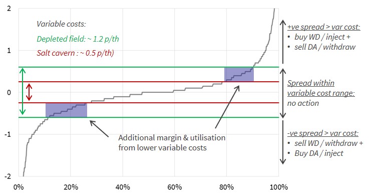
4. Gas storage closures

A number of higher cost, less flexible European storage assets are in trouble.  The funeral bells have been ringing for five years.  Owners have been holding on in the hope of a market recovery, deferring maintenance and investment decisions in an attempt to keep carrying costs to a minimum.  2019 may be the year that a significant volume of storage capacity is finally pulled off line.

TTF seasonal price spreads have remained stubbornly stuck between 1-2 €/MWh for most of the last five years, barely covering the variable costs of cycling seasonal storage.  Many asset owners have managed to hang on due to a combination of:

  1. Long term contracts at more favourable terms (many of which are now expiring)
  2. Hopes of a market recovery
  3. Hopes of regulatory reform to support storage (e.g. changes to system charges).

But owner patience may be running out, particularly those suffering negative cashflows. Storage assets with a higher fixed cost or variable cycling cost base are particularly vulnerable.  Any requirement for substantial capex spend may be terminal. The precipitation of closure decisions if it happens in 2019, will likely contribute to the start of a more sustainable recovery in value of European gas supply flexibility.

5. Rising cost of capital

Energy infrastructure developers have benefited from an historically low cost and easy availability of capital over the last five years.  Could that be about to change in 2019?

Easy access to capital has been underpinned by low borrowing costs. The cost of raising debt can be broken down into two components:

  1. Risk free rate: Massive central bank quantitative easing has driven down interest rates on ‘risk free’ government debt. This is most clearly reflected in 10 year German bond yields which are currently below 0.2%.
  2. Credit risk premium: The credit spread over risk free rates is also at low levels historically, reflecting e.g. low default rates and European Central Bank buying of corporate debt as part of its quantitative easing measures.

So what could change in 2019 to reverse 5 years of readily available capital targeting energy infrastructure? Firstly, global central banks are entering a phase of quantitative tightening in 2019 which could see borrowing rates rise.  Secondly, the potential for a deterioration in economic conditions could widen credit spreads.  Thirdly, investor risk appetite may decline as a result of the first two factors.

The impact of a higher costs of capital in European energy markets would be felt most by companies or projects with higher leverage.  Higher cost of capital erodes asset margins via increasing debt servicing costs. It also increases the cost hurdle for investment in new infrastructure.

We wish you all the best in navigating these (and no doubt many other) surprises across 2019.

Major energy surprises of 2018

 As the Christmas break rapidly approaches, it is time for our traditional year end review of energy market surprises.

We approach this in two parts in today’s article:

  1. A progress check on the 5 surprises we published at the start of the year
  2. A table of 5 things that have surprised us across 2018 given the benefit of hindsight.

Hope you enjoy the ride.

A review of our 2018 surprises

As usual we published a set of 5 potential surprises in Jan 2018.  We below do a quick review and progress check on each of them below.   A reminder that these surprises are not forecasts or predictions, but rather areas where we think it is worth challenging prevailing industry consensus.

1. A setback for LNG prices

Chart 1 shows Asian spot LNG prices started the year at 11.0 $/mmbtu. To everyone’s surprise, prices again reached this level over the summer, with another year of blistering Chinese LNG demand growth.  But the North Asian spot markers look to be ending the year closer to $8.5/mmbtu.

The setback in prices came, but it was very much a Q4 story. Supply has ramped up into year end, both via new projects & from the seasonal increase in liquefaction plant output as temperatures cool. At the same time Asian demand for spot cargoes has been tepid in Q4.  Asian buyers appear well contracted into winter (after being caught short the last two years) and weather has so far been mild.  This has caused a substantial Q4 ramp up in cargoes ‘spilling’ into Europe.  So the setback came but not as most people imagined it.

Chart 1: Global spot gas price benchmarks

Source: Timera Energy

2. Blockchain transformation takes off

This surprise was rooted in a scepticism of bitcoin, but a constructive view of the peer to peer transaction mechanism underpinning it. Bitcoin crashed in 2018, while development of blockchain applications steadily progressed.

The Nov 2018 launch of VAKT, a blockchain based trading platform for crude oil (backed by e.g. BP, Shell, Gunvor, Mercuria), marked perhaps the highest profile energy progress.  But the more innovative use of blockchain to support the evolution of distribution connected energy evolution (e.g. roll out of renewables, flex, efficiency) remains in the early stages of evolution.  Will 2018 go down as the ‘take off’ point for blockchain in energy? No.

3. Reality check for UK engines & batteries

2018 has undoubtedly been a tougher year for UK distribution connected flexible assets. This is in part linked to a dual capacity market surprise: (i) a low 8 £/kW clearing price in Q1 and (ii) a sudden suspension of the capacity market in Q4. From a battery perspective falling frequency response prices have also hit margins.

2018 started with a ‘wall of capital’ looking to invest in distribution connected flex.  This was reflected in strong competition to purchase two of the UK’s leading flex portfolios (UKPR & Greenfrog), competition that somewhat fizzled out after the Q1 auction result. This tempering of investor enthusiasm is a setback not a roadblock. But it is forcing investors & developers to focus on evolving more robust merchant business models going forward.

4. Big step towards global hub based market

This surprise came in two parts: (i) rapid growth in liquidity of the traded LNG market and (ii) Gazprom fully conceding to hub price penetration in Europe. It was in essence a big step towards a global gas market underpinned by a TTF hub price signal.

LNG market liquidity has grown rapidly this year.  This has been helped by price volatility, continued expansion of flexible supply and trading intermediaries and significant growth in portfolio hedging against TTF (ICE TTF futures volumes up 70% in 2018).  But the extent to which Gazprom has embraced hub prices is a bigger surprise, via (i) contract concessions to reflect TTF (ii) directly auctioning supply and (iii) selling uncontracted production directly at hubs.

5. Fund acquisition momentum builds

Low interest rates and a search for yield appeared to be fuelling tailwinds for fund investment in European energy infrastructure at the start of 2018.  But as it turned out, this year’s biggest M&A activity in Europe was focused on utilities (e.g. E.ON / Innogy,  China Three Gorges / EDP and Total / Direct Energie deals).

In the gas & oil space, North Sea fund activity continued in both upstream & midstream assets (e.g. Wren House acquisition of NSMP UK gas processing assets). But if anything this was at a slower pace than 2017 and did not reflect a ramp up in fund acquisition activity.

A few 2018 surprises with the benefit of hindsight

So what else made headlines in 2018?  We summarise five things we think shook the consensus tree in Table 1 below.

Table 1: Hindsight vision – 5 major 2018 surprises

Surprise Description
1. UK Capacity Market halt The UK’s suspension of capacity payments has to be the biggest regulatory shock of the year. A Nov 18 ECJ court ruling saw an immediate halt to capacity payments that have underpinned the UK’s approach to security of supply.
2. CO2 price tripled; TTF surge to $10 Carbon prices tripled across Summer 2018 as implementation of the Market Stability Reserve brought marginal abatement in the power sector back into focus. This contributed to TTF prices surging to 10 $/mmbtu in Sep.
3. LNG shipping cost explosion Spot charter rates for LNG vessels started 2018 at around $70k per day. By early Q4, rates had tripled to $220k per day (although have since fallen back to around $150k). Higher costs have contributed to the ramp in LNG flow back into Europe.
4. Europe’s move against coal France & the Netherlands joined the UK & Italy in announcing permanent closure plans for coal fleets. But the move that attracted most attention was the establishment of a German coal commission to address phaseout (although initial findings have been delayed until 2019).
5. Russian gas import constraints Two of the three key Russian pipeline routes into Europe have been constrained across most of 2018 (Nordstream & Yamal). Even Gazprom’s less favoured Ukranian swing route faced constraints across Q3. These conditions were hard to imagine given European demand and Russian flow volumes back in 2015.


Timera year end news

Our client base has continued to expand in 2018 with new clients including JP Morgan, Cheniere, Axpo, Sumitomo, Ineos, Smartest Energy, Drax & Triton.

Our client work this year has included:

  • Development of an LNG portfolio flex optimisation model
  • Value capture optimisation of UK battery & engine portfolios
  • Valuation of large Continental thermal power portfolio
  • Commercial due diligence to support a bid for a large midstream gas portfolio
  • Valuation & investment case analysis for a range of European gas storage assets
  • Developing a portfolio risk management framework
  • Analysis of the evolution of price signals in the European gas market

To support this work we have again been actively growing the Timera team in 2018, with some exciting new additions also in the pipeline for 2019.

This is our last feature article for 2018.  But we’ll be back in early January with a set of new surprises for 2019.  In the meantime, we will be continuing to publish material via the Angle and Snapshot columns.

We wish you all the best for a relaxing festive season!